Name
A name you can own.
For founders before day one. Naming routes, the story behind each, and a shortlist you can say out loud, own outright, and build on.
- Naming routes
- Meaning and story
- Shortlist and recommendation
Blue Owl Design Studio · Hyderabad
Every brand we make starts with one.
Then we say no to everything else.
We name and design brands for founders.
From Hyderabad, since 2016.
Scroll
Selected work
Most brands try to say ten things. Great ones say one. We find it, and design everything around it.
Every project starts with one question about the business. The answer becomes the brand.
One idea, applied to every surface, without exception. A name, a mark, a colour. Then discipline.
The kerning on a card. The pattern inside a box. The parts nobody sees, done right anyway.
It starts with a name.
Naming is where most of our brands begin.
Tell us what you do and who it’s for. We’ll come back with names you can say out loud, own outright, and build a brand on.
See how naming worksPick the one that fits where you are. We’ll take it from there.
Name
For founders before day one. Naming routes, the story behind each, and a shortlist you can say out loud, own outright, and build on.
Brand
For founders who need to look as serious as they are. One idea, carried through every surface without exception.
Launch
For founders opening a door, a shelf or a site. The brand, plus everything it has to live on.
One more thing.
No account managers. No hand-offs. The people you meet are the people who design.
Tell us in a sentence. We reply within a day.
Or WhatsApp us: +91 90328 27583 · malvika@blueowl.in · rahul@blueowl.in · Instagram · Insights
Tell us what you started. We will tell you what it needs.
Then we build a brand around it.
Blue Owl is a brand studio in Hyderabad. We name companies, design their identities, make the things people hold, and build the places they live online. Since 2016, for founders who want their brand to make sense the moment you meet it.
01 · Naming
We find names you can say once and remember, then check them against the trademark register and the languages your customers speak.
Seen in High & Dry · LINAÉ · Telugu Medium · Five Little Tales
02 · Brand identity
A mark, a palette, type and the rules that hold them together, so a box, a sign and a screen feel like the same brand.
Seen in Workline · Greater Than · Iconica Capitol · KMC
03 · Packaging & print
Boxes, labels, bottles, cards and menus, drawn from the same idea, so the brand is in the hand before it is in the head.
Seen in O Fam · Telluris Biotech · Do Taar · House of Pops
04 · Websites & social
Websites we design and build, and feeds that keep the story going between launches.
Seen in House of Pops · LINAÉ · The Autumn Leaf
The founders
Every project is led by the two of us, from the first conversation to the last file.
What we believe
Where we have worked
Different brands. Different worlds. One way of working.
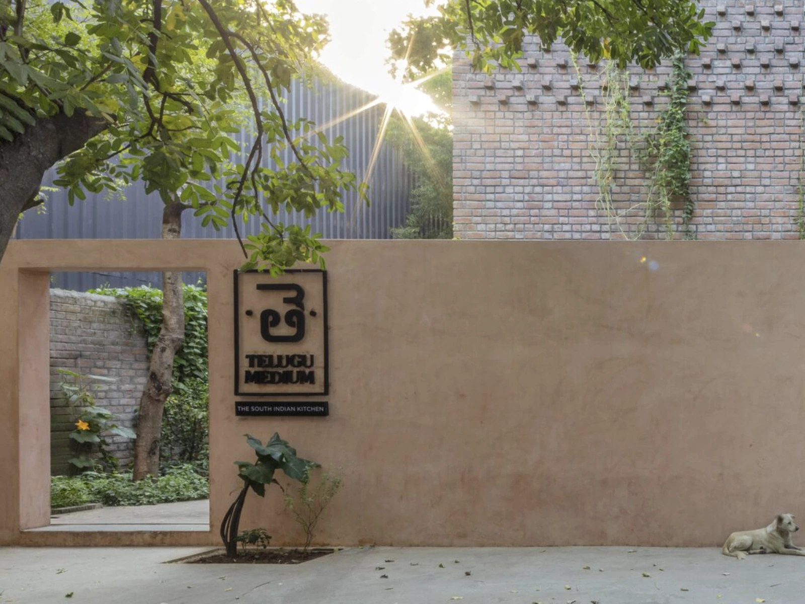
By giving the Telugu letter pride of place.
Food & Beverage · Naming, Brand Identity, Menus & Print
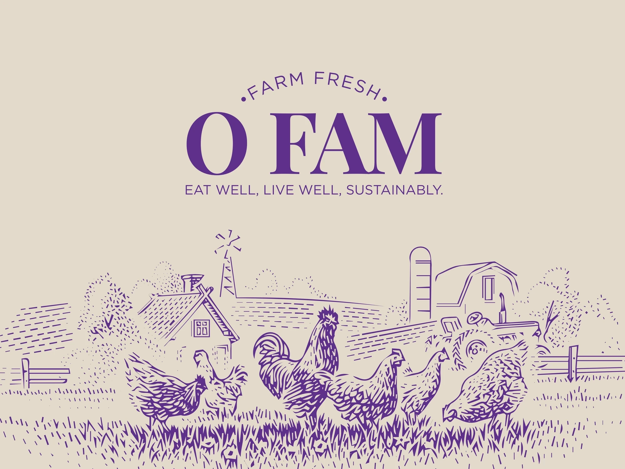
By looking like it actually came from a farm.
Food & Beverage · Naming, Brand Identity, Packaging
With a flower that only blooms in pairs.
Healthcare · Naming, Brand Identity, Brochure
By being a place you linger in, not a page you close.
Retail · Brand Identity, Illustration, Stationery
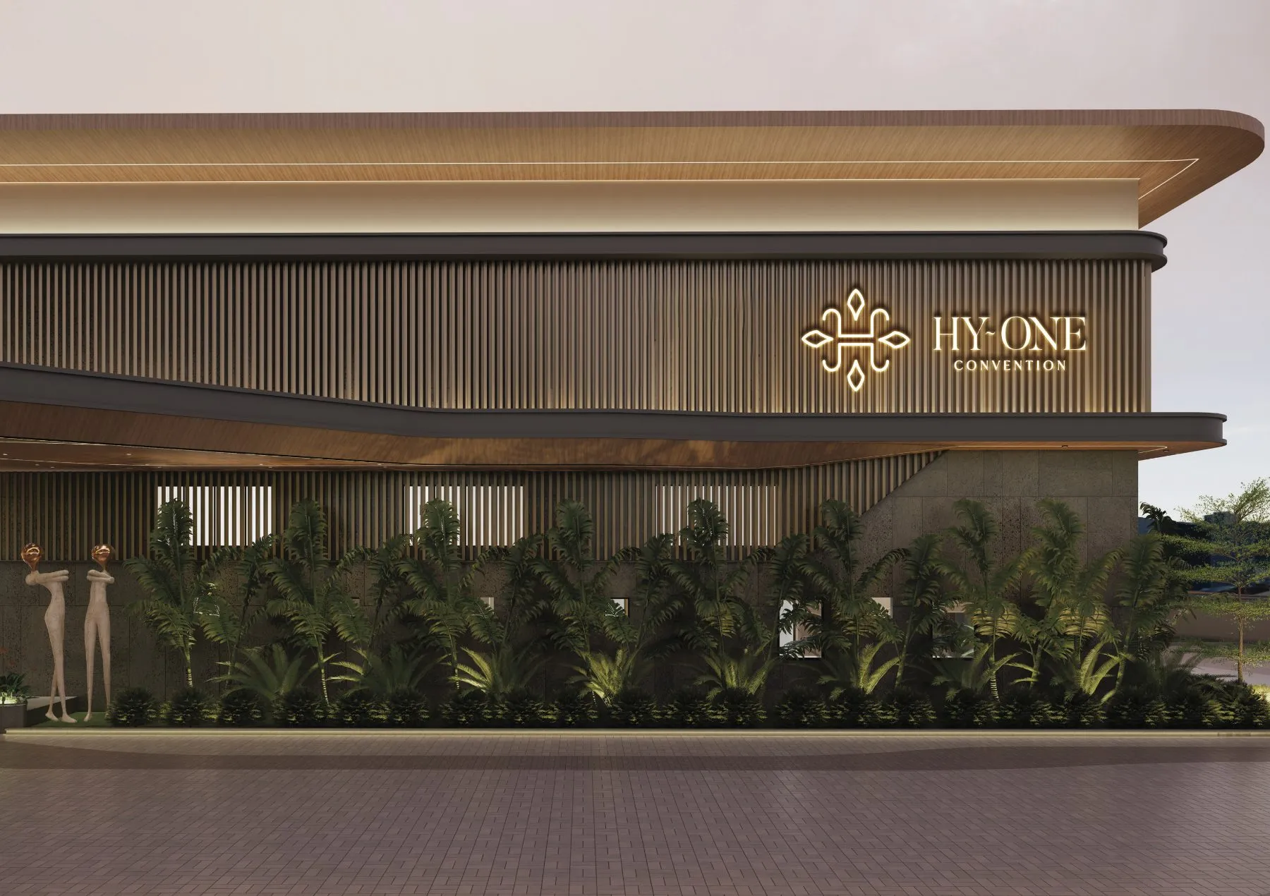
An H drawn like a jharokha ornament, dressed in maroon and gold.
Hospitality · Naming, Brand Identity, Signage
By turning its own technique into its visual language.
Fashion · Brand Identity, Packaging, Print
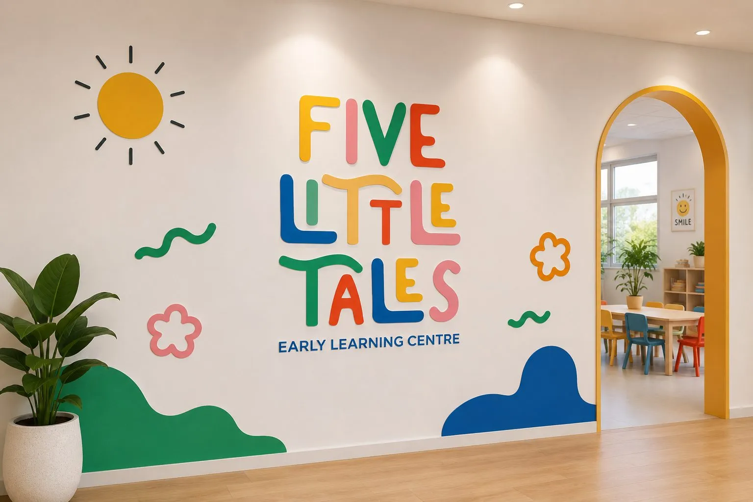
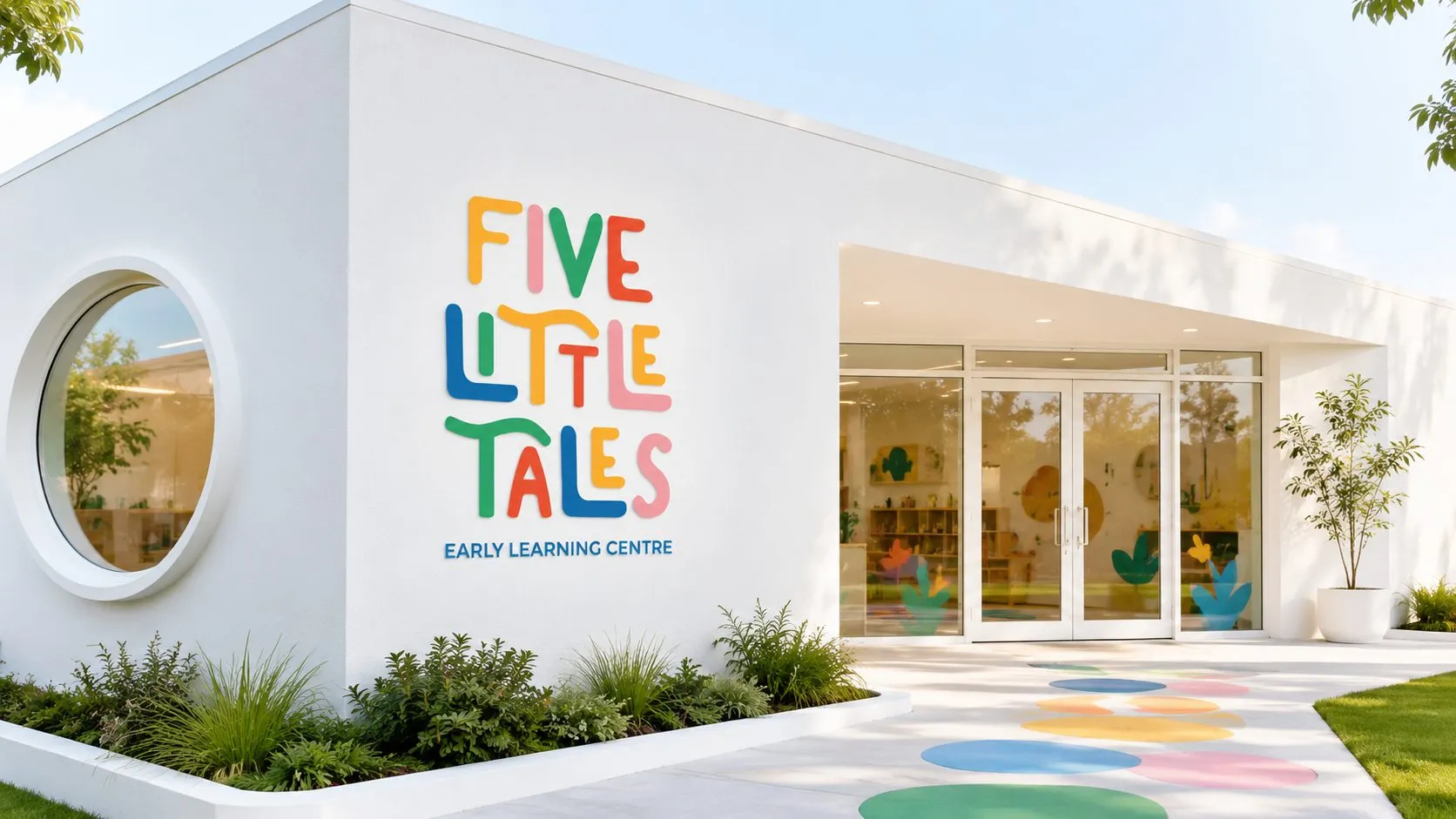
Make it look the way childhood feels.
Education · Naming, Brand Identity, Signage
By being fun everywhere it shows up.
Food & Beverage · Naming, Brand Identity, Photography
By living life in capital letters.
Real Estate · Brand Identity, Campaign, Brochure
You name the brand after one. Rüya — Turkish for dream.
Fashion · Naming, Brand Identity, Stationery
By drawing the brand from the metal itself.
Manufacturing · Brand Identity, Stationery
After the first thing poured every morning: coffee.
Food & Beverage · Naming, Brand Identity
By letting the name hold the party up: a garland strung between its own letters.
Events & Celebrations · Logo Design, Brand Identity, Brand Guidelines
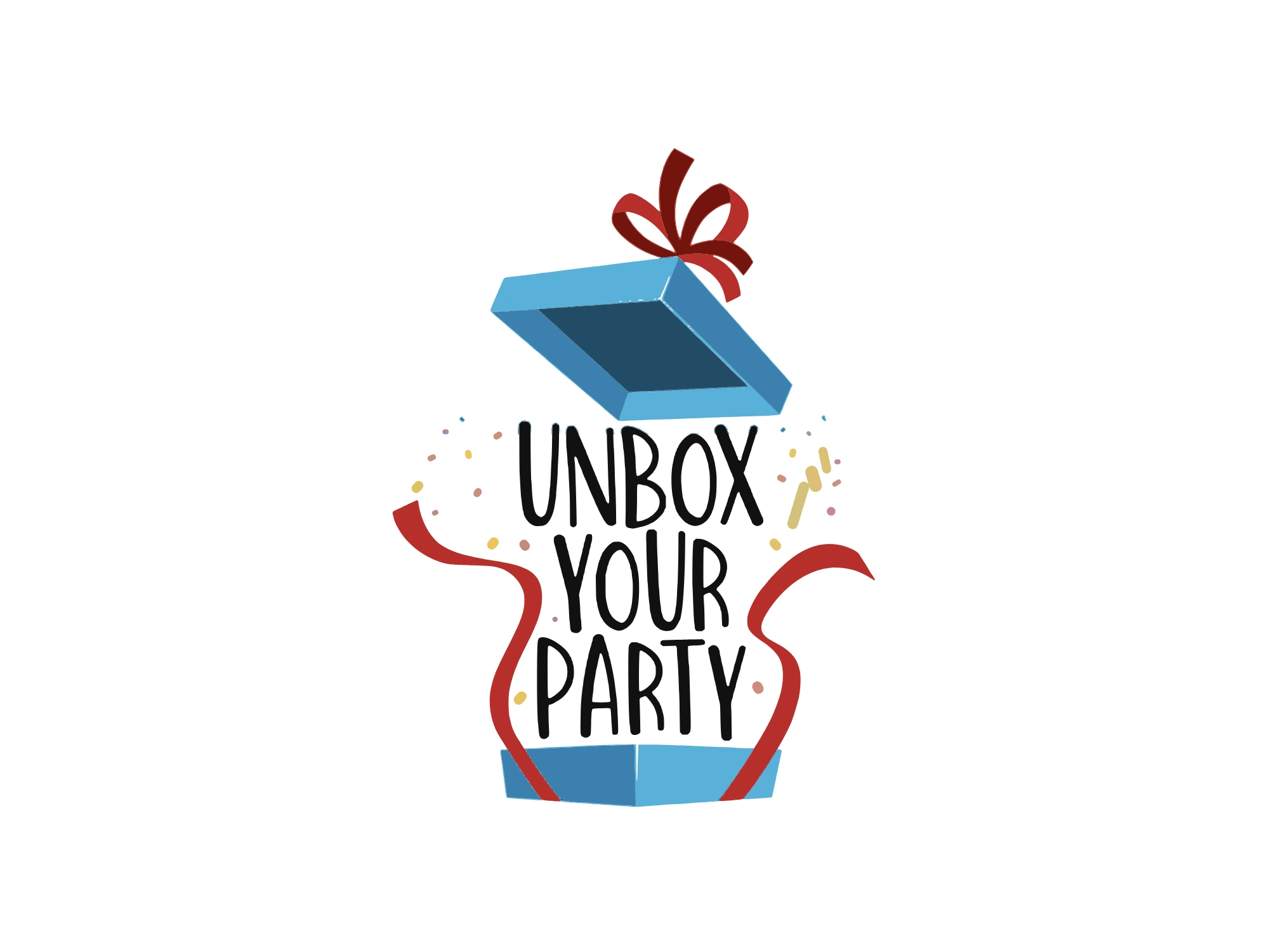
By drawing the exact second the lid comes off.
Events & Celebrations · Logo Design, Brand Identity, Brand Guidelines
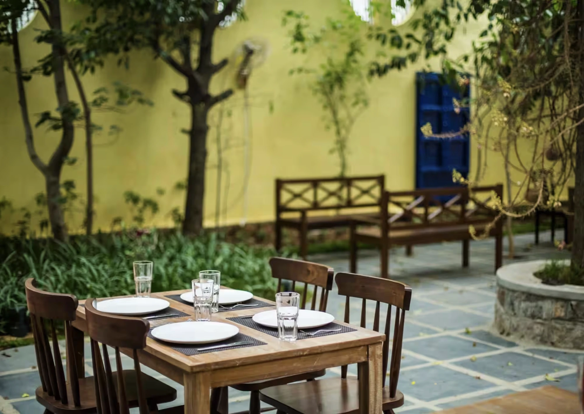
By letting one handwritten leaf do the talking.
Food & Beverage · Brand Identity, Illustration, Menu Design
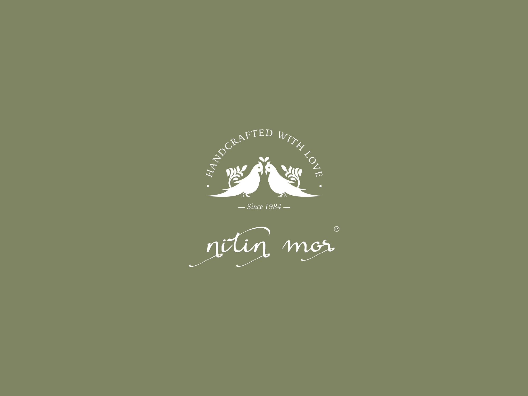
By signing its name, and letting two parrots keep the date.
Fashion · Brand Identity, Pattern, Stationery
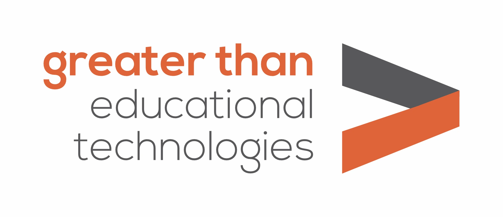
By naming itself after a symbol, and folding it into a ribbon.
Education · Brand Identity, Logo Rationale, Brand Guidelines
By building it from a film strip, with Los Angeles in both frames.
Film & Media · Logo Design, Brand Identity, Brand Guidelines
By building its W from the seven pieces of a tangram.
HR Technology · Logo Design, Brand Identity, Brand Guidelines
Set the little a at half size, and give it four moods to play in.
Hospitality · Brand Identity, Colour System, Stationery
Grow a leaf out of the letters, and let every bottle speak the field’s language.
Biotech · Brand Identity, Tagline, Product Naming
Name it like a mood, talk like a sneakerhead, and keep it black and white.
Fashion · Naming, Brand Identity, Brand Communication
Bright red, a slice hidden inside the G, and pizza drawn so you can almost smell it.
Food & Beverage · Brand Identity, Packaging, In-store Posters
By drawing its name and its mark from a star.
Staffing & Recruitment · Naming, Brand Identity, Stationery
Four upright letters, one swash, and a menu drawn in the same hand.
Food & Beverage · Brand Identity, Illustration, Packaging
Set the name in gold, give the A a macron, and let the R step out under the C.
Fashion · Brand Identity, Logo Design, Packaging
Marks we designed, from cafés to crop science. Hover to see them in colour.
How we think about names, brands and the founders behind them.
Themed by Sneha Chopra · 3 min readAn event studio whose every booking is a different world needed one mark simple enough to sit beside all of them.
Unbox Your Party · 3 min readA themed-party brand whose product changes every weekend. The logo had to show what never changes: the moment the box opens.
Workline · 3 min readSeven pieces, one letter, any shape: a logo that explains how an HR platform fits itself around each company.
Roo La La Productions · 3 min readA film strip, two frames and one city: a production logo that plays like an opening title.
House of Pops · 3 min readA name you can say with your mouth full, two pops crossed into a heart, and ten years of keeping it fun.
Gradi Pizza · 3 min readA new pizza shop in New Zealand needed everything on day one. We built it on one red, one mark and one drawing.
High & Dry · 3 min readA shoe and bag care studio that sells a feeling, not a chore. Built on a name, a line and a lot of white space.
Greater Than · 3 min readMost edtech logos describe the category. This one borrowed a symbol every student already knows.
Nitin Mor · 3 min readA label with forty years of trust does not need to shout heritage. It needs a date, a signature and some restraint.
Half a Bawa · 3 min readClients sometimes ask why a logo takes weeks. The honest answer is that the first good idea is rarely the best one.
Rüya · 3 min readRüya is Turkish for dream. Naming a couture stylist after one meant designing a feeling as personal as the clothes.
 Telluris Biotech · 4 min read
Crop science is built in labs and bought in fields. The brand has to be credible in both places.
 Five Little Tales · 3 min read
For an early learning centre, the brand has two audiences. Parents need to trust it. Children need to love it.
LINAÉ · 3 min readTwo dermatologists, one clinic and a flower that only blooms in pairs: naming, identity, stationery, opening and website.
Iconica Capitol · 3 min readLuxury real estate is sold years before it is built. The brand is the only thing a buyer can hold on launch day.
Hy~One · 3 min readIn hospitality, the smallest objects carry the most weight. A guest may never see your logo on a wall, but they will hold your bottle.
O Fam · 3 min readOrganic brands promise purity. The packaging has to prove it before the customer ever opens a pack.
The Autumn Leaf Café · 3 min readA neighbourhood café lives or dies on its feed. The trick is making every post look like it came from the same place.
Do Taar · 3 min readChikankari is art meant to be worn. The identity had to feel just as delicate, and just as permanent.
 Off The Shelf · 3 min read
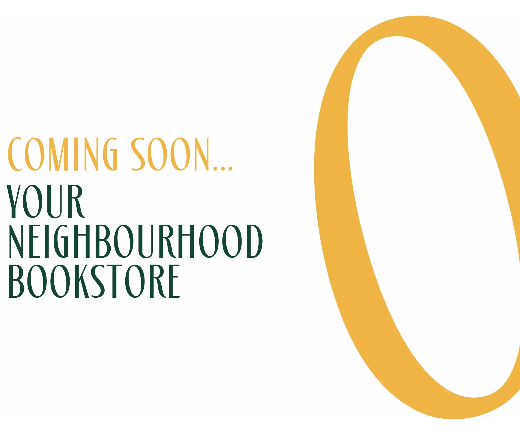
An independent bookstore competes with an app that delivers tomorrow. The brand has to make people want to walk in today.
KMC · 3 min readWhen the next generation takes over, the brand has to move forward without losing what made the business work.
Grow a leaf out of the letters, and let every bottle speak the field’s language.
Telluris Biotech is a research-driven agri-biotech company in Hyderabad, founded in 2015, making patented, eco-friendly crop protection and crop nutrition products. It holds a USEPA Biochemical Classification, and says it has the world’s first True Bio-Nematicide to be referred by the Biochemical Classification Committee. We built the brand end to end: the TB mark, the tagline “Protecting What The World Sows”, the stationery, the label system for the whole range, and the names Kheth Rakshak and Nema Fasak.
The mark, as it grows
The soil line is drawn, the sprout comes up through the join, the leaf opens, and the name settles beneath it.
The rationale
Telluris takes its root from Tellus, the Latin word for the earth. A strong, scientific name, credible with investors and distributors. The identity keeps that credibility and brings it down to the soil.
The T and the B are drawn as one continuous soil-brown line. The company's initials, set down like the ground everything else grows from.
Where the letters meet, a green sprout grows out of the mark. Science and soil in one shape: the thing Telluris exists to protect.
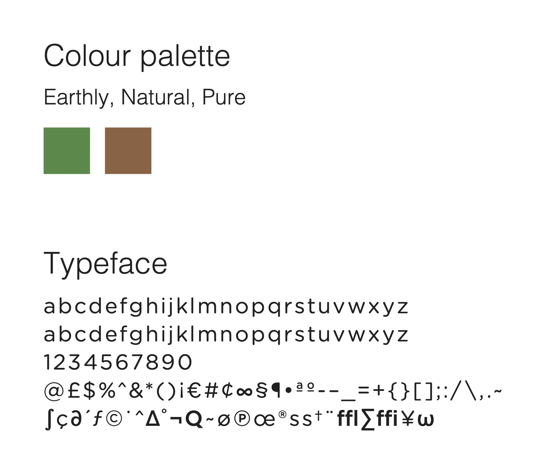
Two colours, straight from the field: soil brown and leaf green, in a clean geometric sans. Earthy, natural, pure.
In the field
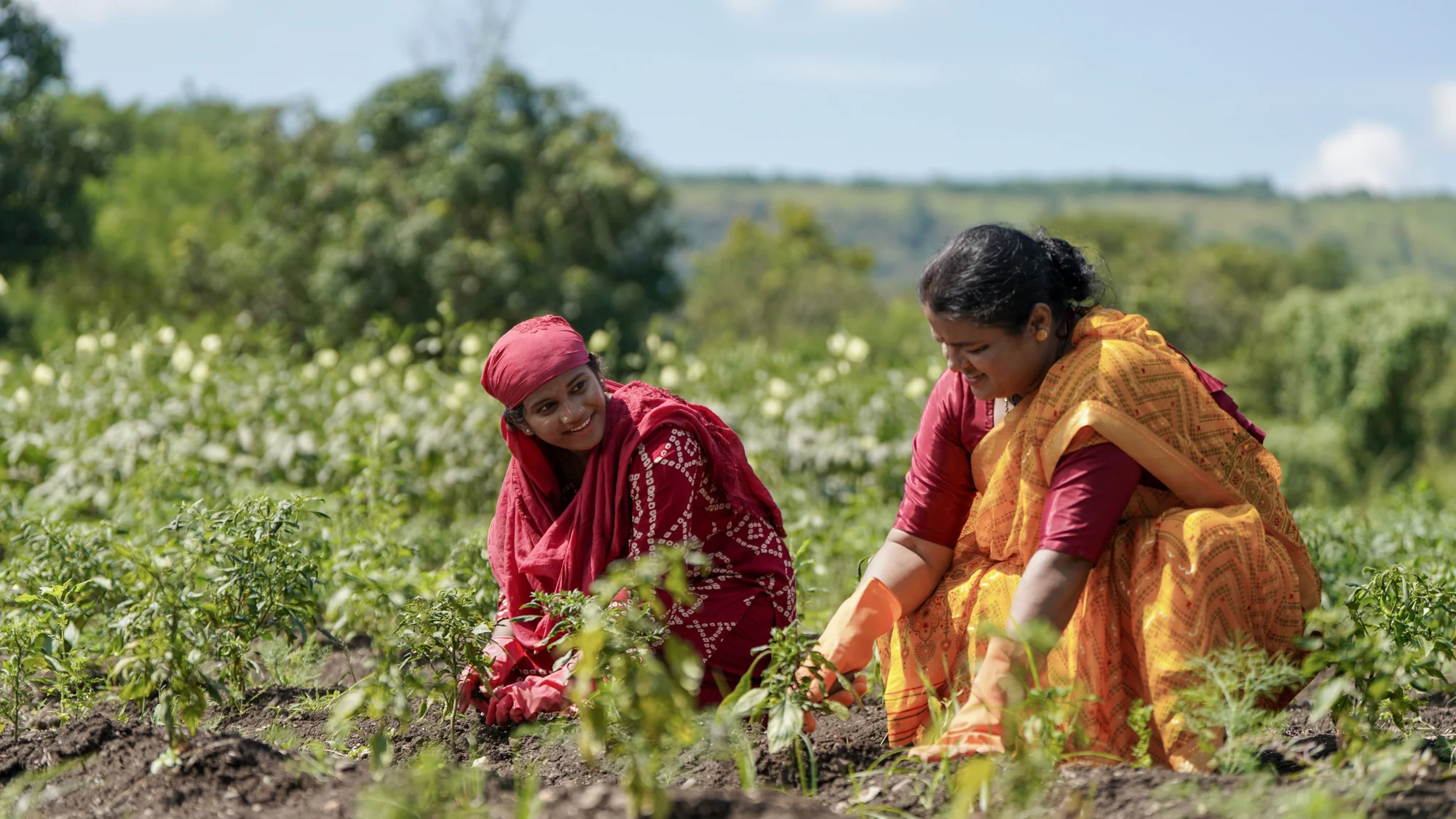
Crop science is built in labs and bought in fields. Over a working field, the sprout comes up again.
Names we gave the range
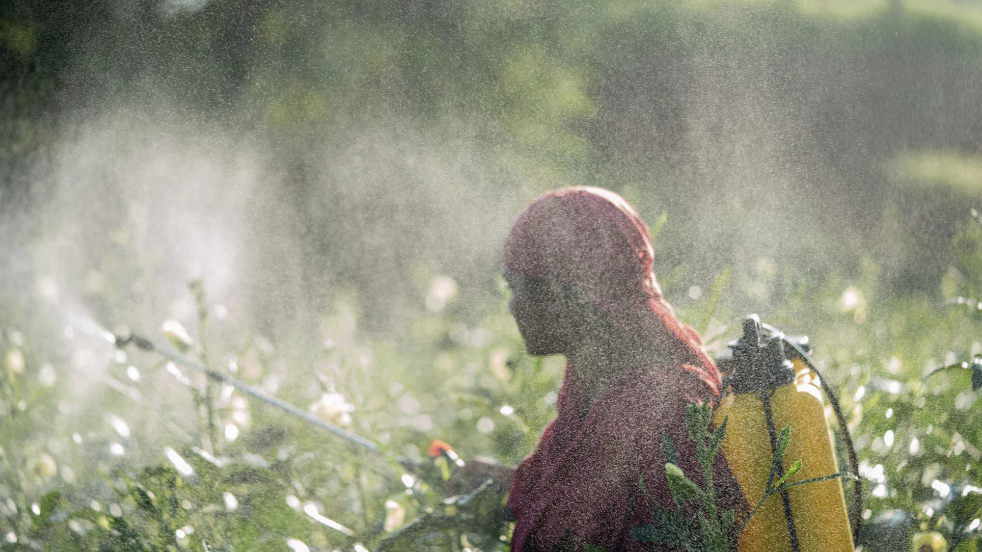
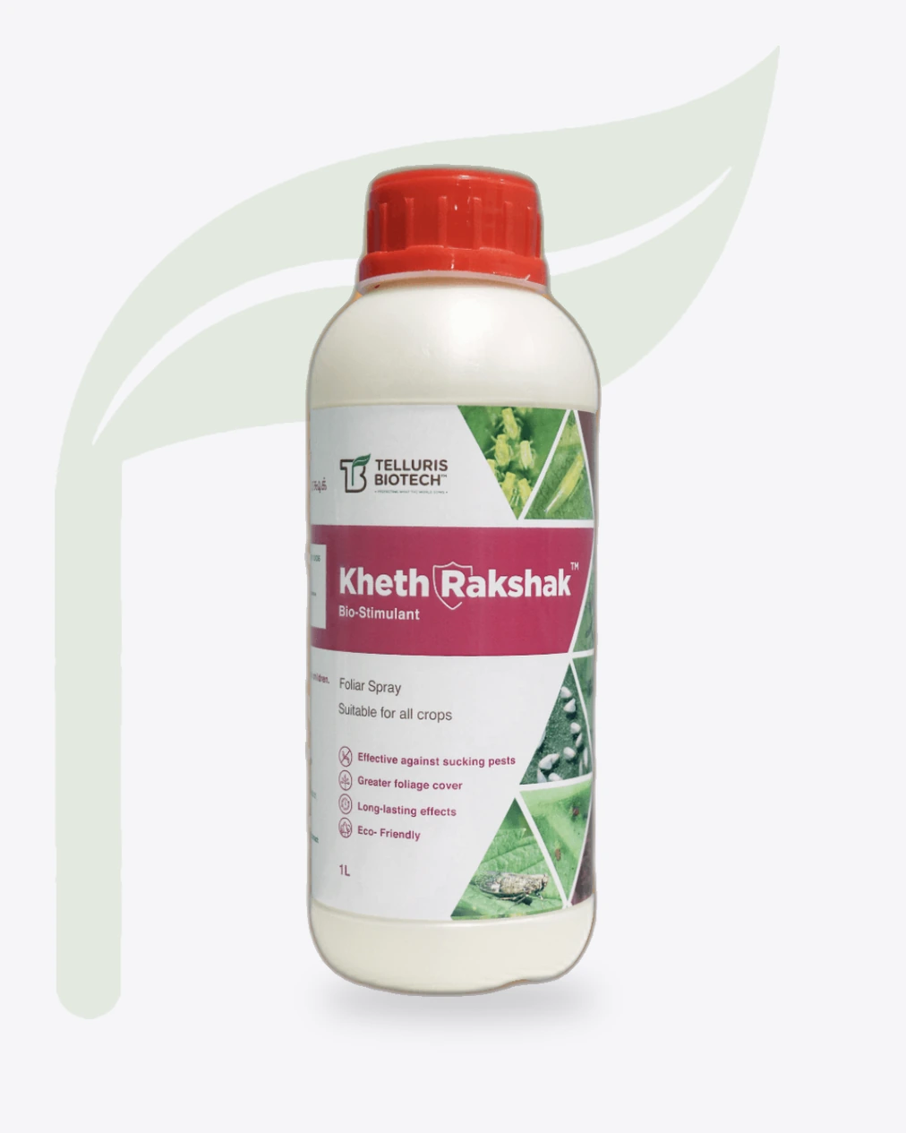
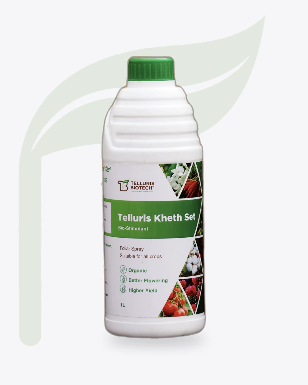
Kheth Rakshak, a foliar spray against sucking pests. A farmer can say it once and ask for it by name at the counter.
Names we gave the range
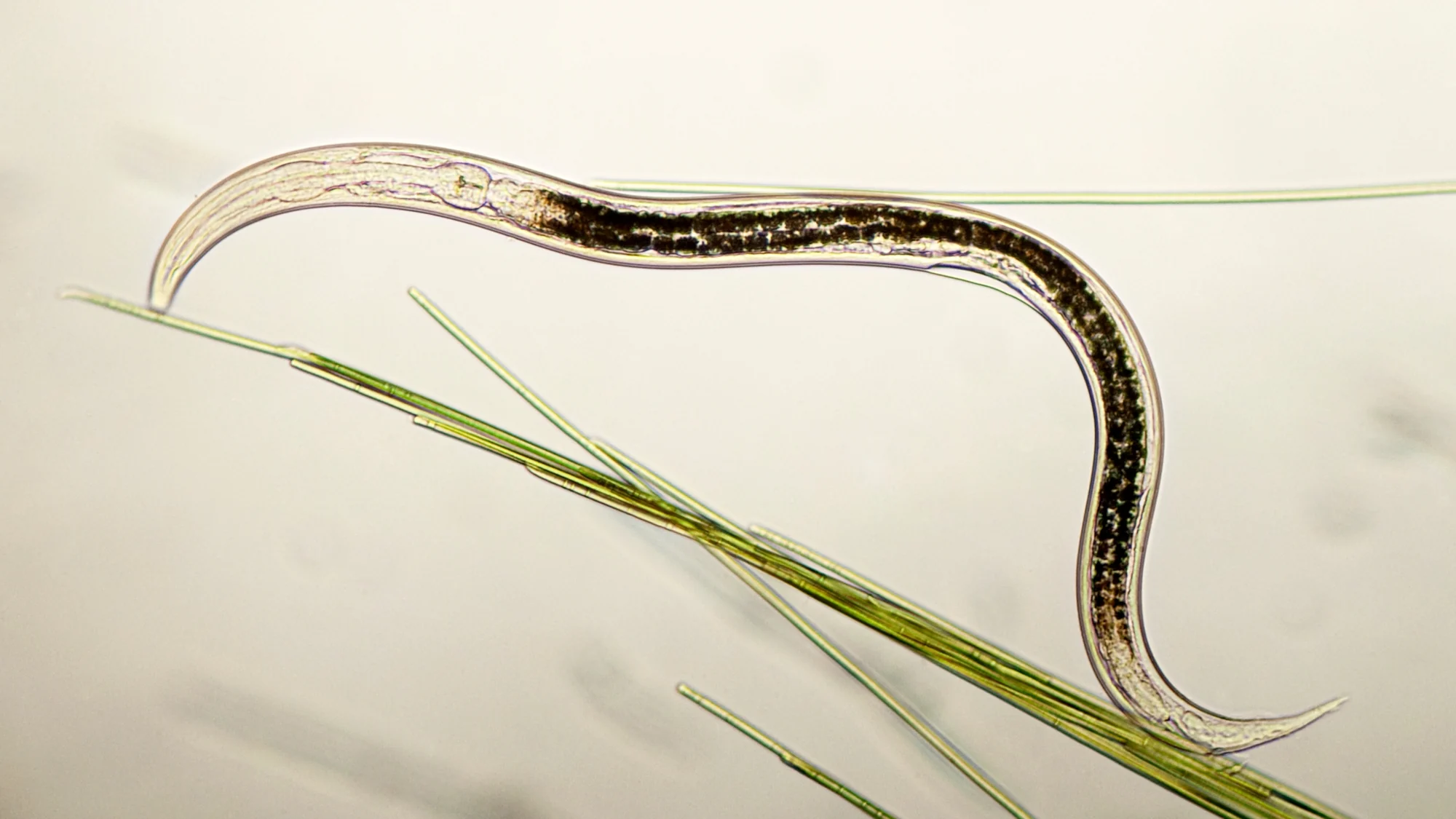
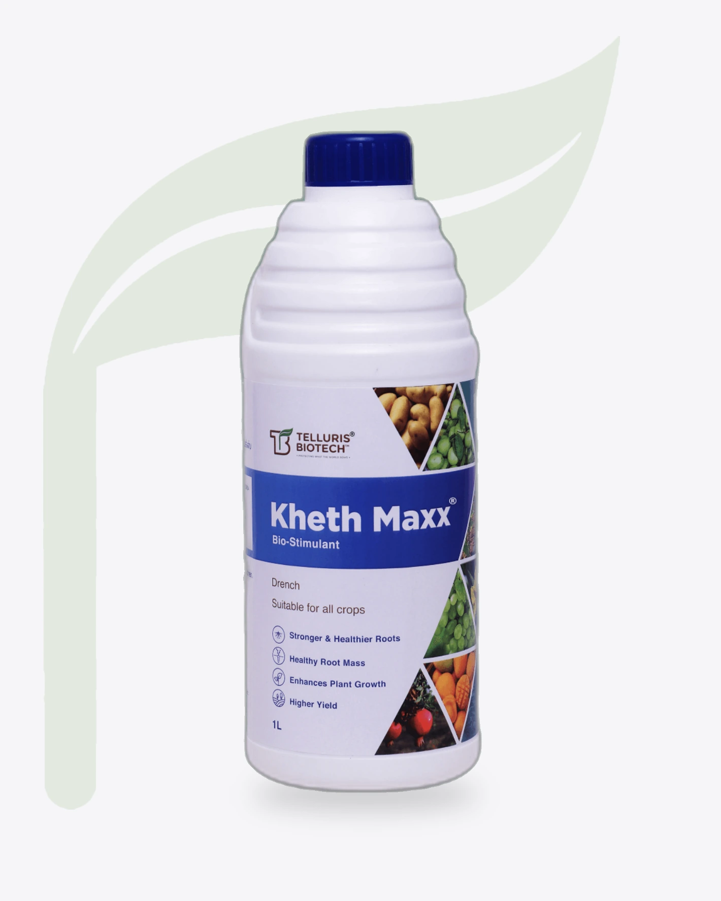
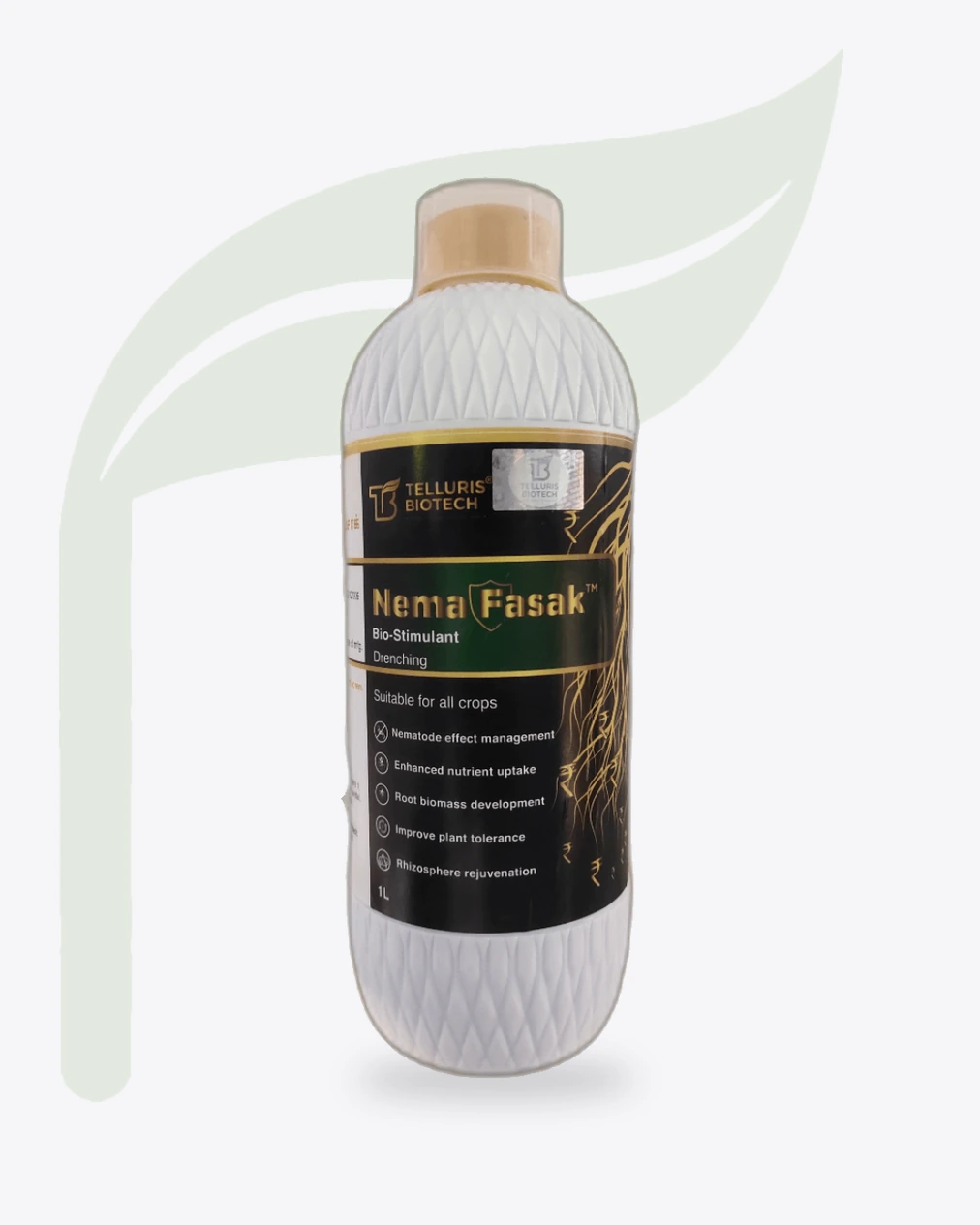
Nema Fasak, a drench for nematodes. The name tells the farmer which pest it is made for.
Telluris holds a USEPA Biochemical Classification. Its founder, Venu Polineni, has said it is the world's first True Bio-Nematicide to be referred by the Biochemical Classification Committee.
The range
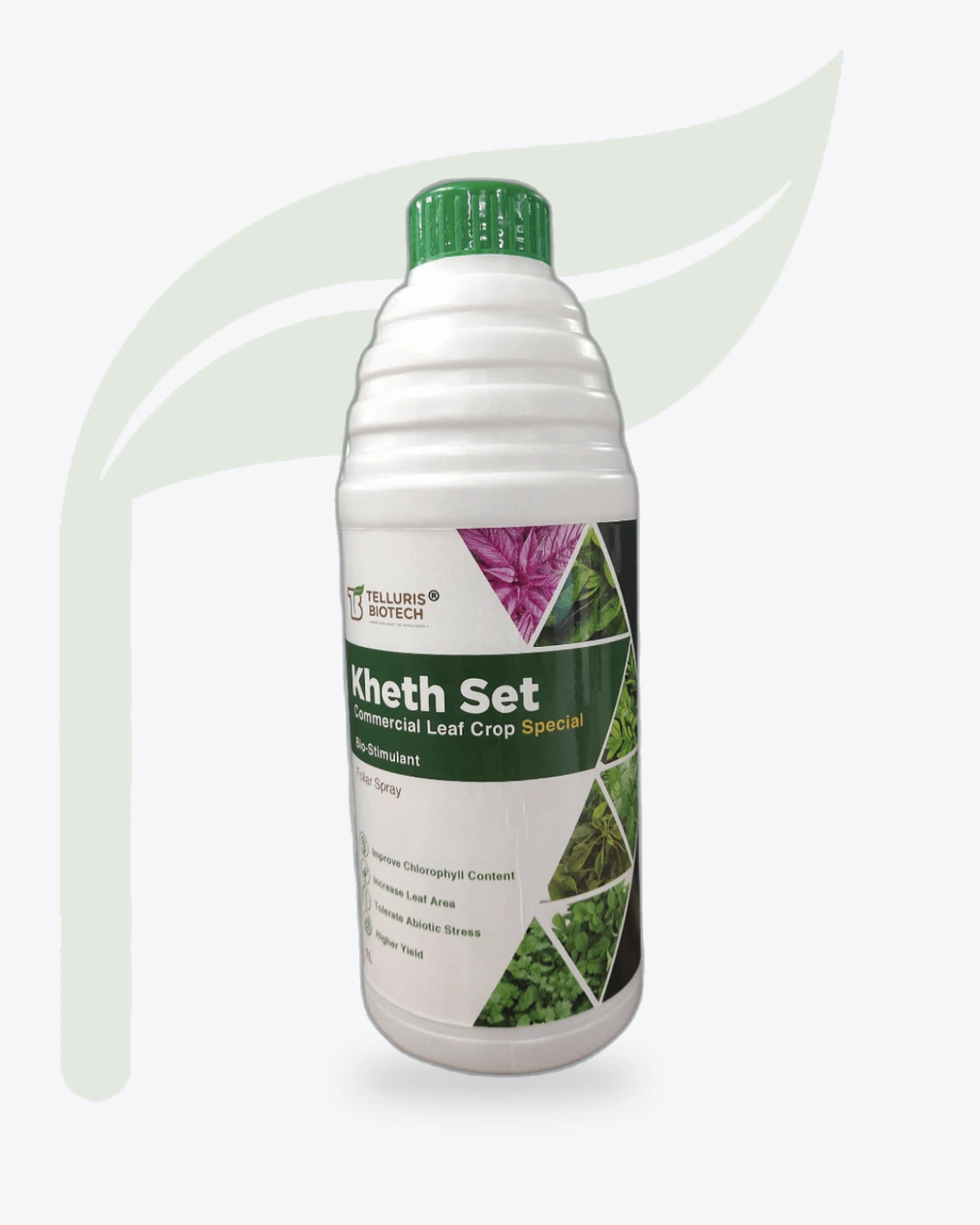
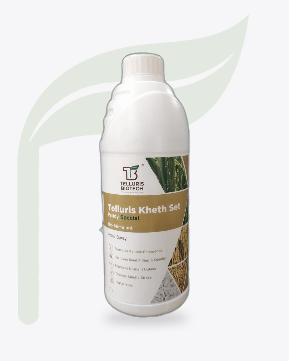
The mark at the top, one colour band for the name, crop photography cut into triangles, the benefits in plain words. Only the band changes.
Lab to field
The brand has to be credible in both places. Drag the sprout from one to the other.
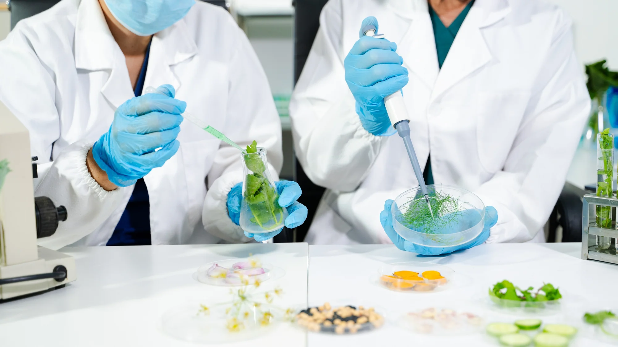
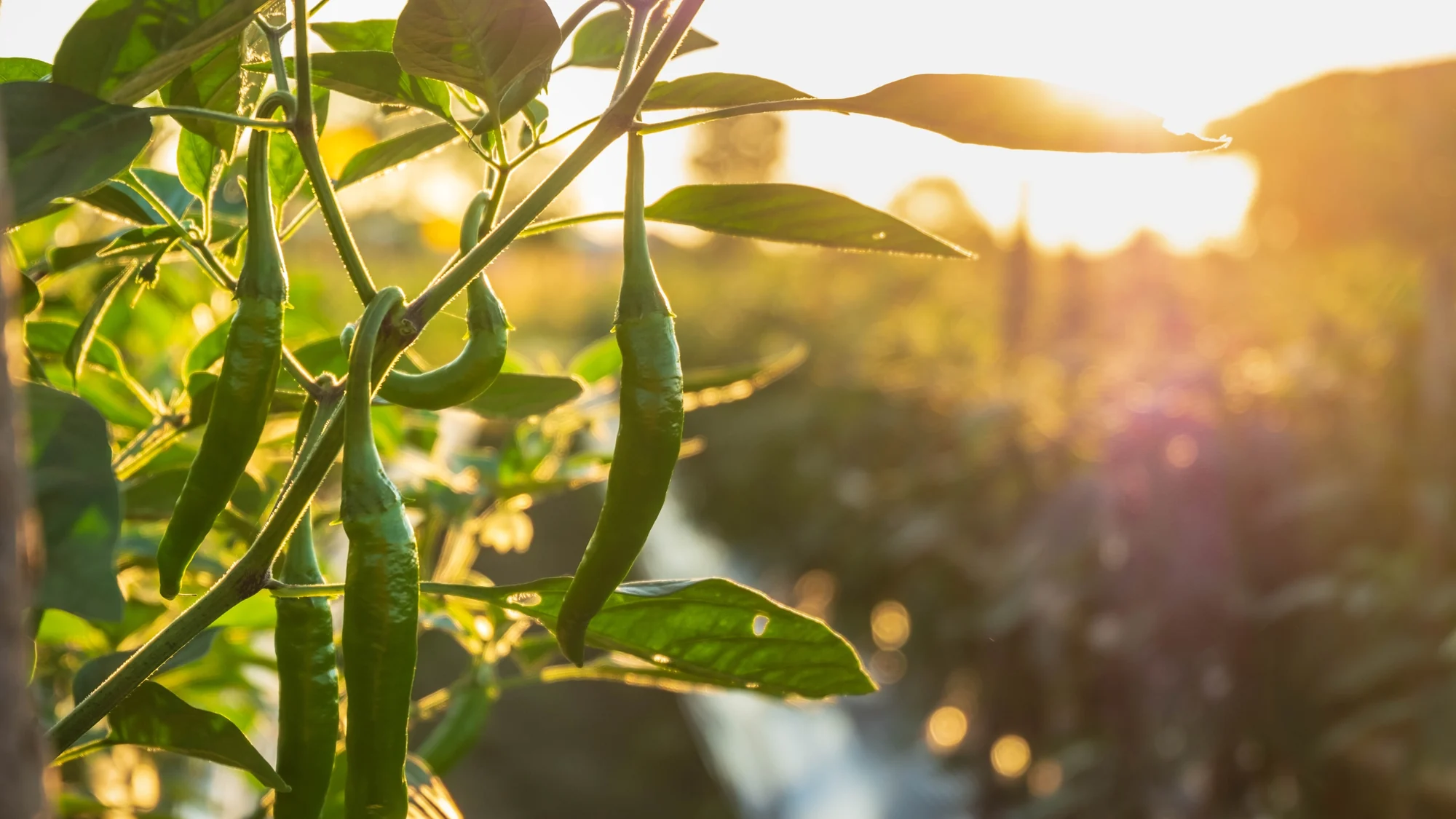 LabField
Lab to field, at speed
Soil, the lab, the crop, the pest and the colour of every bottle. The mark holds its place through all of them, the way a farmer should be able to find it anywhere.
The line
is the science.
is the farmer.
is the ambition.
Five words that hold the whole company. A good tagline is a company description short enough to remember.
Brand guidelines
Colour, versions, the icon, the sprout, lettering, pattern and the label, set out the way a brand book should.
Earthy, natural, pure. Soil brown for the letters, leaf green for the sprout and the line beneath.
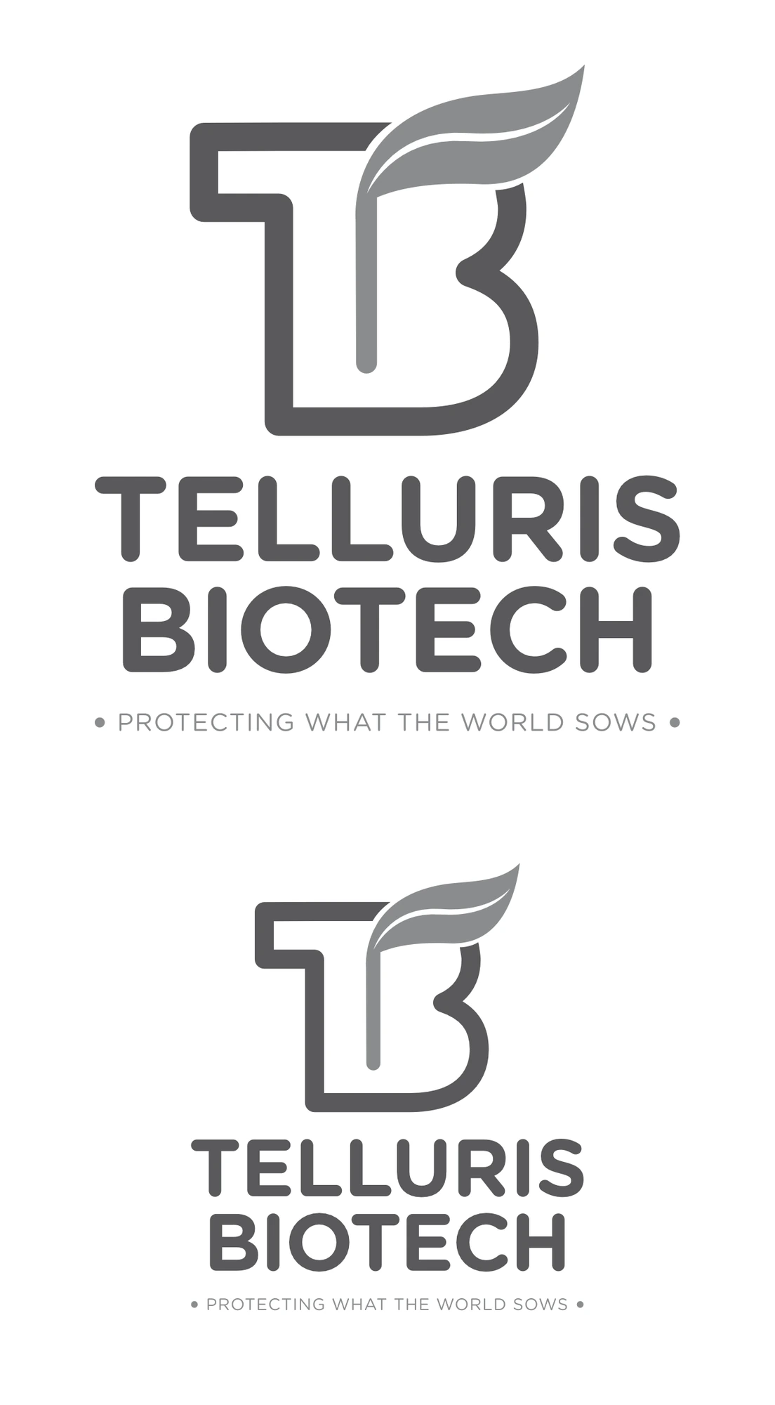
Full colour wherever it can be. In one colour, the mark still holds in greys, large and small.
On dark grounds the letters turn white and the sprout keeps its green. The horizontal lockup sets the name beside the mark.
Where there is no room for the name, the mark stands alone: in a browser tab, or as an app icon.
 Telluris Biotech
Beside the tagline, the sprout from the mark stands alone, without the letters.
A clean geometric sans. The name in heavy capitals in soil brown; the line in light, spaced capitals in leaf green.
TELLURIS BIOTECH
• PROTECTING WHAT THE WORLD SOWS •
The sprout repeats into a quiet field of its own, a background for the line and the brand's printed pieces.
Every bottle shares one grid. Only the band colour changes, so a dealer can tell each product apart from across the shop.
An agri-biotech company from Hyderabad, founded in 2015.
Science you can plant.
We wrote the tagline too.
Five words. The whole company.
Two colours, straight from the field.
One label system, a colour for every bottle.
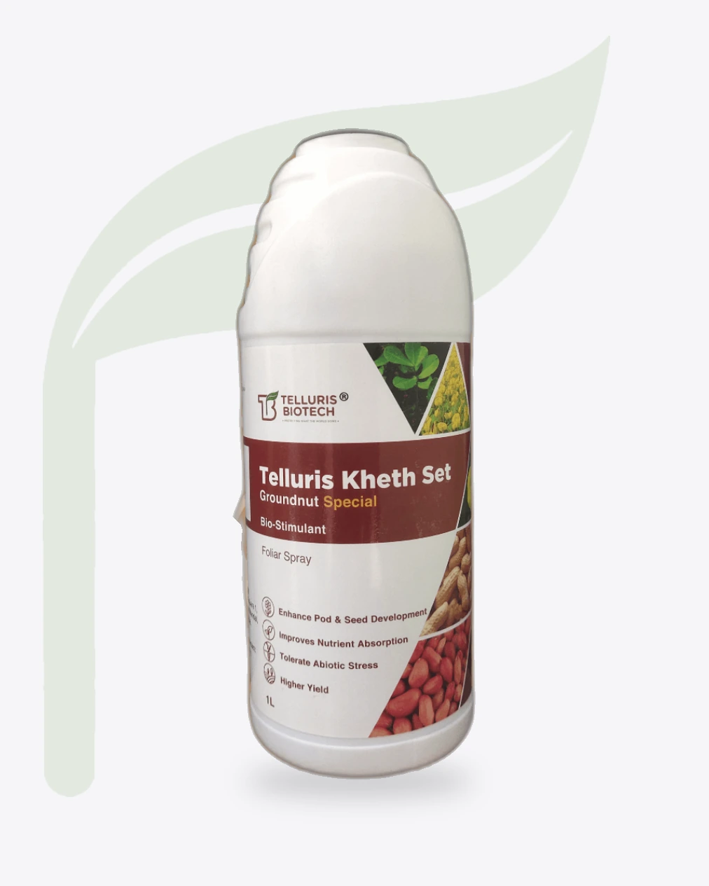
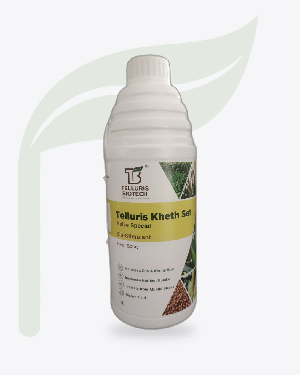
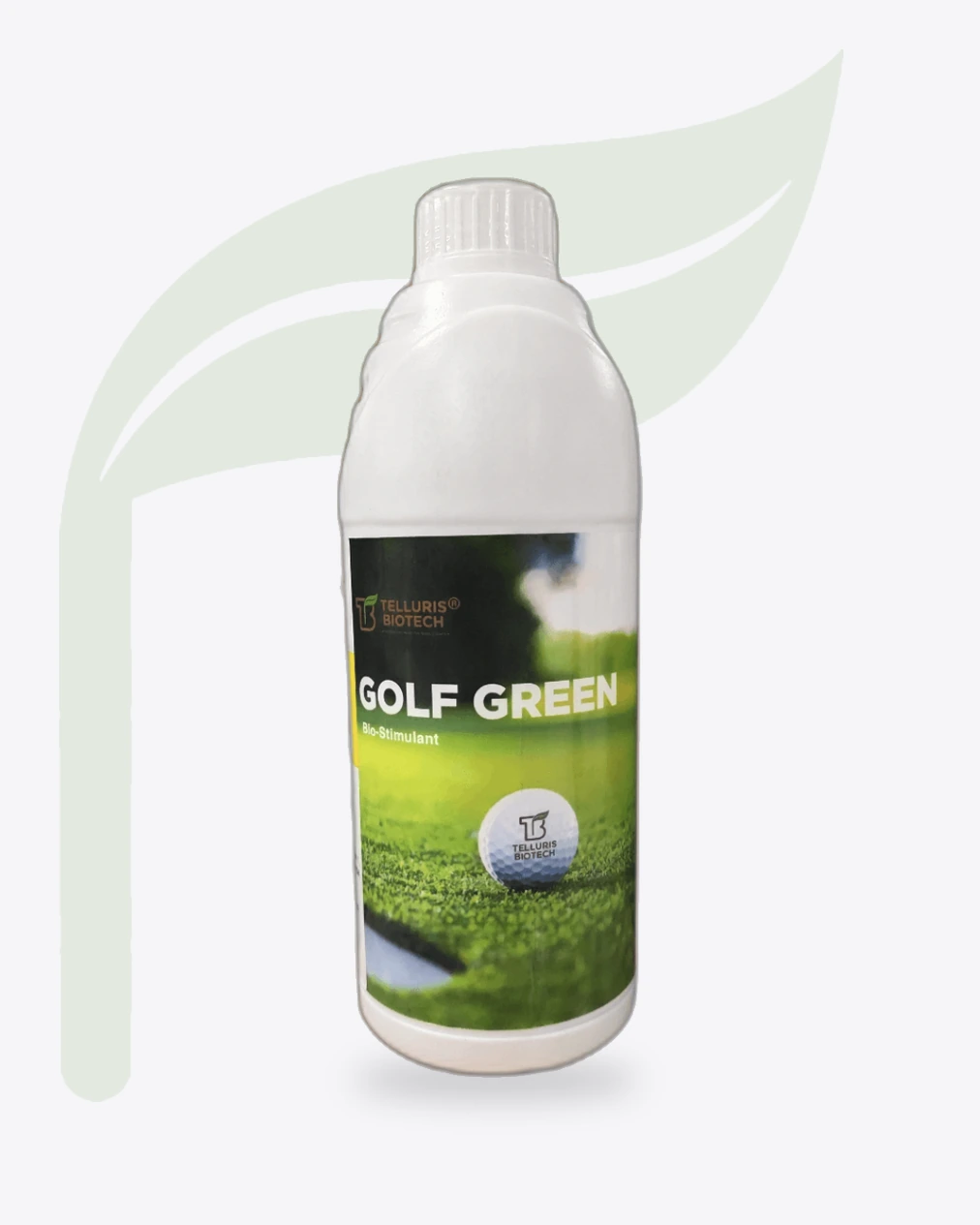
Two of these names are ours.
Where the brand has to work hardest.
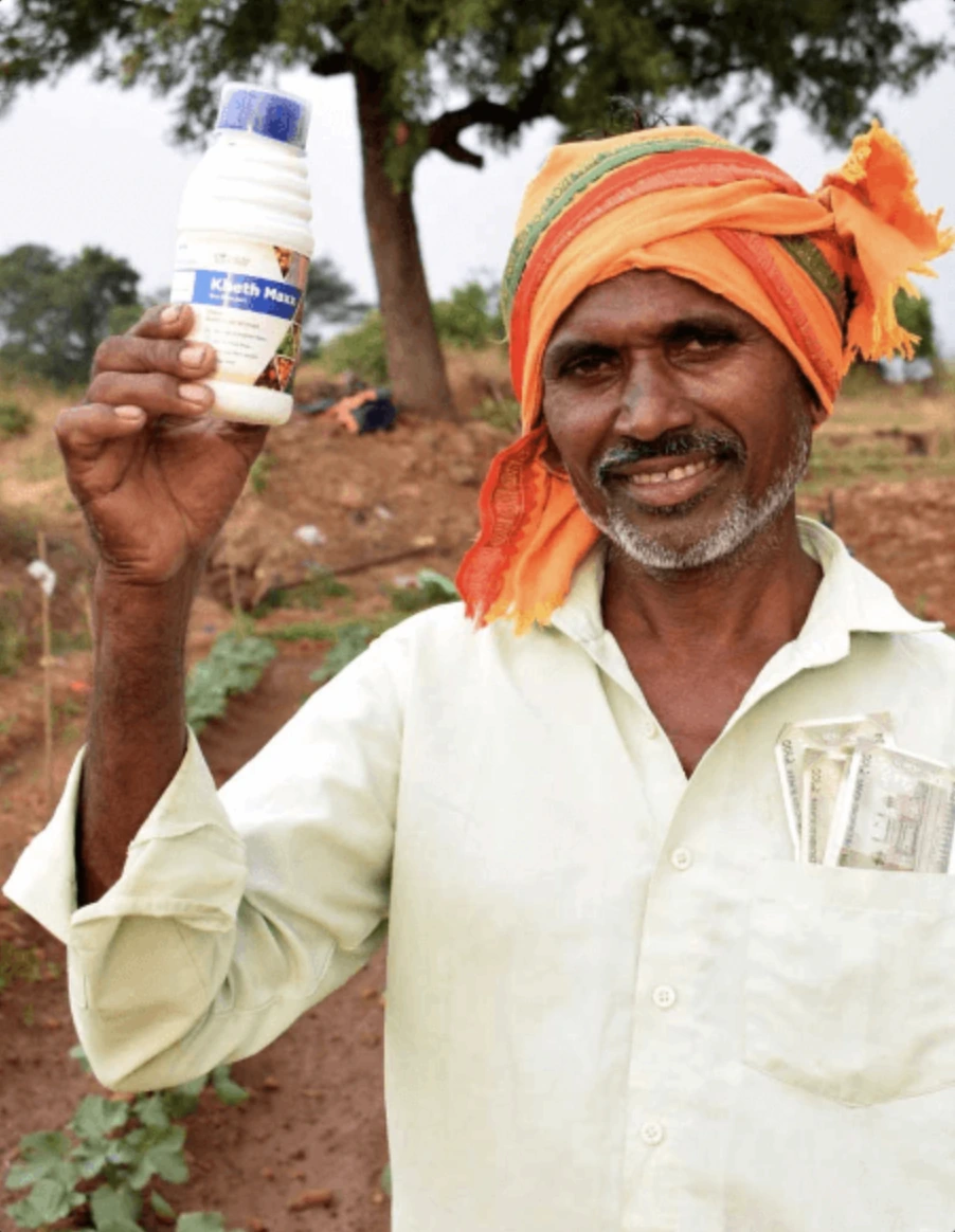
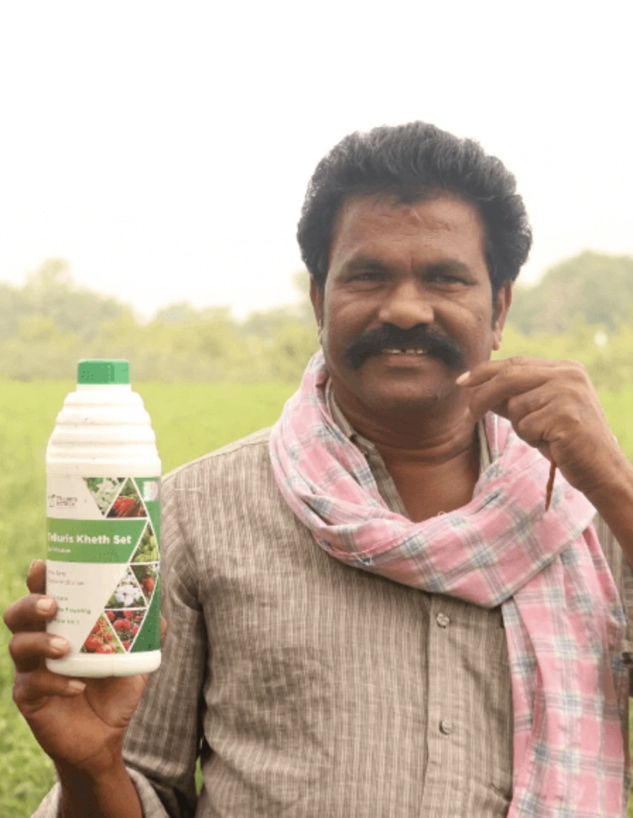
The world’s first True Bio-Nematicide to be referred by the USEPA’s Biochemical Classification Committee.
Telugu MediumFood & BeverageO FamFood & BeverageLINAÉHealthcareOff The ShelfRetailHy~OneHospitalityDo TaarFashionFive Little TalesEducationHouse of PopsFood & BeverageIconica CapitolReal EstateRüyaFashionKMCManufacturingFirst PourFood & BeverageThemed by Sneha ChopraEvents & CelebrationsUnbox Your PartyEvents & CelebrationsThe Autumn Leaf CaféFood & BeverageNitin MorFashionGreater ThanEducationRoo La La ProductionsFilm & MediaWorklineHR TechnologyHalf a BawaHospitalityHigh & DryFashionGradi PizzaFood & BeverageAntela GroupStaffing & RecruitmentSorinFood & BeverageMārcheFashion