







Insights / Café logo design in Hyderabad
Café logo design in Hyderabad: how Sorin drew its menu in one line
Five letters, one swash, and a menu of drawings in the same hand.

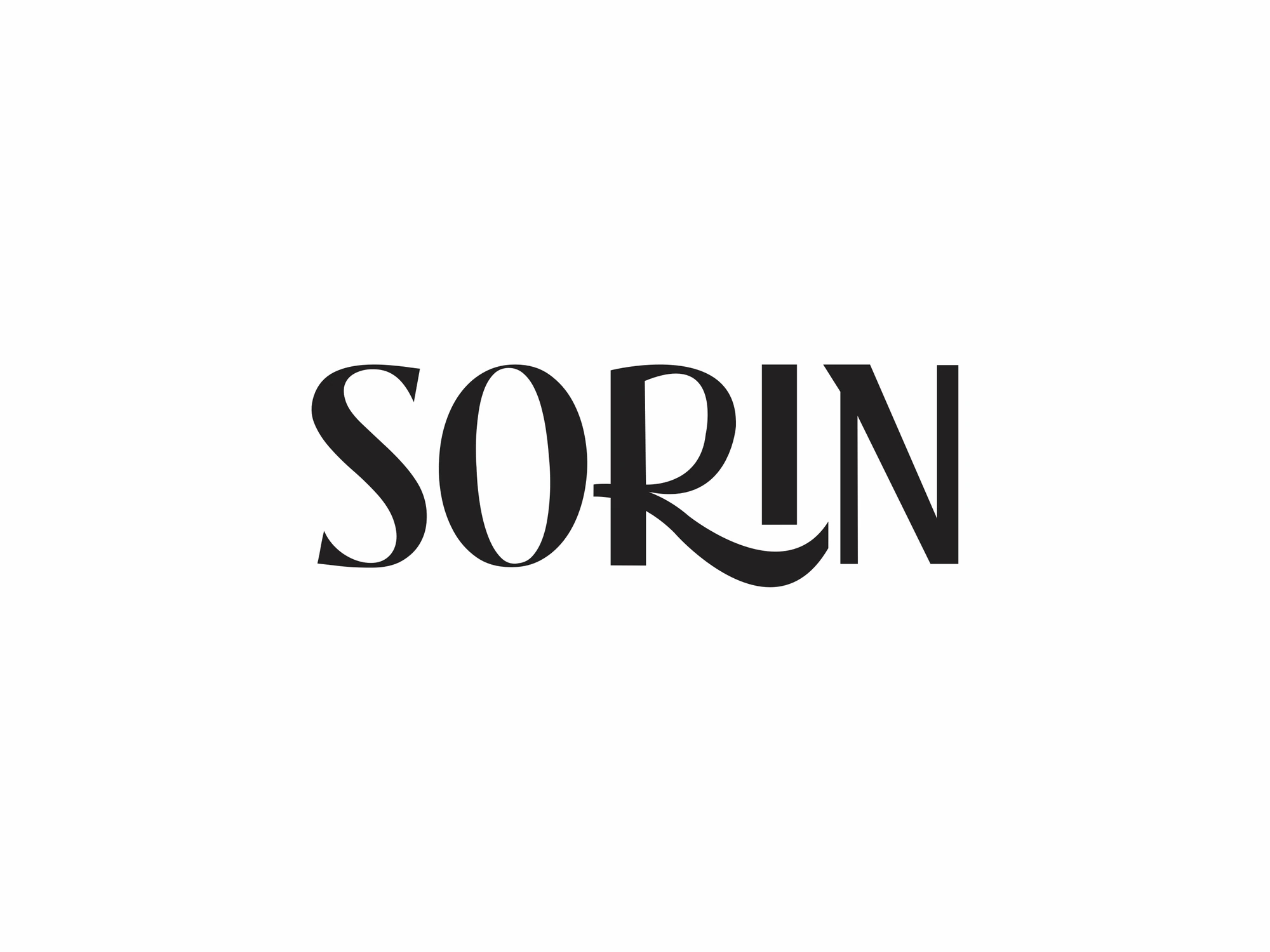
Most café logos try to say everything at once: a cup, a leaf, a croissant, a script that swirls from the first letter to the last. Sorin went the other way. Its identity is five letters and one swash, with a set of drawings that look as if the whole menu was sketched without lifting the pen.
For Sorin, a café in Rai Durg, Jubilee Hills, Hyderabad, with tall glass walls, a black-and-white floor and a menu from coffee and bread to dessert, we designed the brand identity: the wordmark, the illustrations, the stickers, the bread wrap, the butter paper and the takeaway cups.
Five letters, one swash
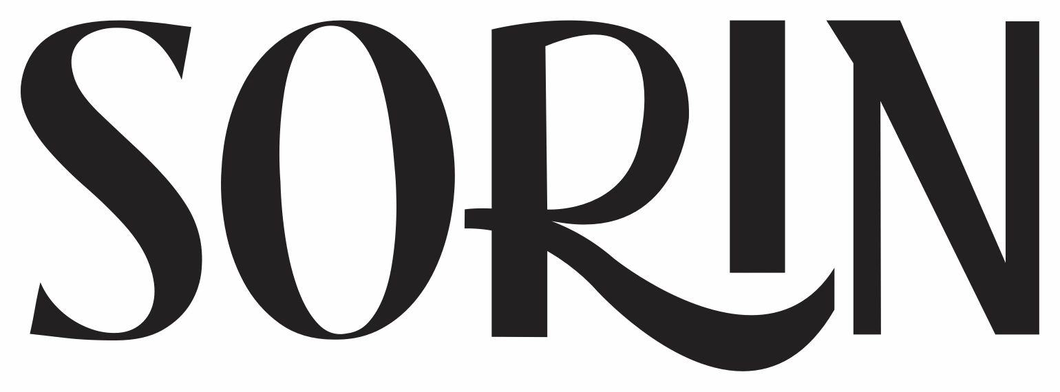
The wordmark keeps almost everything still. The S and the O are drawn in high contrast, thick and thin. The I and the N are cut square. Then the R breaks the rule with what we call the Sorin Swash: its leg runs long, sweeps under the I and lifts toward the N, and a short crossbar steps out of its stem.
One gesture is easier to remember than five. A logo with a single moment of movement gives people something to recognise from across a street, on a sign or on a cup, without asking them to read every letter.
The best café logos are quiet enough to sit on everything, with one detail people remember.
The menu, drawn in one line
Next came the drawings: a cup of coffee, a cupcake, a loaf, a box of noodles, coffee with bread and a three-tier cake. Most of them are drawn in one unbroken line, at the same fine, even weight. Drawn this way, they belong to each other and to the wordmark, and a new dish can join the set at any time, as long as it is drawn the same way.
A line on every sticker
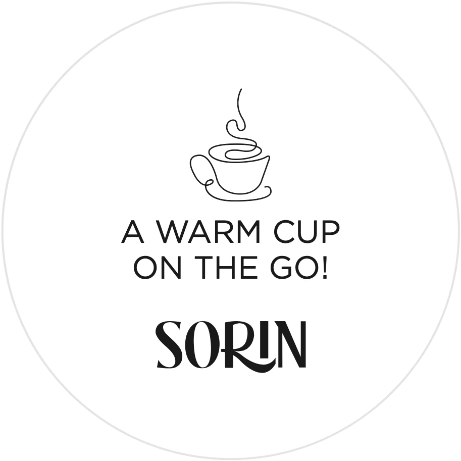
The stickers gave the brand its voice. There are five round ones, three inches across, each pairing a drawing with a short line: a warm cup on the go; life is uncertain, eat dessert first; the answer is bread, always; people who love to eat are the best.
A sticker is the cheapest billboard a café will ever own.
Stickers cost little to print and they travel home with the order. A line worth reading turns packaging into a small conversation.
Bread, cups and paper
The same system carried onto the rest of the takeaway: a bread wrap printed with the loaf drawing, a card that says the answer is always bread, butter paper in hand-drawn wavy lines, and cup sleeves where the line from the sticker sits beside the name and a steaming cup.
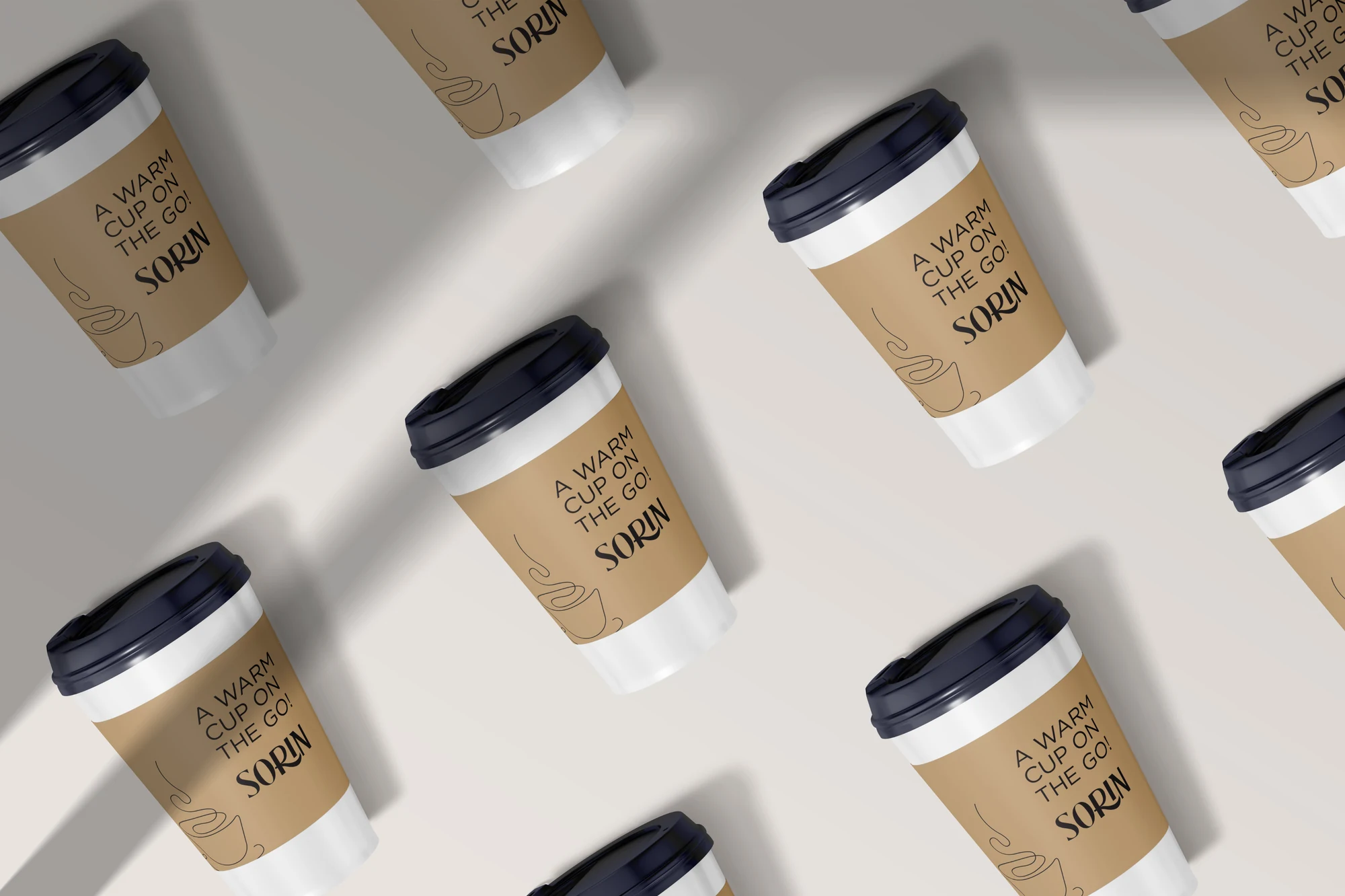
None of these pieces needed a new idea. Each one used the wordmark, a drawing and a line, in black on a natural ground.
At the gate
At the gate, the wordmark went up in wood, and at dusk it glowed. A logo that holds up as a cut-out sign, lit from behind, is a logo that was drawn simply enough. The identity drew a lot of appreciation.
What café founders can take from this
Give the logo one gesture. Calm letters and one memorable detail beat a logo that decorates every letter.
Draw the menu in one hand. A consistent illustration style makes a growing menu look like one place.
Write lines for the packaging. Stickers and sleeves are read at home, when the brand finally has a customer's full attention.
Design for the sign. If the mark works in wood and light, it will work anywhere.
See the full identity on the Sorin project page, or read our café branding checklist before your own launch.