












Insights / Saree brand identity in Hyderabad
Saree brand identity: how Nitin Mor signs a label that began in 1984
A label with forty years of trust does not need to shout heritage. It needs a date, a signature and some restraint.

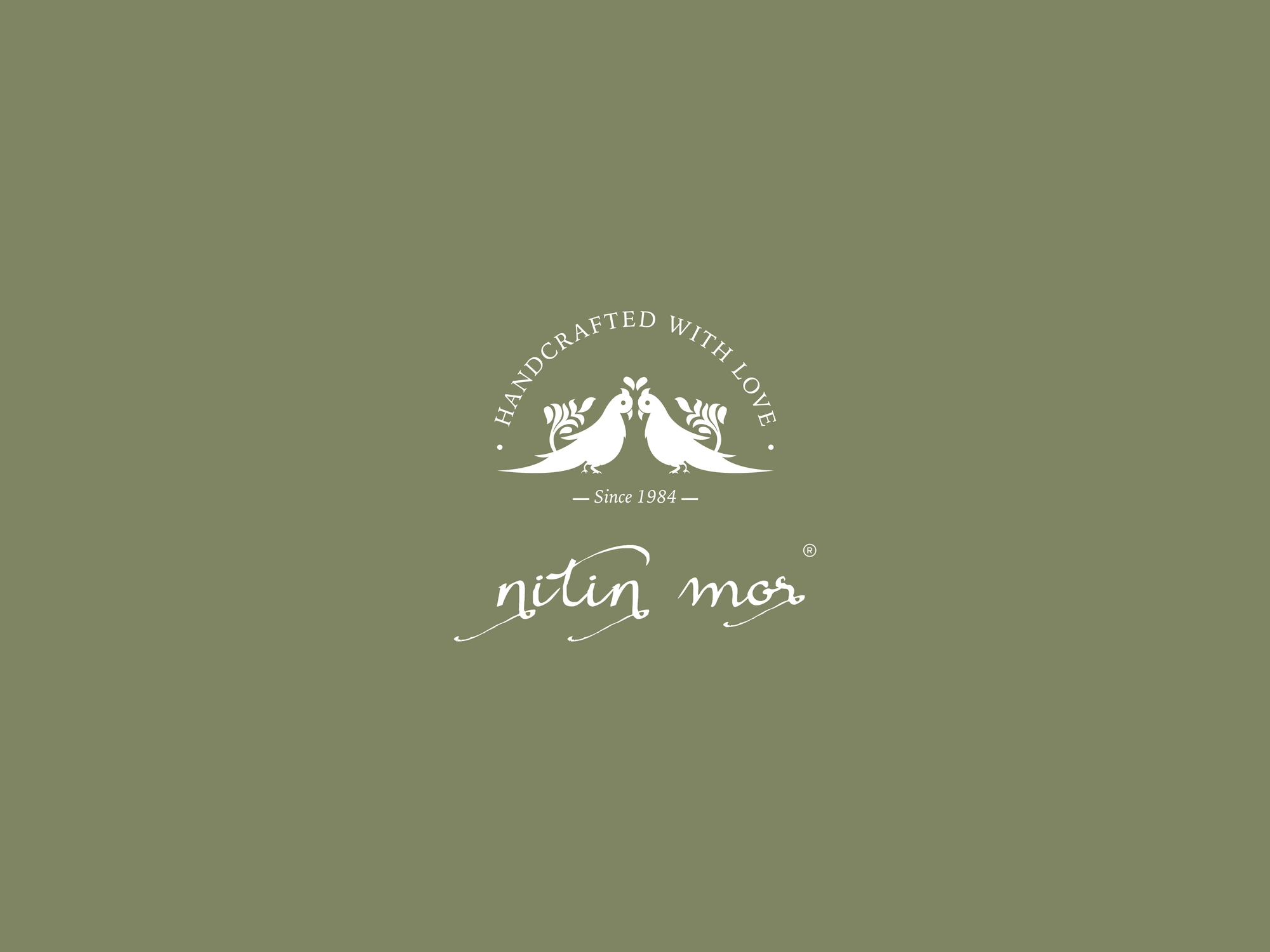
Some brands have to earn trust from scratch. A saree house that has been working since 1984 has a different problem: it already has the trust, and the identity has to carry it without making the label look old.
That was the brief, in spirit, for Nitin Mor, a saree and embroidery label in Banjara Hills, Hyderabad.
Start with what the customer already believes
Anyone buying an embroidered saree is buying hours of hand work. They want to feel that the hands were careful. So the first question was not what the logo should look like. It was what the label should promise. The answer was already in the business: handcrafted, and for a long time.
Those two facts became the emblem. A pair of parrots faces each other under an arc that reads Handcrafted with Love, with Since 1984 set beneath them. It reads like a seal on a letter: the date doing the work that a long sentence about heritage never could.
A heritage label does not need to say heritage. It needs to show a date and let the customer do the rest.
A name that is signed, not typed
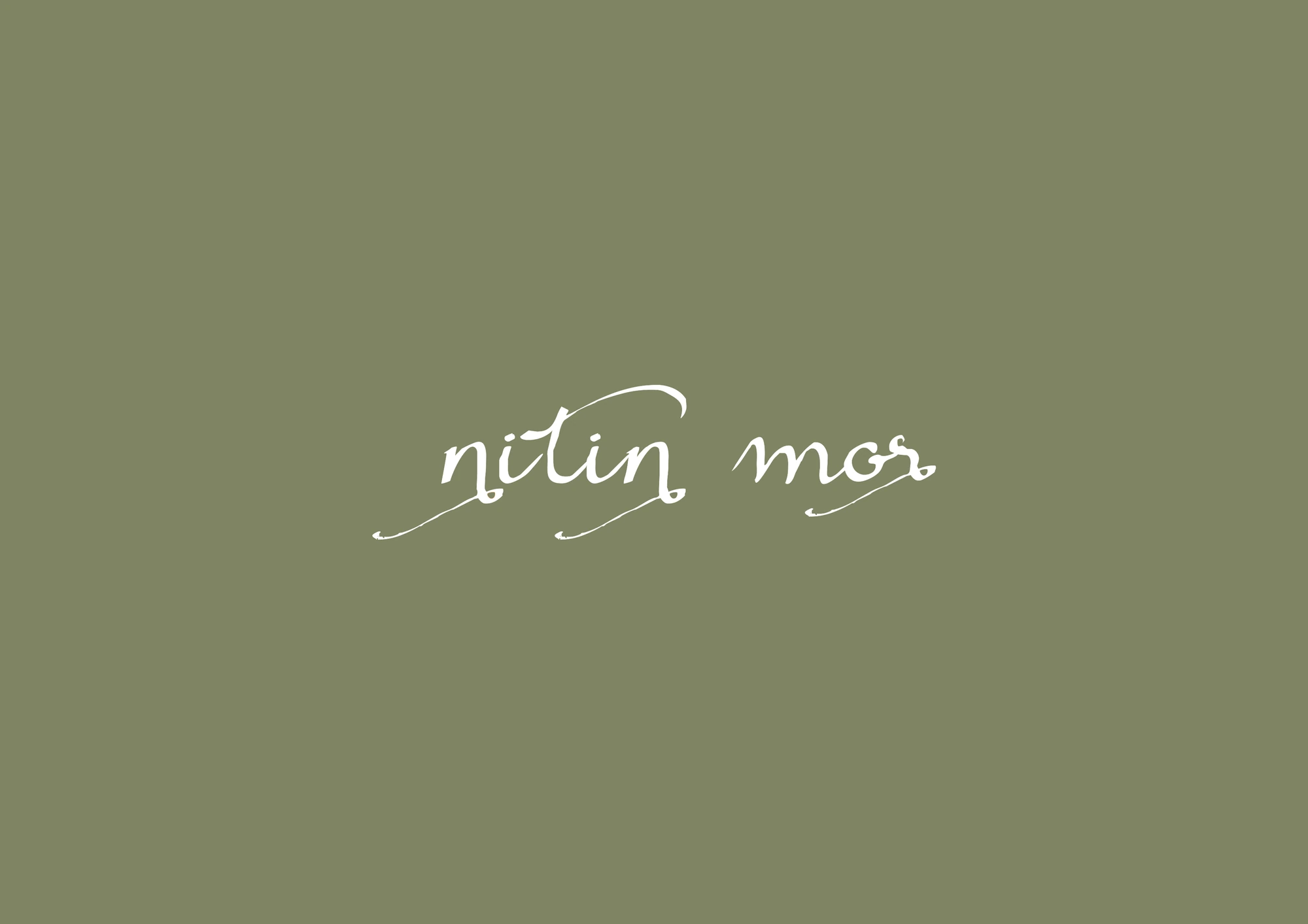
For the wordmark, a clean typeface would have looked modern and anonymous. The name Nitin Mor is set as a calligraphic signature instead, with long, inked tails underneath. It feels written by a person, which is exactly what a handcrafted label should feel like.
The signature works alone on small things and with the emblem on large ones. That gave us two lockups that cover almost every surface the brand will ever need.
A heritage label should be signed, not typed.
One colour, used with discipline
Saree labels often reach for gold, maroon and every jewel tone at once. We chose a single sage green and white. Green sits quietly next to almost any fabric colour, so it never competes with the sarees themselves. The product is the colour. The brand is the frame.
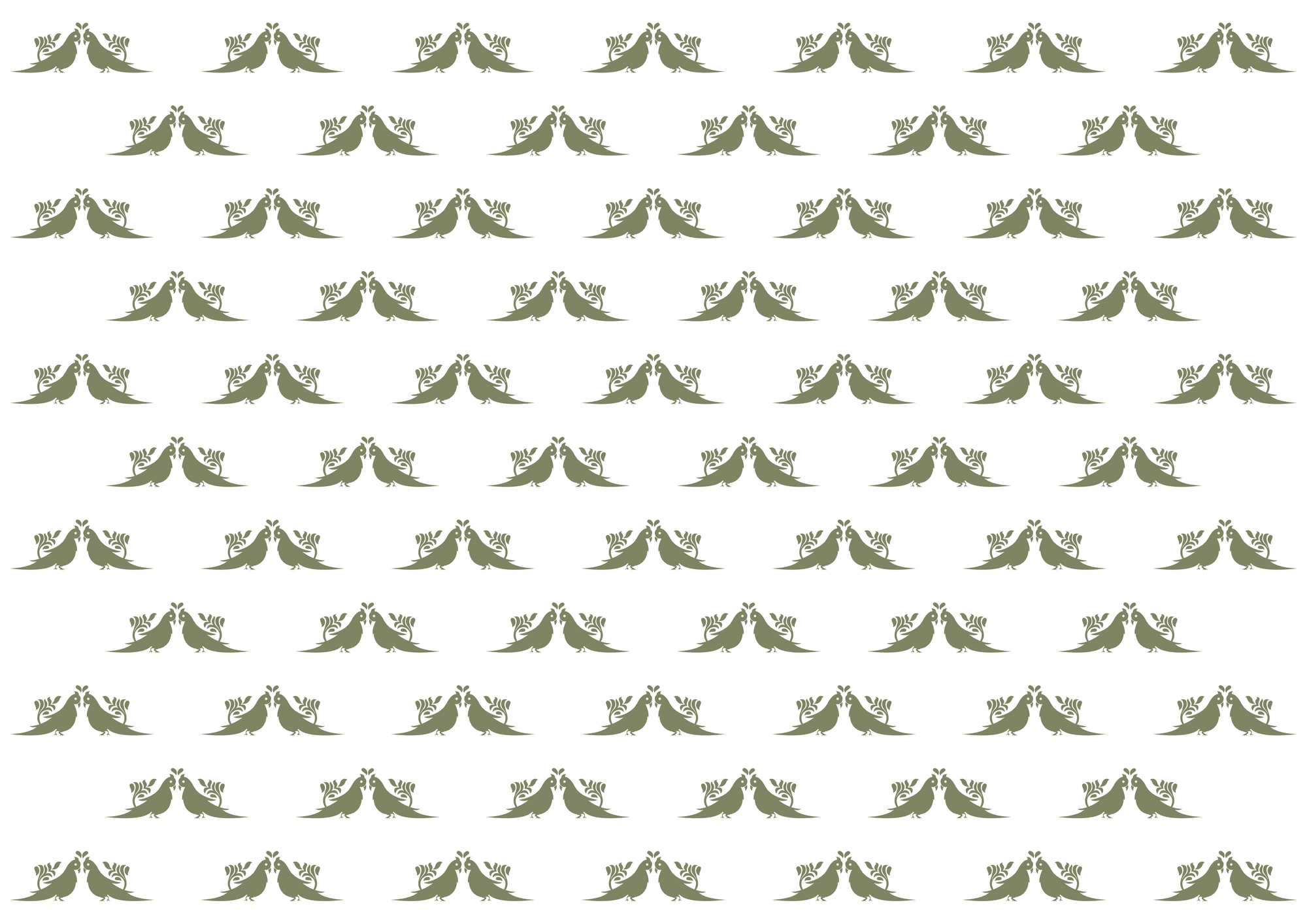
The parrots also became a repeat pattern, row on row, each line offset from the last the way a block print repeats. It gives the brand a texture without adding a second idea.
The paper is part of the product
For a label like this, much of the brand is experienced after the purchase. So the stationery got the same care as the logo:
The hang tag carries the emblem, the signature and the Instagram handle, so the saree introduces the brand on its own.
The thank-you card speaks in the brand's italic, thanking the customer for their saree and talking about thread, stitch and pattern rather than discounts.
The business card and letterhead keep to the same green, the same signature and the emblem as a quiet watermark.
None of these pieces is complicated. That is the point. A customer who unwraps a saree, reads the card and keeps the tag should feel one consistent hand behind everything.
What founders of craft labels can take from this
Lead with your strongest fact. For Nitin Mor it was a date and a promise. Yours might be a place, a technique or a family name.
Make the wordmark feel like the work. If your product is made by hand, a mark that looks hand-made earns trust faster than a clever font.
Pick one colour and protect it. Restraint makes a label recognisable and keeps the product in front.
Design the after-purchase moment. Tags, cards and paper are where a customer decides whether to come back.
If you run a craft or fashion label in Hyderabad and your brand feels younger or older than your work, that gap is usually the place to start.