


















Insights / Fashion brand identity design
Fashion brand identity: how Do Taar turned two threads of chikankari into a brand
Chikankari is art meant to be worn. The identity had to feel just as delicate, and just as permanent.

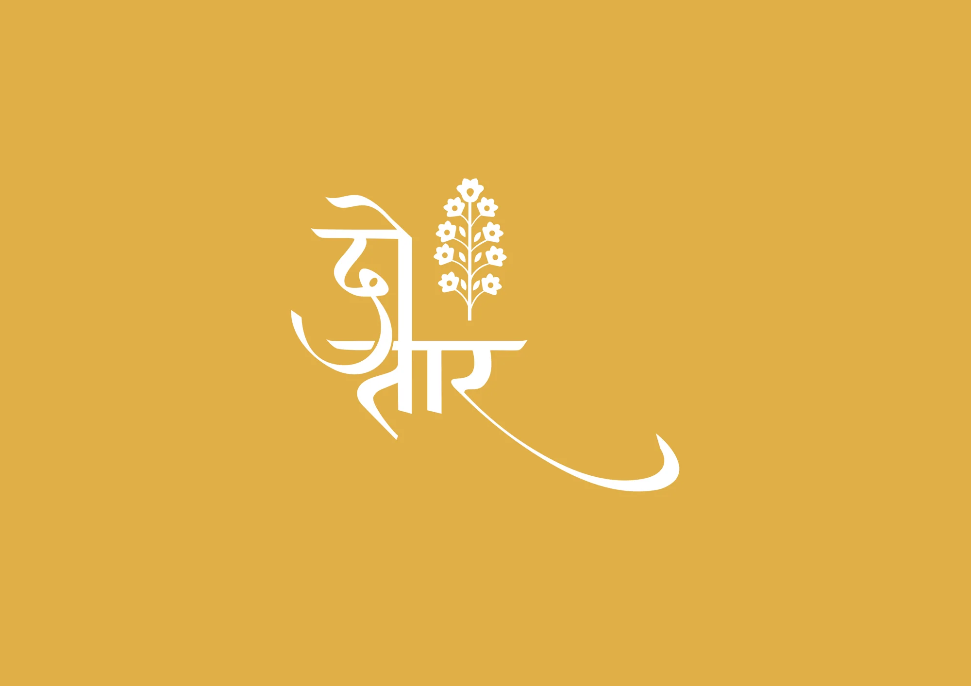
Few crafts capture an Indian summer quite like chikankari. It is light, intricate and quietly luxurious, a craft so detailed it feels like art meant to be worn. Do Taar brings together a thoughtful curation of this workmanship, and the identity had to carry the same spirit: elegant, poetic and unmistakably handmade.
A name that is also a technique
Do Taar, pronounced /doh-taar/, means two threads. In chikankari it describes a specific technique, where two threads are used simultaneously to create slightly bolder, more defined patterns. It is a style that needs a balanced hand, so the double-thread work never becomes heavy or loses its elegance.
That definition became the brief. The brand needed two things at once: the confidence of a bold mark and the restraint of fine needlework.
A fashion identity rooted in craft should feel like the craft itself: considered, balanced and never overworked.
A wordmark written in Devanagari
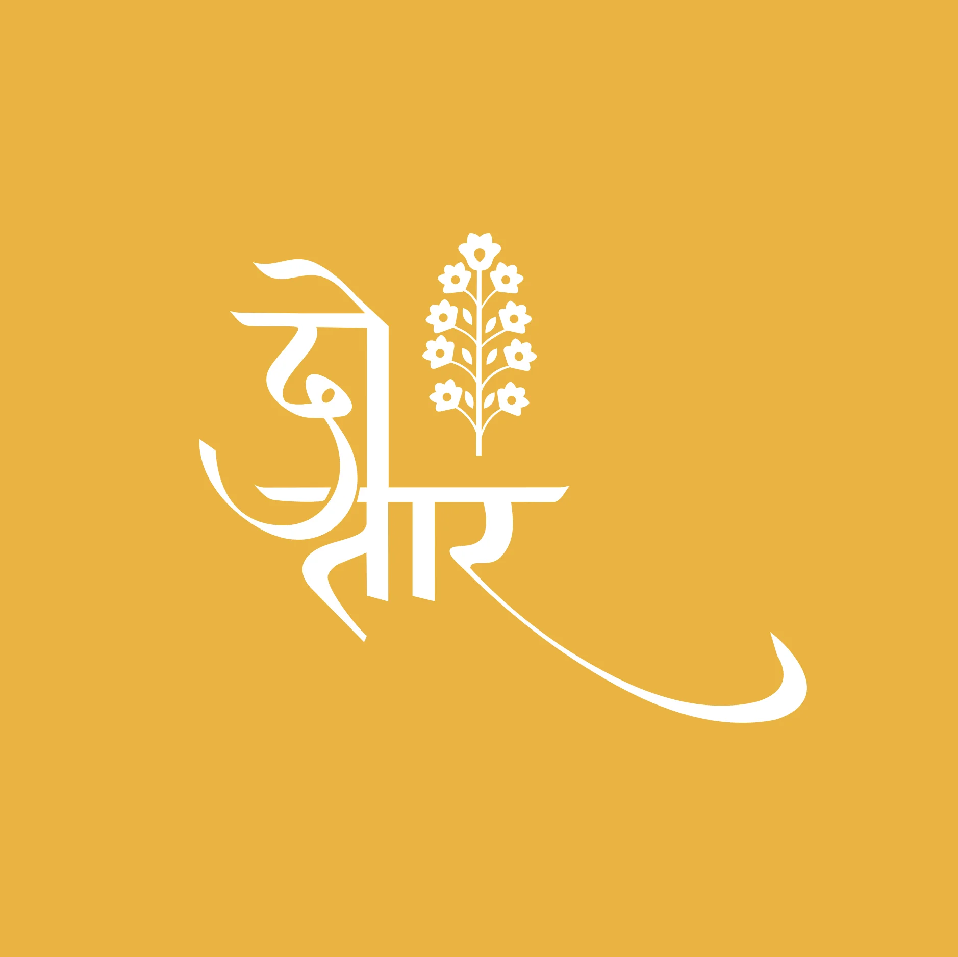
Rather than translating the name into a Latin wordmark, we drew it in Devanagari: दो तार. The letterforms flow into a long, sweeping tail, like a thread pulled through fabric. Beside it rises a single booti, lifted from the artisans' own sketchbooks,, .
The result reads as a signature as much as a logo. It feels written by hand, which is exactly what the garments are.
The technique became the visual language.
Summer hues and a pattern that repeats like embroidery
The palette draws on soft summer hues, led by one marigold yellow that owns every box, stamp and tag it touches, that feels both traditional and contemporary. The buti motif repeats into a pattern system that echoes the rhythm of embroidered fabric, ready for packaging, tags, tissue and social content.
Permanence beyond seasons
Fashion brands often chase the season. Chikankari doesn't. Each piece is made to be cherished and owned for years, so the identity avoids anything trend-driven. The mark, the motif and the palette are built to look as right in ten summers as they do in this one.
Why craft-led fashion brands need strong identities
India's fashion market is full of beautiful products sold through Instagram and WhatsApp, and many of them look alike. For a craft label, the identity is what tells a customer this is curated, not mass-produced. A distinctive wordmark, a single ownable motif and a disciplined palette let a small label look as considered as the work it sells, on a phone screen, a tag or a gift box.
What fashion founders can take from this
Let the name do the storytelling. If your name carries meaning, design around it rather than over it.
Use your craft as your visual language. A motif drawn from the work itself is more ownable than any generic ornament.
Write in your own script. A Devanagari or regional wordmark can be more memorable than a translation.
Design for permanence. Craft lasts; the brand should too.
See the work
The full identity is on the Do Taar project page. For another brand built on calm, precise restraint, read how Linaé looks calm before a patient walks in.