


















Insights / Aesthetic clinic branding in Hyderabad
Clinic branding in Hyderabad: how LINAÉ looks calm before a patient walks in
Two dermatologists, one clinic and a flower that only blooms in pairs: naming, identity, stationery, opening and website.

Healthcare brands have an unusual job. Before anyone reads a word, a patient is already deciding whether they feel safe. A skin clinic has to look clinical enough to trust and gentle enough to relax in, and most get only one of the two.
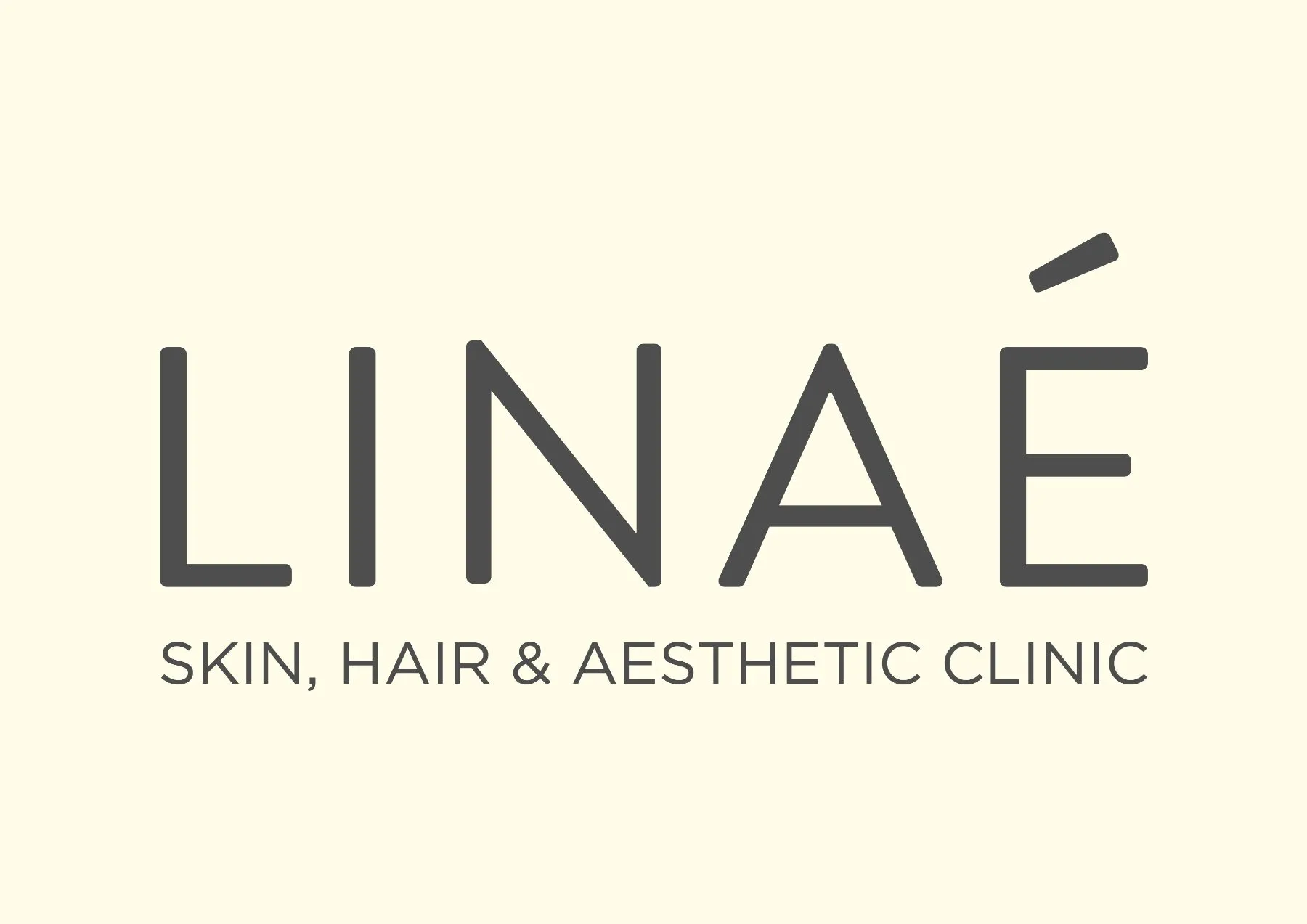
LINAÉ is the skin, hair and aesthetic clinic of two dermatologists, Dr. Shravya Rimmalapudi and Dr. Praneeta Jain, on Road No. 70 in Jubilee Hills, Hyderabad. We named it, designed the identity and built the full ecosystem around it, from the first business card to the live website.
A name that blooms in pairs
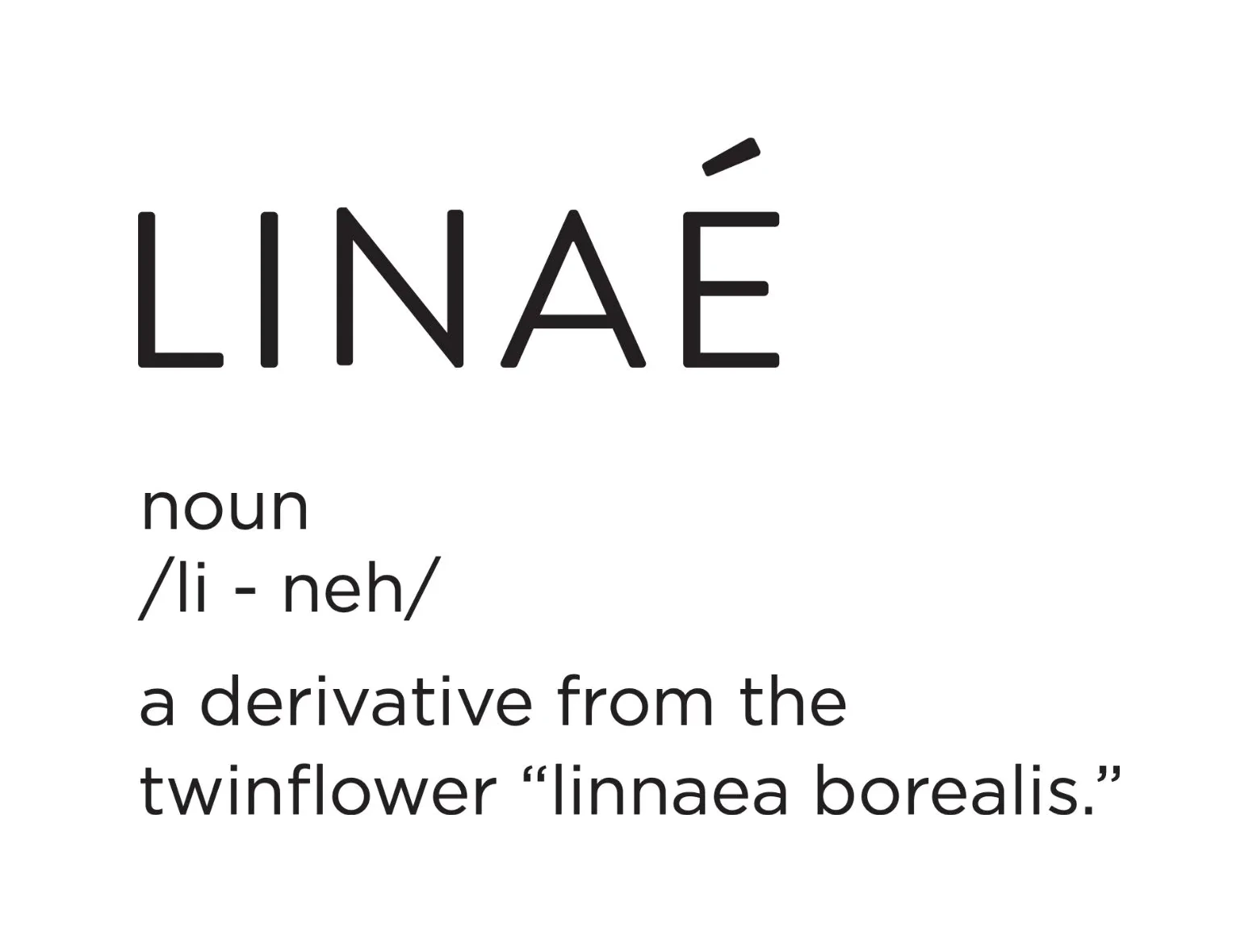
The name comes from Linnaea borealis, the twinflower, whose bell-shaped blossoms always grow in pairs. Two doctors, one clinic: the founding story was already in a flower. We shortened it to LINAÉ and kept the accent, which gives an everyday word the feel of a considered one.
The best names carry the founding story, so nobody has to tell it twice.
Clinical where it must be, gentle everywhere else
The wordmark is set in light, wide capitals with a single lifted accent. The palette is three colours: warm cream, calm grey and sage. Cream for skin and softness, grey for precision, sage for nature and healing. Every piece of the clinic uses the same three, so a patient sees one place, not a collection of printed things.
The twinflower also became a mark of its own: looping petals, drawn as one line. It appears large and pale behind letterheads and brochures, and small as a seal on the back cover.
Clinical where it must be. Gentle everywhere else.
A mood before a message
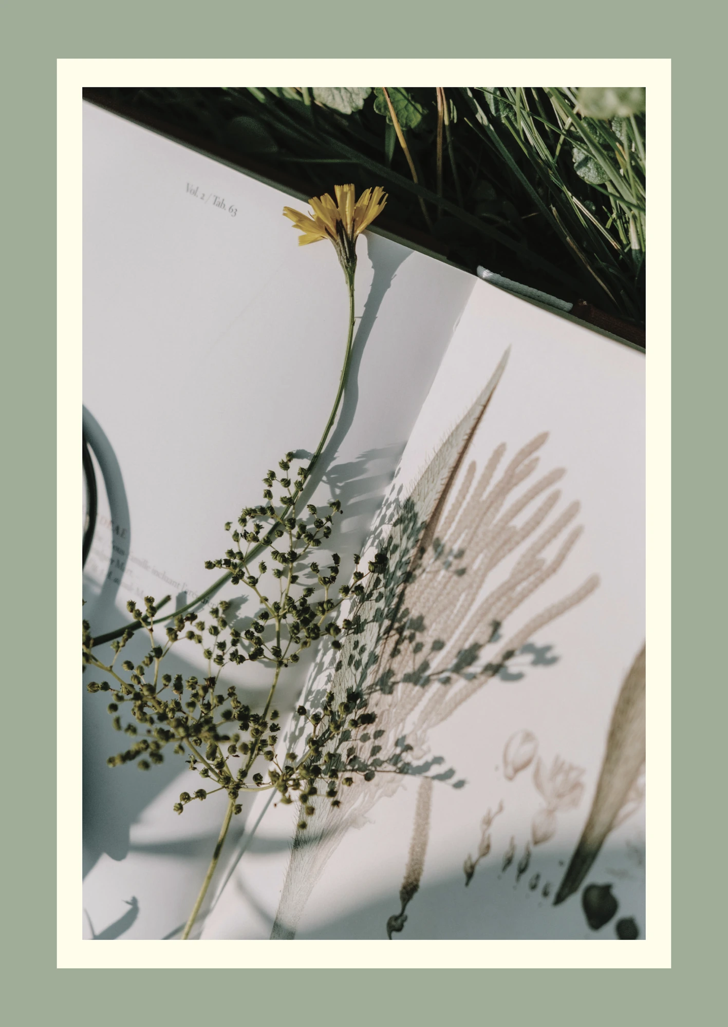
For photography we built a mood board of skin, light and botanicals, each image framed in sage and cream. No before-and-after shock, no clinical glare. The line on the lead poster says it simply: skin health, backed by science.
A clinic's first treatment is how calm it makes you feel at the door.
Every sheet a patient holds
The brochure, Where Science Blooms, lays out the full range of care in plain lists: clinical dermatology, procedures and dermatosurgery. The stationery follows the same rules: cream-on-sage business cards, letterheads with the flower in the faintest grey, an envelope, and a name board carrying both doctors' names and the appointment number.
Even aftercare is designed. The post-procedure card opens with a line that patients remember: because healthy skin is built in the treatment room and maintained at home.
An opening and a website
The clinic opened on 16 November 2025, announced with an invitation carrying a line-drawn twinflower and a personal letter from Dr. Shravya introducing the clinic and its services.
The website, linaeclinic.com, carries the same calm online: Where science blooms & confidence begins. It is doctor-led throughout, explains treatments by concern, and introduces the technology behind them, so informed patients can make better decisions.
What healthcare founders can take from this
Let the founding story name the brand. Two doctors and a flower that blooms in pairs is a story patients repeat.
Choose a palette that lowers the pulse. Colour is the first thing a nervous patient reads.
Design the moments after the appointment. Aftercare cards and letters build more trust than any advertisement.
Keep the website as calm as the clinic. The online visit is now the first visit.
If you are opening a practice, design how it should feel before you design how it should look. The rest follows.