










Insights / Convention centre branding in Hyderabad
Convention centre branding in Hyderabad: why Hy~One started with a water bottle
In hospitality, the smallest objects carry the most weight. A guest may never see your logo on a wall, but they will hold your bottle.

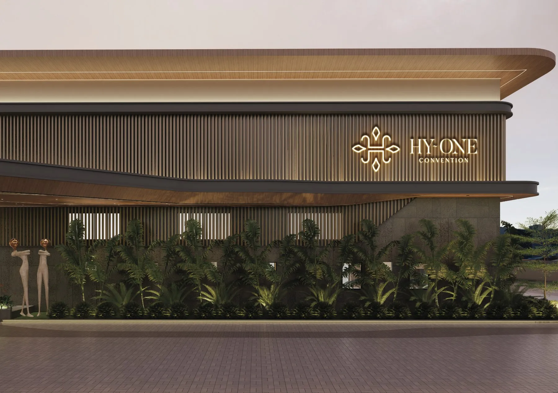
Branding a convention centre in Hyderabad is an unusual challenge. The venue hosts weddings, conferences and celebrations, often in the same week, for very different audiences. Each event arrives with its own décor, its own colours and its own mood. The venue's brand has to be present without competing with any of them.
Hy~One is a premium convention centre off Radial Road 30, near Hyderabad's Financial District, built for weddings that fill a thousand chairs. We named it too: Hy for Hyderabad, One for where it intends to stay. For Hy~One, we found the answer on the table.
The most-handled object in the room
At a wedding reception or an all-day conference, the one branded object almost every guest touches is the water bottle. It sits beside every plate, gets carried around the hall and ends up in photographs. That makes it a better canvas than any lobby sign.
So we treated the bottle label as the flagship application of the identity, not an afterthought printed at the last minute.
Maroon, ivory and an ornament that behaves
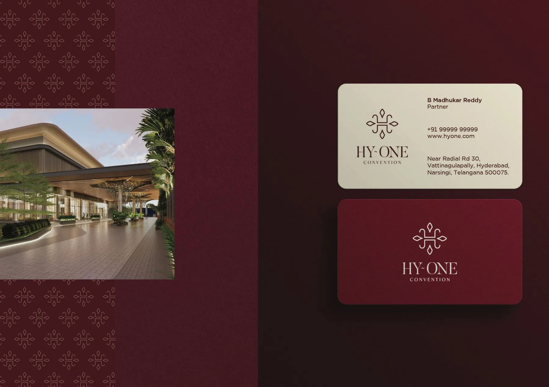
The identity pairs a deep maroon with warm ivory. Maroon brings the ceremony and richness that weddings in Hyderabad call for; ivory keeps it light enough for a corporate day. The two labels are mirror images of each other, so the venue can choose the right tone for the event.
A venue brand should feel like a good host: present, gracious and never louder than the guests.
At the centre is an H drawn like a jharokha ornament, symmetrical and quietly traditional, paired with a refined serif wordmark: Hy~One, and CONVENTION set wide beneath it. The ornament gives the brand a sense of occasion; the typography keeps it contemporary.
Design for the object every guest touches.
Designing for events you'll never see
The hardest part of hospitality branding is that you design for thousands of future events you will never attend. The system has to hold up next to marigolds, LED walls, brand banners from corporate clients and everything in between. Restraint is what makes that possible. A limited palette and a single emblem can sit on a table next to anything.
What hospitality brands can learn
Find your most-handled object. For a venue, it might be the bottle, the table card or the parking ticket. Brand that first.
Offer two moods, one identity. A light and a dark version of the same system lets you serve both celebrations and business.
Let the ornament do one job. Tradition belongs in the emblem. Everything around it can stay clean.
The business case for venue branding
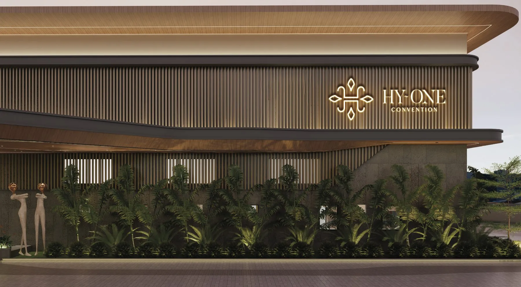
Convention centres in Hyderabad are usually chosen on capacity, location and price, and then remembered, or forgotten, on experience. Guests rarely know the name of the hall where they attended a wedding. A distinctive, consistent brand changes that. When the venue's identity appears quietly on the bottle, the table card and the entrance, guests leave with the name as well as the memory.
That matters commercially. Many venue bookings come from people who attended an event there first. Every branded object on every table is, in effect, a small invitation to the next booking. For a hospitality business, few marketing investments work as hard or as quietly.
Read on
The full identity is on the Hy~One project page. For another story about letting culture lead the design, read how Telugu Medium made its language the logo.