






Insights / Manufacturing and family business rebranding
Rebranding a family business: how KMC reimagined an industrial identity for a new generation
When the next generation takes over, the brand has to move forward without losing what made the business work.

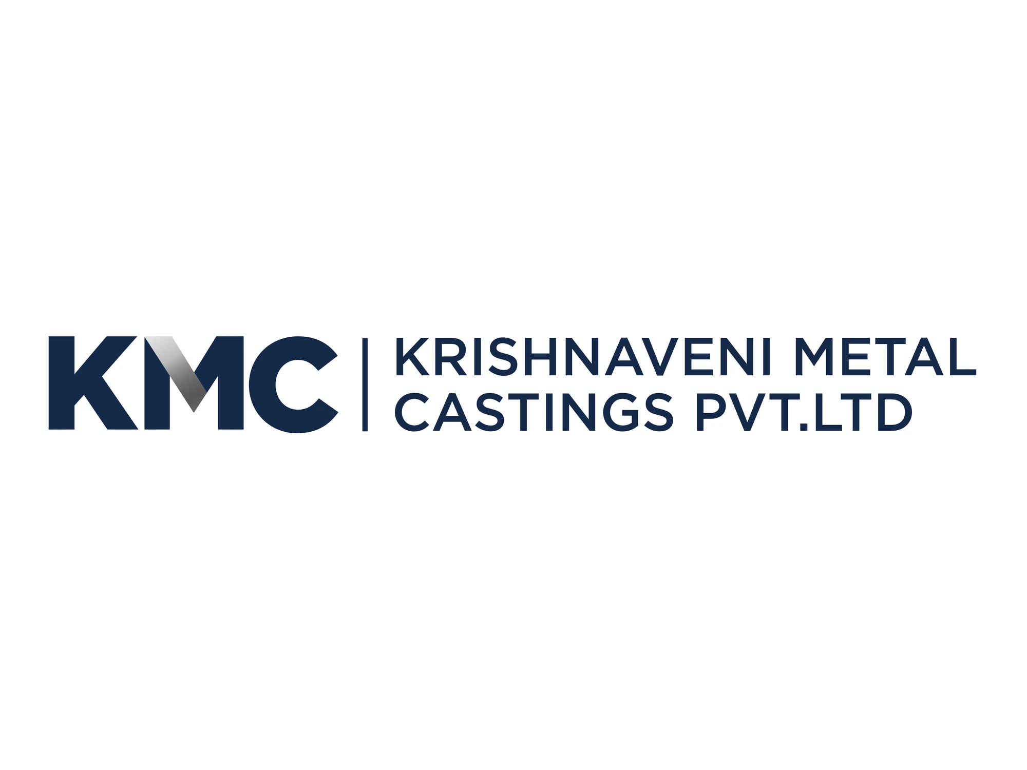
Some of the most interesting branding projects aren't startups at all. They are established family businesses, with decades of reputation behind them, where a new generation is stepping in. The foundation stays rooted in carrying the business forward, but the perspective the next generation brings is always refreshing.
KMC, Krishnaveni Metal Castings Pvt. Ltd., was one such project for us. Founded in Hyderabad in 1997 and run by the Karnati family, it makes aluminium ingots, cubes, shots, notch bar ingots and ferro aluminium. Much of what it produces goes into steel plants, where aluminium is used to remove oxygen from molten steel, and into the alloys automotive manufacturers cast with.
Reimagine, without losing the essence
As a new generation took over, the brief was to reimagine the identity while staying true to the business. That is a delicate balance. Change too little and the rebrand goes unnoticed. Change too much and long-standing customers, suppliers and employees no longer recognise the company they trust.
A family business rebrand isn't about starting again. It's about showing everyone that the business is moving forward, on purpose.
The metal is in the mark
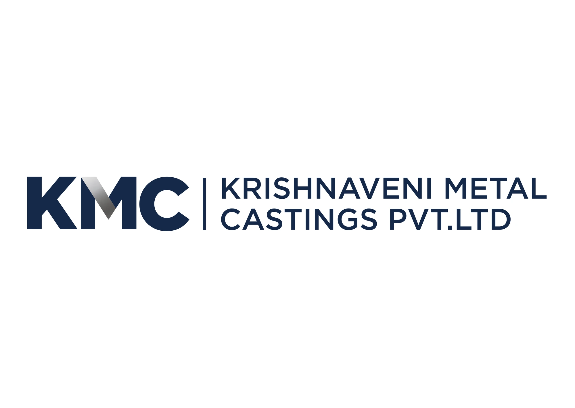
Rather than reaching for industrial clichés, gears, flames or molten metal, we drew from the material itself. The KMC monogram is set in heavy navy capitals, and the first stroke of the M is turned into a strip of brushed aluminium, with the light running down it the way it runs down a polished ingot.
It is the kind of detail people in the industry notice immediately, and everyone else simply reads as quality. The full name sits beside the monogram, divided by a single thin rule, so the company can be KMC in conversation and Krishnaveni Metal Castings on a contract.
Respect the legacy. Evolve the rest.
Navy blue, on purpose
Navy was a deliberate choice. It signals boldness, strength and reliability, the three qualities a manufacturer most needs to show buyers placing large, long-term orders. Paired with the clean wordmark, it makes KMC look like a modern, well-run company rather than a legacy one.
Cards that point forward
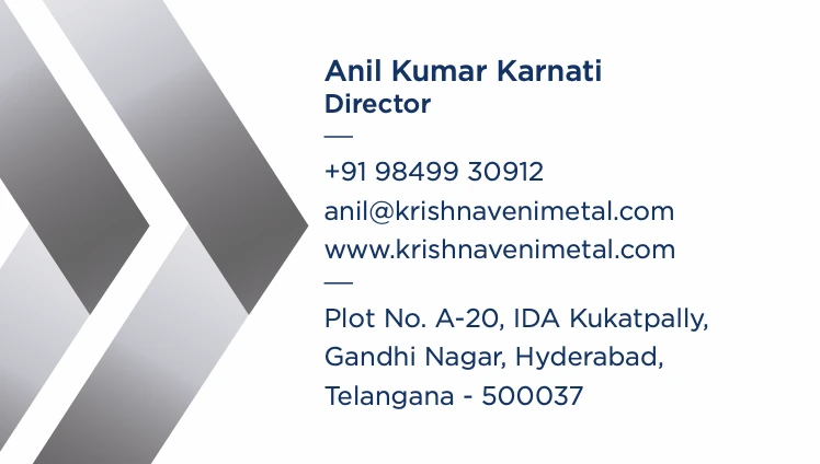
The business card does two jobs. The front carries the lockup and a plain line listing everything the foundry makes, because an industrial buyer's first question is always what you supply. The back gives each director their own card and adds two chevrons in the same brushed metal, pointing forward. It is the generational change, drawn in two shapes.
A letterhead that earns trust
On the letterhead, the lockup sits above the ISO 9001:2015 certification and the company number. The foot carries the address, the product line and the certification marks over a band of navy. Every letter that leaves the office says the same thing before anyone reads it: this company is serious about quality.
Doing less, impactfully
With industry-led identities, doing less but doing it impactfully always proves effective. Industrial buyers are practical people. They want clarity, competence and consistency, not decoration. Two colours, one monogram and one metallic detail, applied the same way everywhere, do exactly that.
What founders can take from this
Draw from what you make. The strongest industrial marks come from the material, not from a stock icon.
Rebrand at the handover. A generational change is already a public moment. Use it.
Say what you supply. For a B2B business, a clear product line is part of the brand.
Let one detail carry the craft. A single metallic stroke says more than a dozen effects.
If you run a family business that is changing hands, start with what has always made it trustworthy, and make that impossible to miss.