

















Insights / Popsicle branding in Hyderabad
Popsicle brand identity in Hyderabad: how House of Pops became fun everywhere it shows up
A name you can say with your mouth full, two pops crossed into a heart, and ten years of keeping it fun.

Some brands are built to be trusted. Others are built to be loved. A popsicle brand has to be both: parents need to trust what is inside, and everyone else needs a reason to pick it up, photograph it and come back.
House of Pops is a popsicle brand that started in Hyderabad and now reaches Vizag and Kurnool. We named it in 2016 and have built it end to end since: the identity, illustration, pop tags, menus, photography direction, campaigns, the Pop Cart and the website.
A name you can say with your mouth full
House of Pops is short, warm and easy to repeat, which matters when your customers are often children and the person ordering is shouting over a crowd. It also leaves room to grow: a house can hold popsicles, shakes and a creamery without changing its name.
Two pops, crossed into a heart
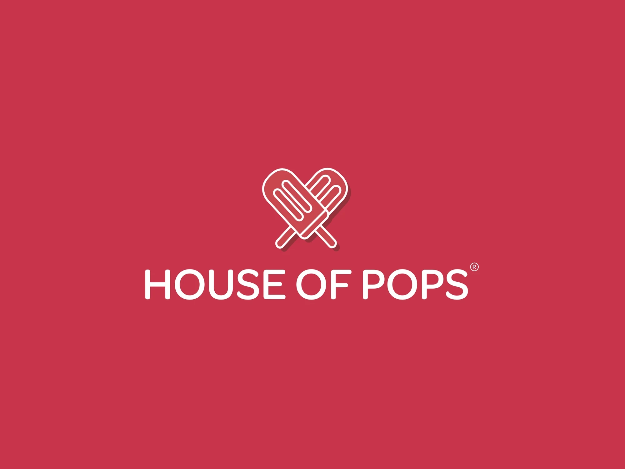
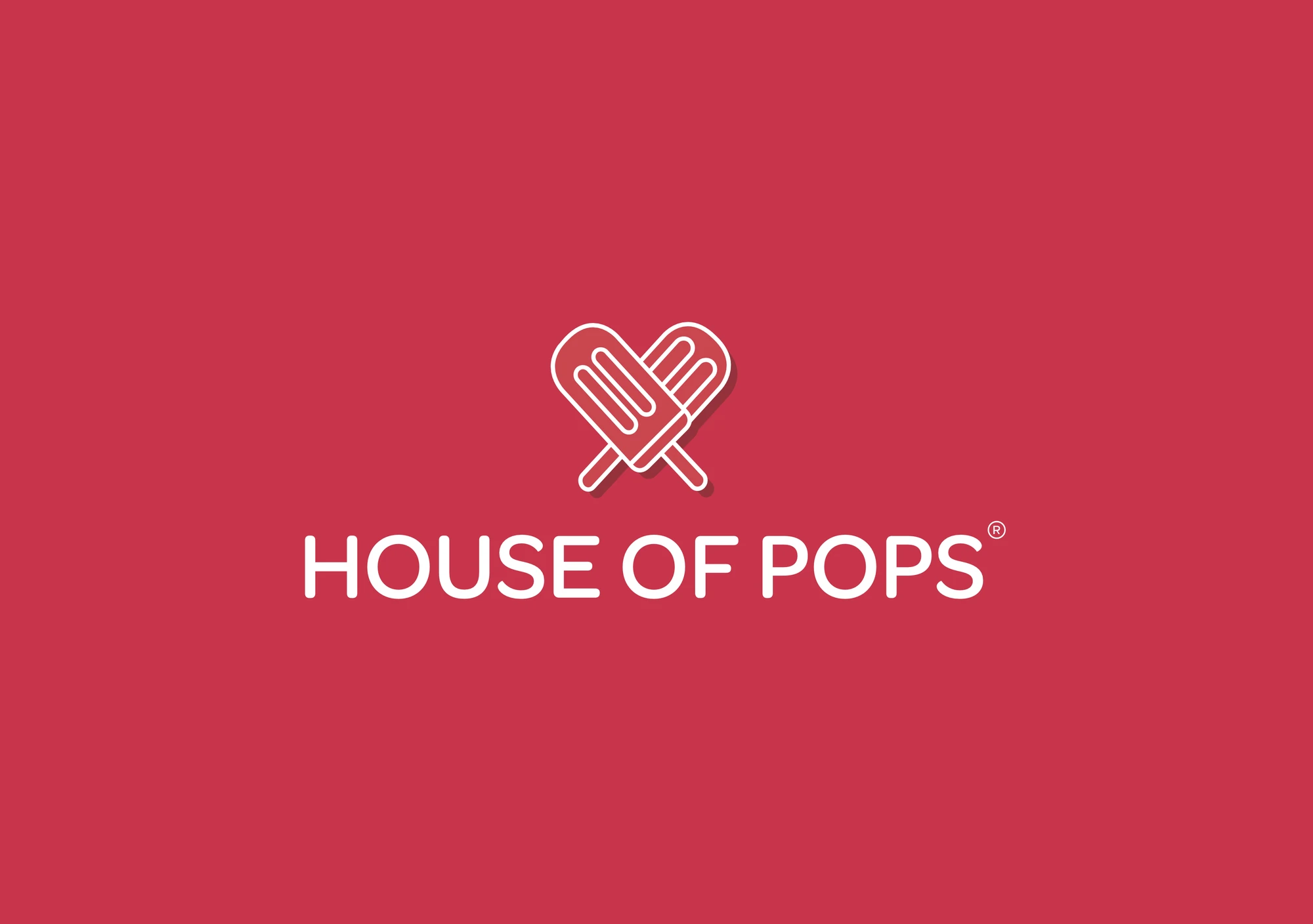
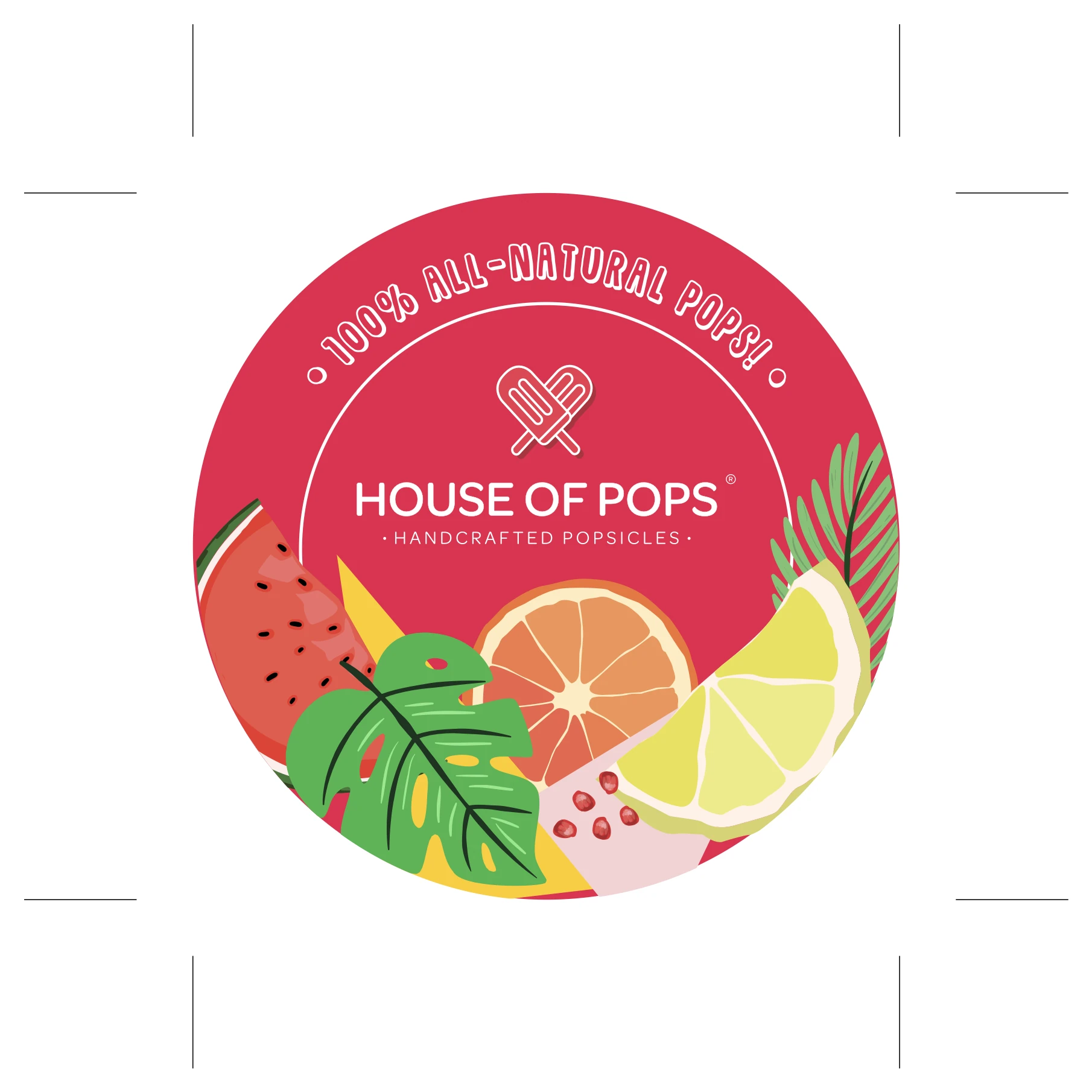
The mark is two popsicles crossed into a heart. It is readable before you can read, which is exactly the point when half your audience is under ten. Beneath it sits the brand's promise, said once and applied everywhere as a seal: no artificial colour, no added preservatives.
A fun brand still needs one serious sentence. Ours is the promise on every seal.
Watercolour fruit and one bright red
We drew the fruit once, in loose watercolour, and used it everywhere: lids, bands, menus, stickers and walls. One bright red ties it together, and the brand speaks in its own hand-lettering.
Every flavour gets its own pop tag, so nobody has to guess what they picked. The menu boards shoot every pop on black, so the colour does the selling.
Photography with one colour world per flavour
We directed the shoots so each flavour lives in its own colour world: Lemint, Mango, Oreo, Strawberry, with the fruit as the set and the name in the brand's lettering. When the range grew into shakes, the Hop In! campaign carried the same voice.
The best ads for a fun brand are the photos customers take themselves.
Out in the world
The brand now lives on a mall wall in Kurnool, on counters, and on the Pop Cart, which rolls into weddings, fests and birthdays with House of Pops in neon. Customers photograph themselves with it, and that is the most valuable advertising the brand has.
Consistency over ten years
The hardest part of a fun brand is keeping it consistent while everything around it changes. Since 2016 the range has grown, the menu has expanded into shakes and a creamery, and the brand has moved into new cities. The heart, the red, the watercolour fruit and the hand-lettering have not changed. That is why a customer in Kurnool and a customer in Hyderabad recognise the same brand at a glance, and why new flavours feel like they have always belonged.
Every new piece starts from the same toolkit, so the team can launch a flavour, a campaign or a cart without starting from scratch.
A website that sells
We designed houseofpopsindia.com end to end: flavour-led storytelling, the full menu, Pop Cart bookings and online ordering with a WhatsApp checkout, fluid on every screen.
What D2C food founders can take from this
Make the mark readable before reading. Your youngest customers recognise shapes, not words.
Put your promise in one sentence and repeat it. Trust is built by saying the same true thing everywhere.
Design for the photograph. If customers want to share it, you have earned free reach.
Plan for the range you will have, not the one you have. A good name and system grow with you.
See the full identity on the House of Pops project page, or read our café branding checklist for food founders.