





Insights / Logo design in Hyderabad
Logo design in Hyderabad: why Half a Bawa went through six routes before one
Clients sometimes ask why a logo takes weeks. The honest answer is that the first good idea is rarely the best one.

If you search for logo design in Hyderabad, you will find plenty of offers promising a logo in forty-eight hours. Some of those logos are perfectly fine. But a logo that has to carry a business for ten years deserves more than a first draft. The real work of logo design is not drawing one idea. It's drawing several, then having the discipline to choose.
Half a Bawa is a good illustration of that process.
A name with a story
Half a Bawa is a hospitality consultancy that builds standout F&B spaces, end to end. The name comes from its founder's half-Parsi heritage. Parsis are fondly called Bawas, and they are famous for loving good food, refined taste and getting things exactly right.
A name like that is an asset, but it also sets a trap: it's tempting to illustrate it literally, with a caricature or a cartoon, which usually produces a logo that is clever once and tiring forever. We wanted the joke to live in the type, not in a drawing.
Six routes, on purpose
Rather than presenting a single concept, we developed six distinct logo routes. Each one explored a different idea of what the brand could be: some leaned into the name's humour, some were purely typographic, and others built a symbol that could stand alone on packaging or signage.
Six routes aren't indecision. They're how you find out which idea is actually strong, and which one only looked strong on its own.
Placing them side by side changes the conversation. Instead of asking "do we like this?", the question becomes "which of these will still feel right in five years?" That is a much better question for any founder to answer.
The first good idea is rarely the best one.
From mark to business card
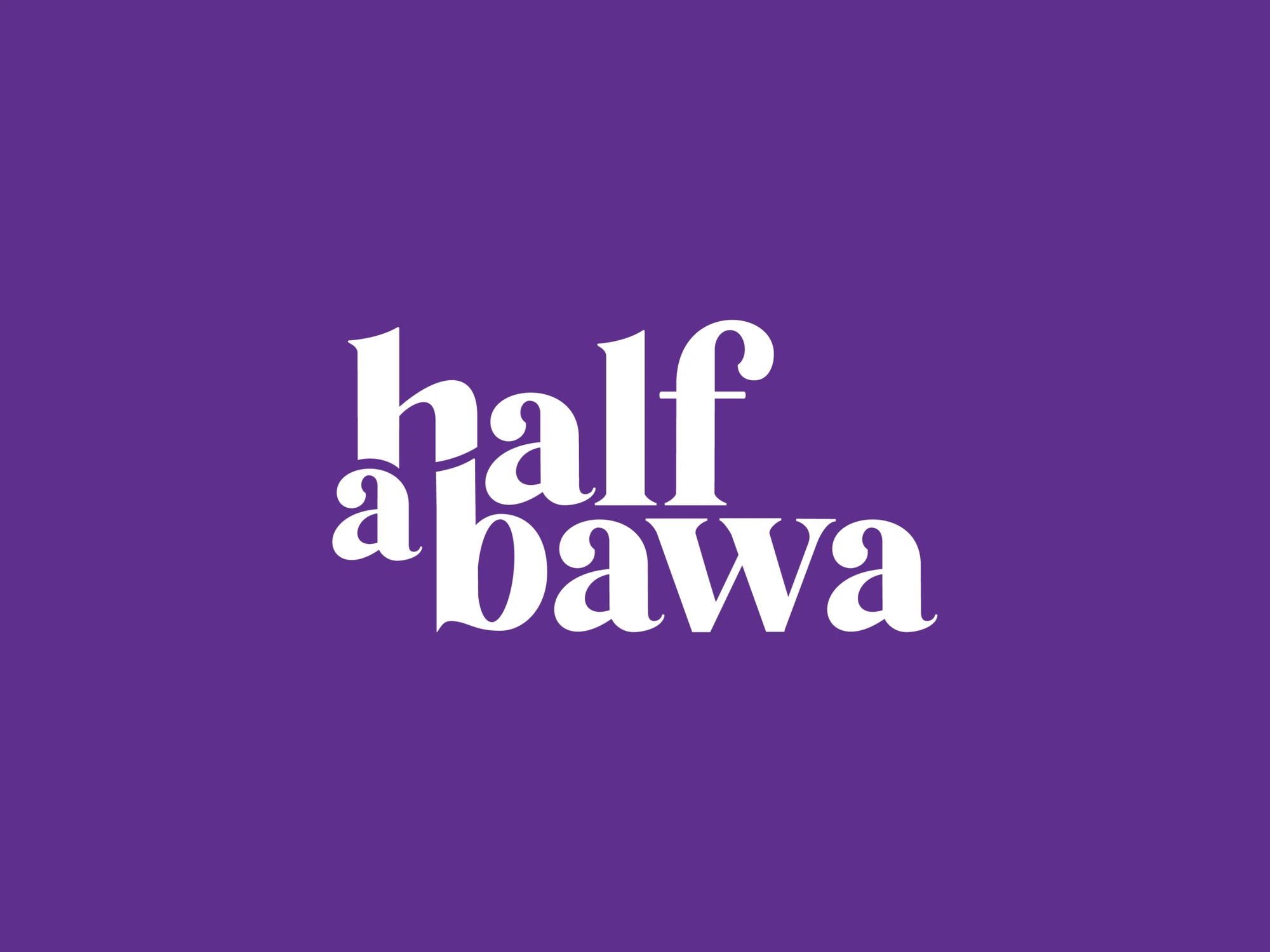
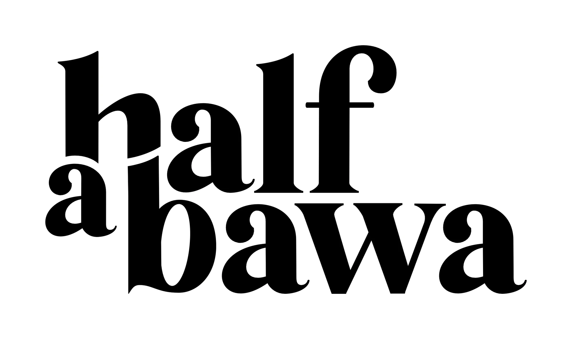
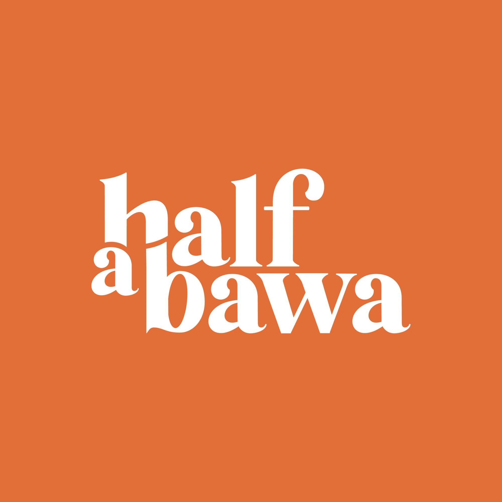
Once a route was chosen, we refined it into the final wordmark: a stacked serif where the little a sits at half height, tucked between the words. Then we gave it four colour moods, purple, mustard, orange and sky, and built the first real application: business cards for the founder and the managing partner. Business cards are a small but brutal test. If a logo can't hold its own at five centimetres wide, next to a phone number and an email, it isn't finished.
What founders should expect from a logo process
More than one idea. A good studio shows you real alternatives, not three colour variations of the same sketch.
A reason for every route. Each option should represent a different strategic direction, not just a different drawing.
A small-size test. Ask to see your logo on a card, a favicon and a sticker before you approve it.
Time. A few weeks for a logo that lasts a decade is a very good trade.
Logo, identity and brand: what's the difference?
Founders often use these words interchangeably, but they describe different things. A logo is the mark itself. An identity is the system around it: colours, typography, layouts and rules for using them. A brand is what people feel and say about you, shaped by everything you do.
A logo is where the brand becomes visible, but it can't carry the whole load on its own. That's why the Half a Bawa process didn't stop at the mark; it moved straight into a real application, the business card, where the logo meets typography, colour and information for the first time.
If you are commissioning logo design in Hyderabad, ask whether you are buying a mark or the beginnings of a system. The second is almost always the better investment.
See the work
The final identity is on the Half a Bawa project page. For a brand where a single character became the whole logo, read how Telugu Medium made its language the logo.