













Insights / Preschool branding in Hyderabad
Preschool branding in Hyderabad: turning Five Little Tales into a story children walk into
For an early learning centre, the brand has two audiences. Parents need to trust it. Children need to love it.

Preschool branding in Hyderabad is crowded with the same visual shortcuts: primary-colour rainbows, crayon fonts and clip-art children holding hands. It is easy to understand why. Early learning should feel joyful. But when every centre looks this way, parents are left comparing fees and distances, and the brand does nothing to help.
Five Little Tales needed to feel joyful and considered at the same time.
Two audiences, one identity
An early learning centre speaks to two very different people. Parents are anxious decision-makers, reading every detail for signs of care and competence. Children, meanwhile, respond to colour, character and play. The brand's job is to satisfy the adult's head and the child's heart at once.
We named the centre too: like the first line of a bedtime story. Five fingers, five senses, five little years before big school. Five Little Tales suggests stories, curiosity and a small, intimate scale. We built the identity to feel like the opening page of a picture book.
Lettering with a hand in it
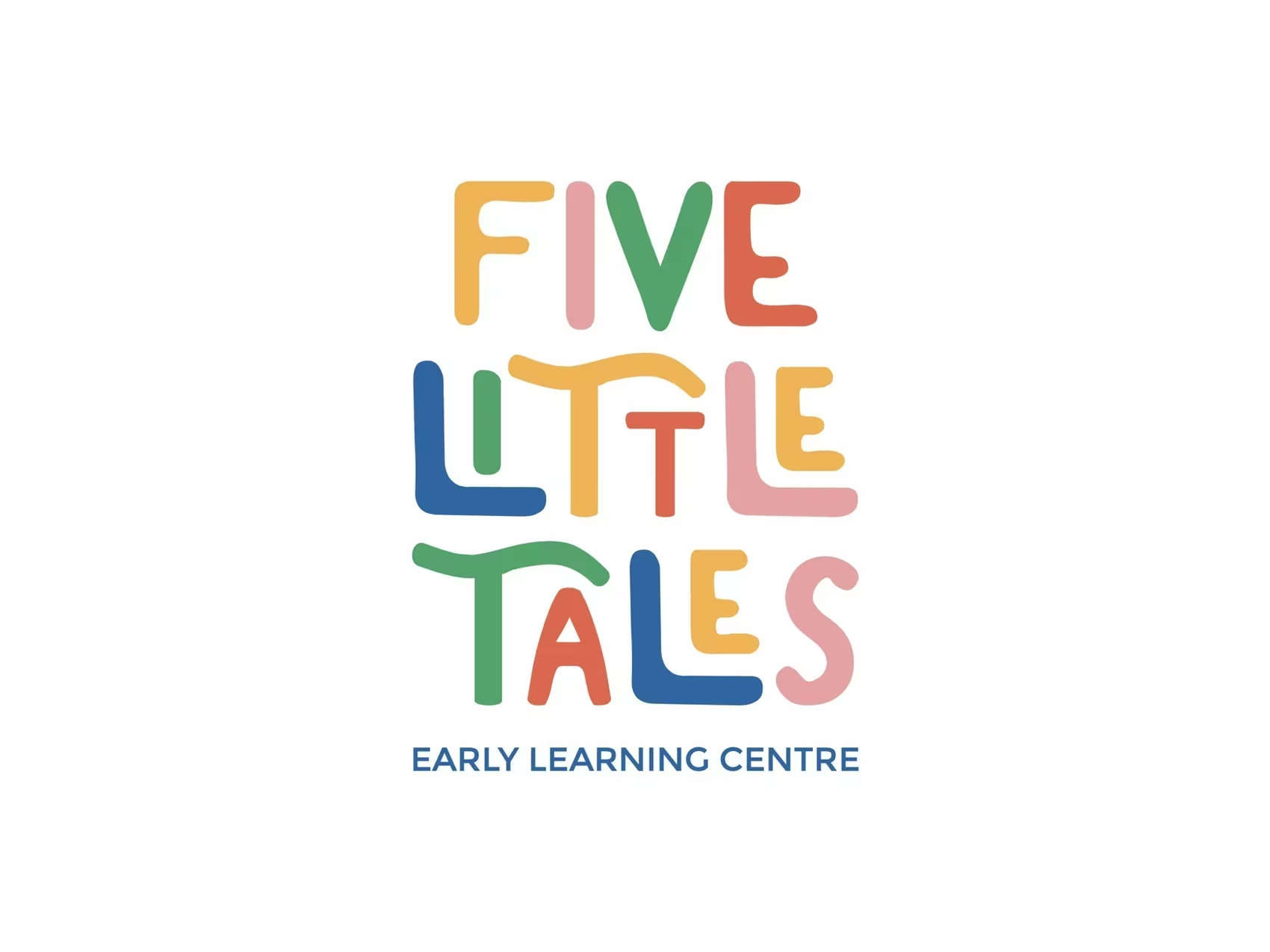
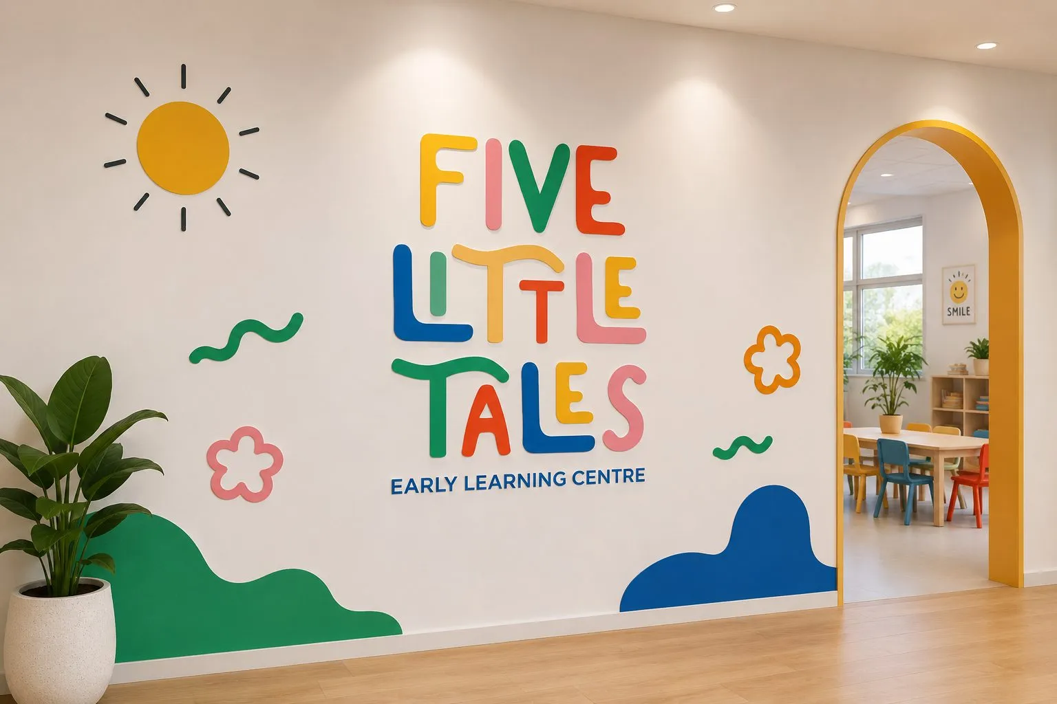
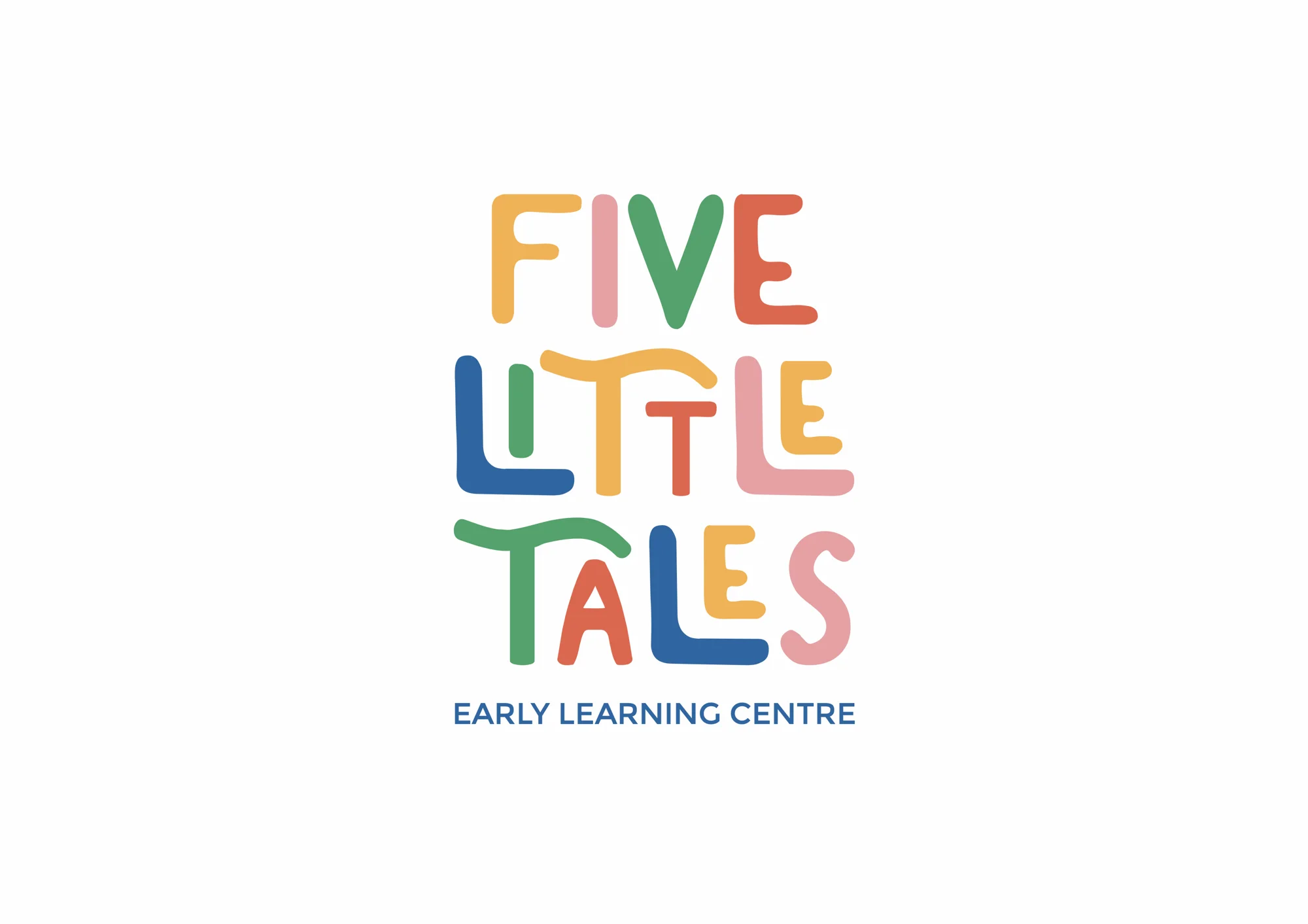
The logo is hand-drawn lettering stacked into a playful block, each letter in its own colour: coral, teal, yellow and blue. The letters wobble slightly, as if drawn by someone who cares more about joy than perfection, but the overall block is carefully balanced, which keeps it legible and grown-up enough for a parent's WhatsApp forward.
A good children's brand looks like a child could have drawn it, and like an adult definitely didn't rush it.
Warm enough for a four-year-old. Credible enough for the parent.
The brand as a place
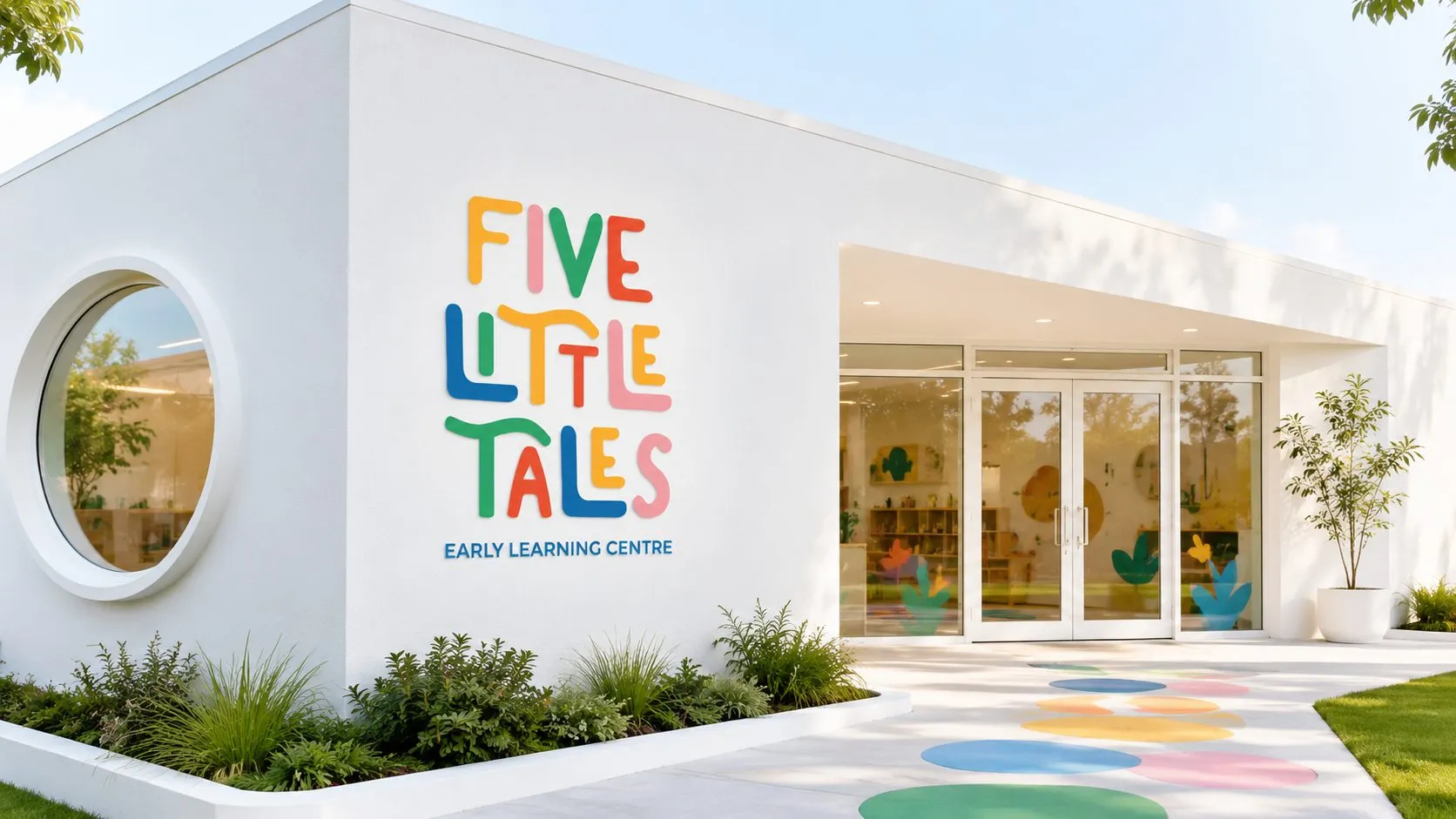
The identity really comes alive on the walls. We extended the logo into environmental graphics: a sun, flowers, rolling waves of colour and an archway framed in yellow. These aren't decorations added later. They are the brand, scaled up into a space that children physically move through.
For parents on a first visit, those walls do more selling than any brochure. They show, without words, that someone thought carefully about how a four-year-old experiences a room.
What school and preschool founders can learn
Design for both audiences. Playfulness for children, balance and clarity for parents. Test the identity with both.
Let the building carry the brand. Environmental graphics are often the first and most lasting impression of a school.
Avoid the clip-art shortcut. A distinctive, ownable style is worth more than a generic "kids" look.
How parents actually choose
Most parents shortlist preschools through word of mouth, then visit two or three before deciding. The visit is the moment of truth. Parents notice everything: how clean the rooms are, how staff speak to children, and whether the space feels designed for small people.
A strong environmental brand makes that visit memorable for the right reasons. It gives parents something to describe to their partner that evening, and something to photograph and share with friends. In a city with as many options as Hyderabad, being the preschool parents talk about after the tour is a real advantage.
The same identity then carries through admissions forms, newsletters, uniforms and social media, so the feeling of the building follows the family home.
See more
The full identity is on the Five Little Tales project page. For a brand built to last for decades rather than for childhood, read how Iconica Capitol earned the presence of an heirloom.