




























Insights / Café branding and social media design in Hyderabad
Café branding and social media: how Autumn Leaf stayed consistent for a whole year
A neighbourhood café lives or dies on its feed. The trick is making every post look like it came from the same place.

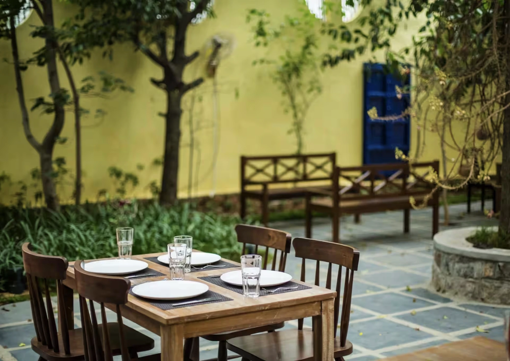
For a neighbourhood café, the Instagram grid has quietly become the shopfront. People discover you there, decide whether you're worth the drive there, and come back to it when they're hungry. That makes café branding less about one perfect logo and more about a system that keeps looking right on day three hundred.
Autumn Leaf is a good example of that thinking in practice.
The problem with festival calendars
Every food brand in India faces the same calendar: Sankranthi, Republic Day, Holi, Ugadi, Women's Day, Mother's Day, Thanksgiving, Christmas, New Year. Each one invites a greeting post. Most cafés handle these one at a time, usually in a rush, often with a stock template.
The result is a feed that looks like thirty different businesses. A café's personality gets diluted a little with every off-brand greeting.
For Autumn Leaf, we designed the festival posts as a series from the start. Each one shares the same layout logic, type pairing and colour behaviour, so a Holi post and a Christmas post feel like siblings. The occasion changes; the voice doesn't.
A brand calendar is a design problem, not a scheduling problem. Solve it once and every festival looks like you.
Menus as content, not just information
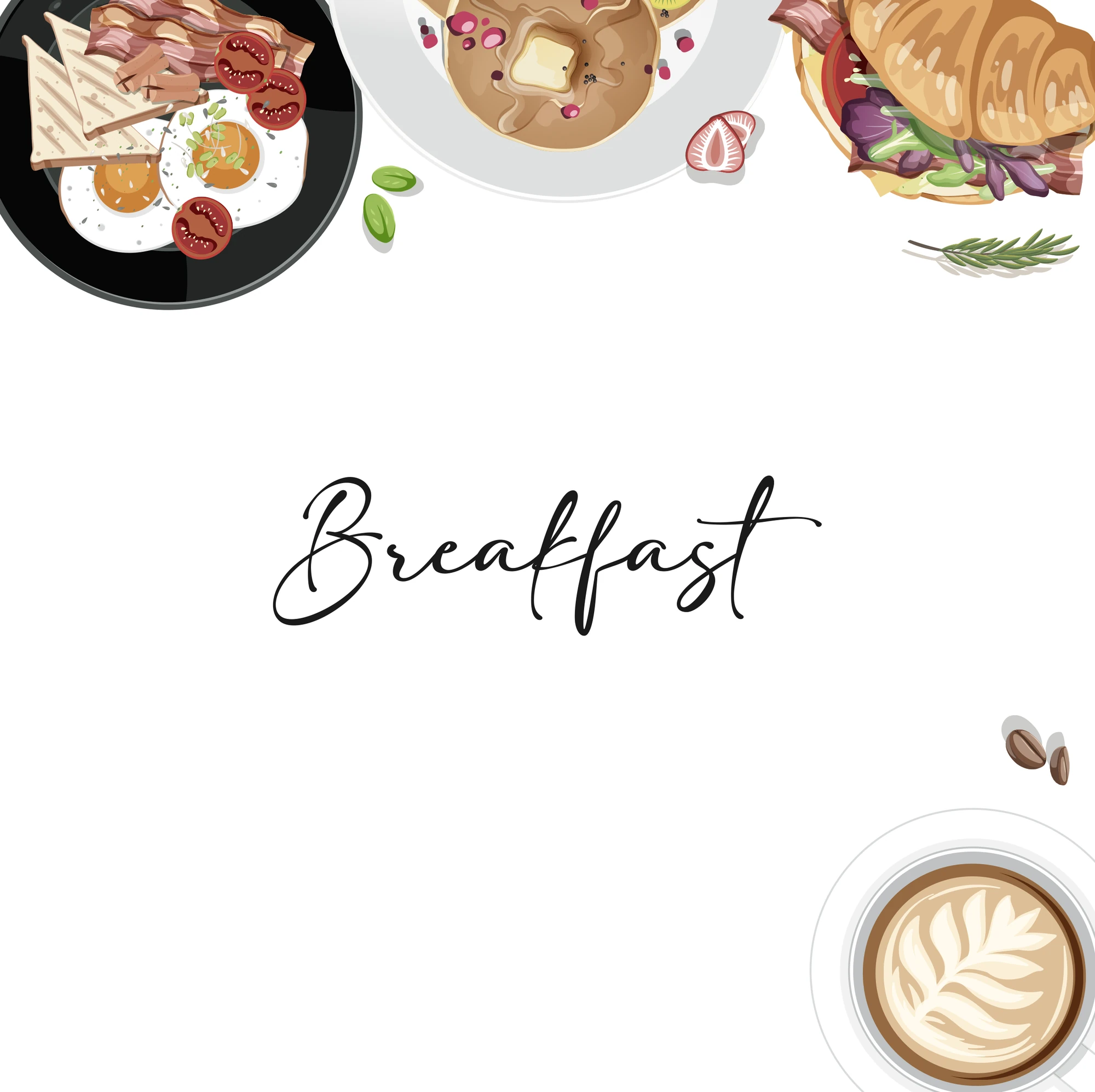
The second pillar was the menu itself. Rather than posting random dish photos, we broke the menu into series: sandwiches, pasta and the café's signatures, each with a consistent frame, numbering and typographic treatment.
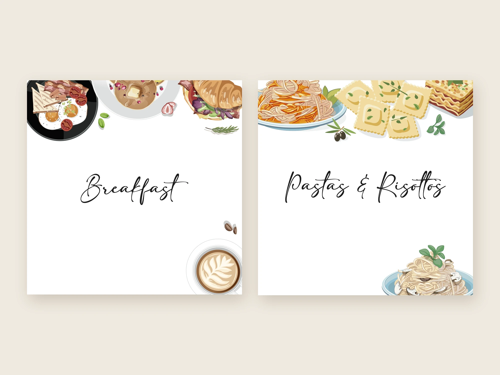
This does two useful things. It turns the grid into a browsable menu, so someone scrolling can understand the offer in seconds. And it makes production faster: a new sandwich doesn't need a new design, just a new photograph dropped into the existing frame.
Familiarity is the competitive advantage.
Quotes, voice and the in-between posts
Not every post should sell. We also built a set of studio-quote posts, short lines in the café's voice that sit between menu and festival content. They give the feed room to breathe and give followers a reason to feel something other than hungry.
What café owners can take from this
Design the system before the posts. A handful of templates, a clear type pairing and two or three colour rules will carry a year of content.
Treat festivals as a series. Plan the whole calendar in one sitting so every greeting shares a visual thread.
Let photography do the appetite work. Keep graphic elements calm so the food stays the hero.
Leave room for voice. A café that only posts offers reads like an advertisement. A café that also posts a thought reads like a place.
Why consistency beats cleverness
It's tempting to chase trends on social media, a new filter one month, a meme format the next. For a café, that usually backfires. Regulars come back because a place feels familiar; the feed should work the same way. In a city like Hyderabad, where a new café opens on almost every corner, familiarity is a competitive advantage. The café people remember is rarely the one with the cleverest post. It's the one whose posts they recognise before they read the name.
A consistent system also makes the work sustainable. When a template, a type pairing and a colour logic are already decided, the café team can publish confidently without waiting on a designer for every greeting, and the brand still looks cared for.
See the work
The full Autumn Leaf content system is on the project page. If you're earlier in the journey and still deciding on a logo, read how we approached six logo routes for Half a Bawa before choosing one.