










Insights / Real estate branding
Real estate branding: how Iconica Capitol lives life in capital letters
Luxury real estate is sold years before it is built. The brand is the only thing a buyer can hold on launch day.

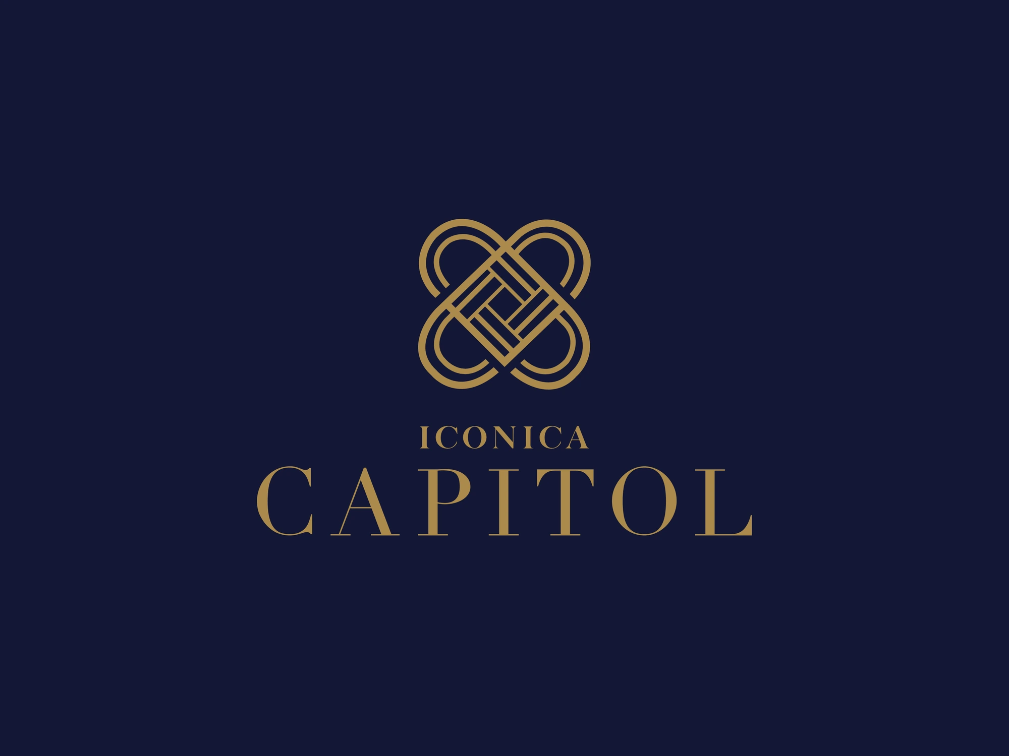
Real estate branding has a peculiar rhythm. A project is launched on renders and promises, sold over months of site visits and brochures, and handed over years later. For most of that time, the building does not exist. What buyers are really responding to is the brand.
That makes the identity of a premium project unusually important. Iconica Capitol is a landmark residential development in Madhurawada, Visakhapatnam. For it, the goal was to create something that feels less like a marketing campaign and more like an heirloom.
Why most project logos age badly
Walk past the hoardings on any growing corridor in the city and you will see the same devices repeated: skyline silhouettes, swooshes, gradient towers and names set in whatever script looked "luxurious" that year. These logos date quickly, and more importantly, they all look alike.
We wanted a mark that could sit on a brass plaque at the building entrance twenty years from now and still feel right.
An interlocking monogram
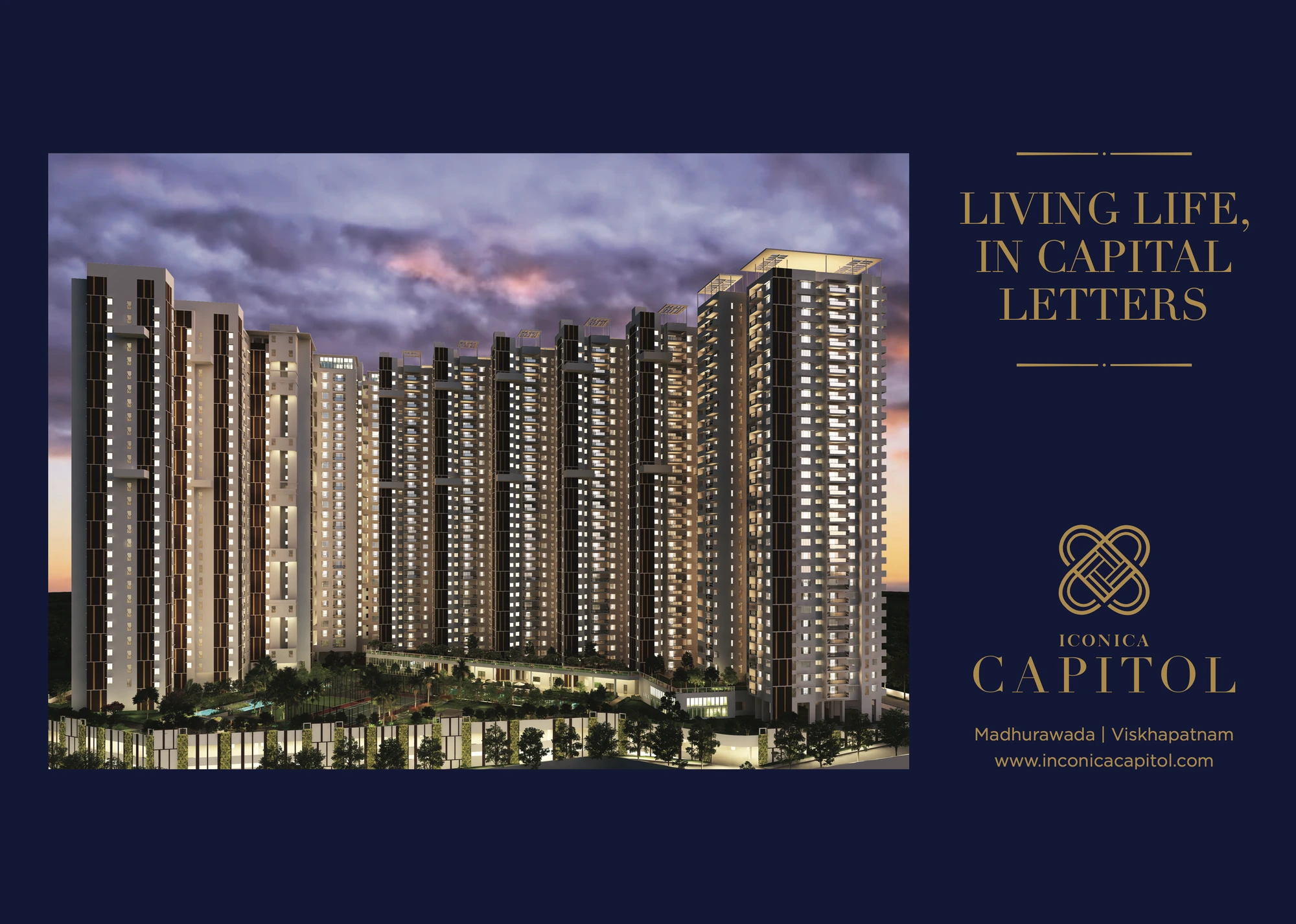
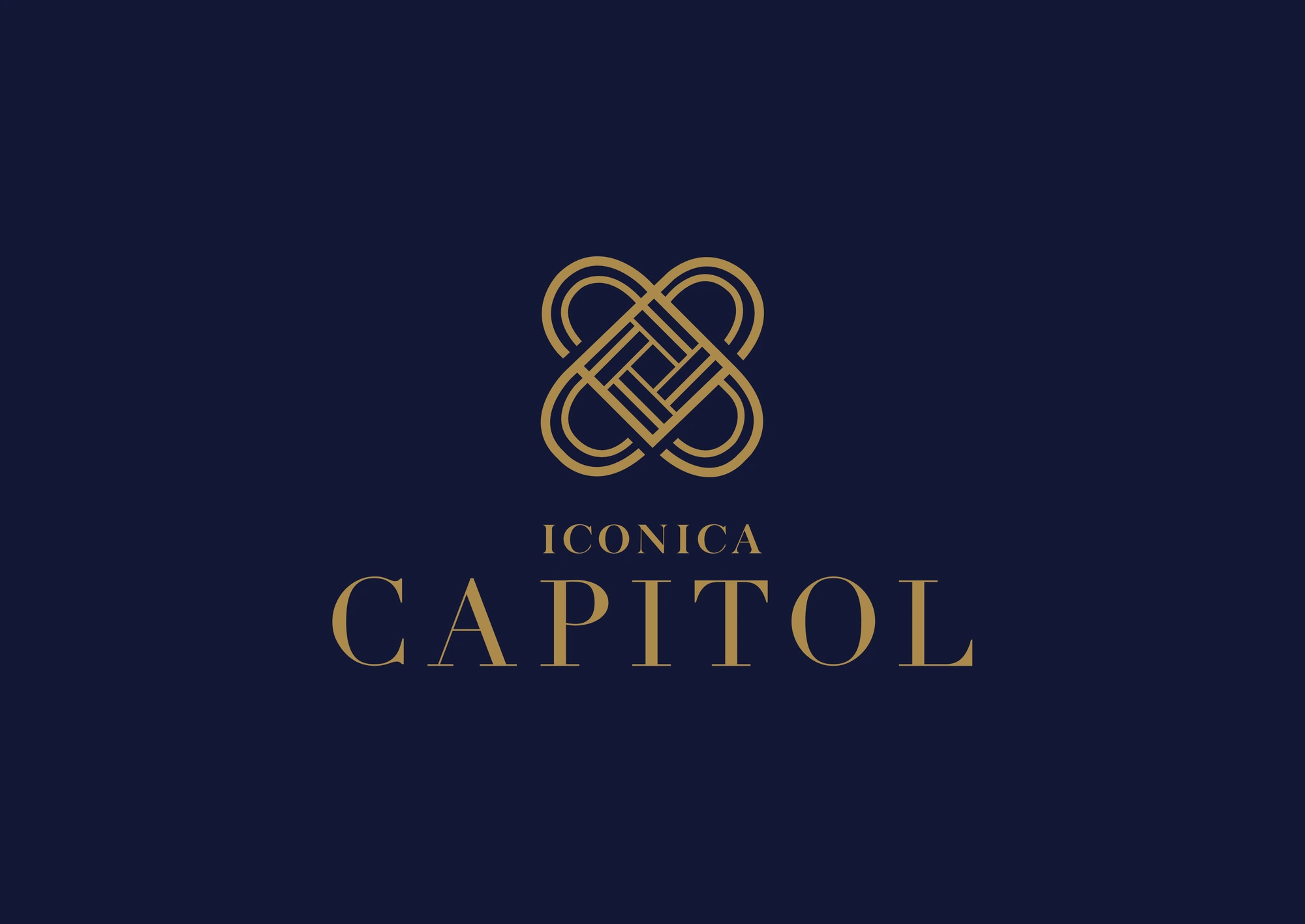
The Iconica Capitol mark is an endless-knot monogram: four hearts interlocked around a square core, a family woven around a home. It borrows from the language of jewellery and old insignia rather than architecture, and it is cut, not printed, so it holds up in brass, in concrete and at ten storeys. A monogram suggests permanence and ownership, exactly the two feelings a home buyer wants.
Buyers don't want a picture of a building. They want a sign that they have arrived somewhere.
The wordmark sets ICONICA in small, widely spaced capitals above CAPITOL in a classical serif, giving the name a quiet, engraved quality.
Brand the address, not the tower.
Midnight navy and restraint
The palette is deliberately narrow: burnished gold on a deep capitol navy, with a high-contrast serif wordmark that carries the promise: living life, in capital letters. Navy reads as serious and stable in a way black can't always manage on print and hoardings, and it gives gold the contrast it needs to feel precious rather than flashy.
The same restraint carries into applications: brochures, site boards and digital launches lean on generous space, fine typography and the monogram, rather than on busy renders.
A line, then a manifesto
The campaign opens on one line: living life, in capital letters. It works because the name already contains the idea. Capitol becomes capitals, and capitals become a way of living.
The brochure earns that line before it shows a single floor plan. Its first spread is a manifesto about levels in life, heights touched and new coordinates, ending on four words: A Life In Capitals. Only then does it turn to the architecture by Hafeez Contractor, the landscaping and a clubhouse spread across two floors. The story is sold first; the square footage follows.
What this means for real estate developers
Brand the address, not the tower. Architecture changes during approvals; a strong name and mark shouldn't.
Design for the plaque. Imagine your logo engraved at the entrance on handover day. If it doesn't work there, it isn't finished.
Limit the palette. Two colours used with discipline read as premium. Six colours read as a sale.
Why premium buyers read restraint as quality
Premium home buyers in Visakhapatnam, as in Hyderabad, are well travelled and well informed. They have seen international developments, boutique hotels and luxury retail, and they judge a project's brand against those references, not against the hoarding next door. To this audience, restraint signals confidence. A brand that doesn't need to shout about luxury is assumed to have the real thing.
That's why the Iconica Capitol identity avoids superlatives and stock imagery. The monogram, the palette and the typography do the persuading. The rest of the marketing, from site boards to the sales gallery, can then be calmer, more credible and, crucially, more consistent over the long years between launch and handover.
See the project
The identity is on the Iconica Capitol project page. For another story about designing for guests rather than buyers, read how HY~ONE Convention started with a water bottle.