















Insights / Café naming and branding
Café naming and identity: how First Pour got its name inside a brewery
A café coming up inside a brewery, named for the first thing poured each morning.

Every café promises good coffee. First Pour came with a more interesting brief: a speciality coffee and bakehouse coming up inside Between the Brewery. The name had to belong to both.
Named for the first thing poured each day
In a brewery, the first pour usually means the first beer from the tap. But a café's day starts hours earlier, and the first thing anyone pours in the morning is coffee. Naming the café First Pour borrows the brewery's own language and gives the morning to the café: two words that make sense to beer drinkers and coffee drinkers alike, and set the bar for every cup that follows.
The best names are found in the place a brand lives, then given a new meaning.
A wordmark that moves like coffee
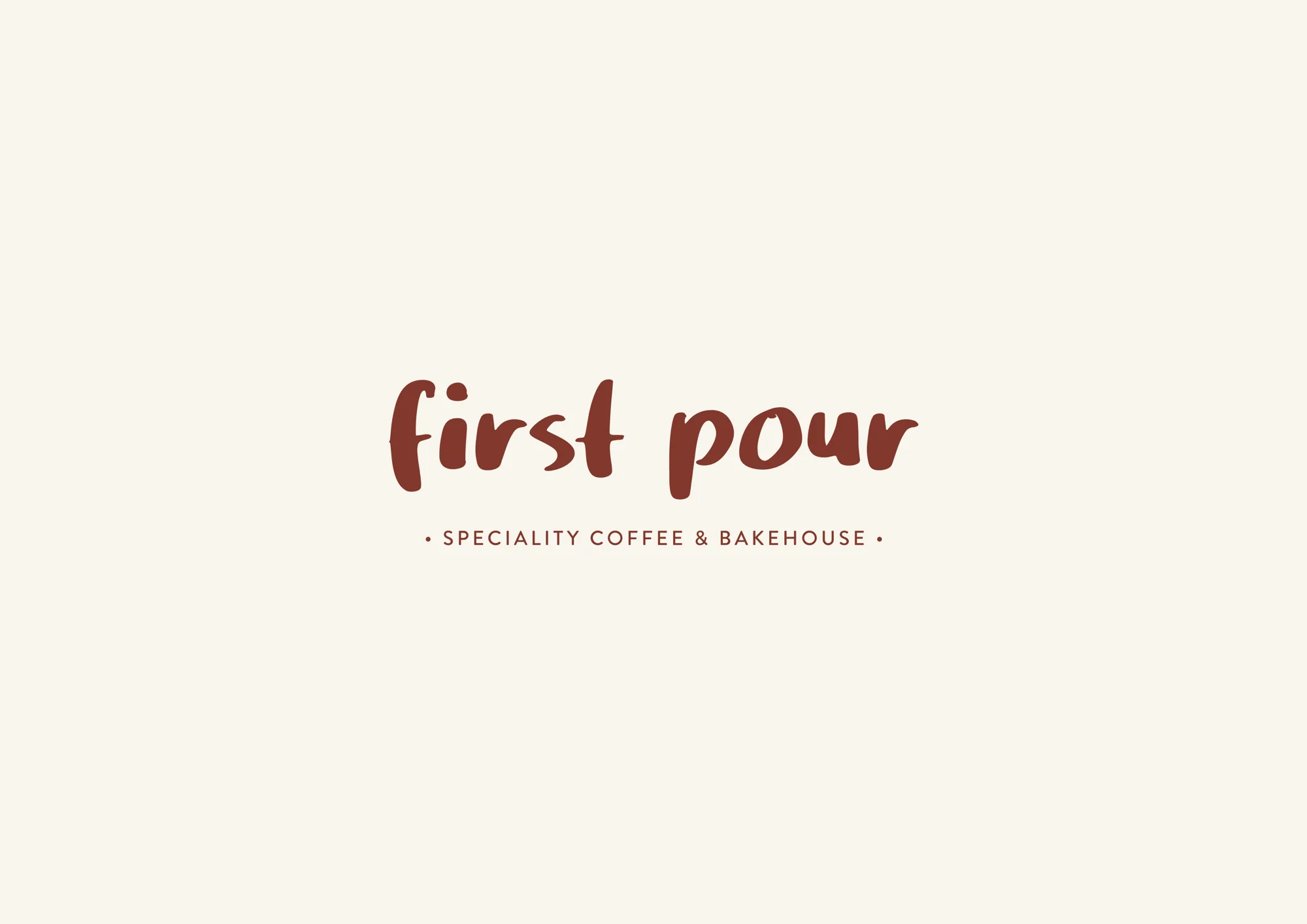
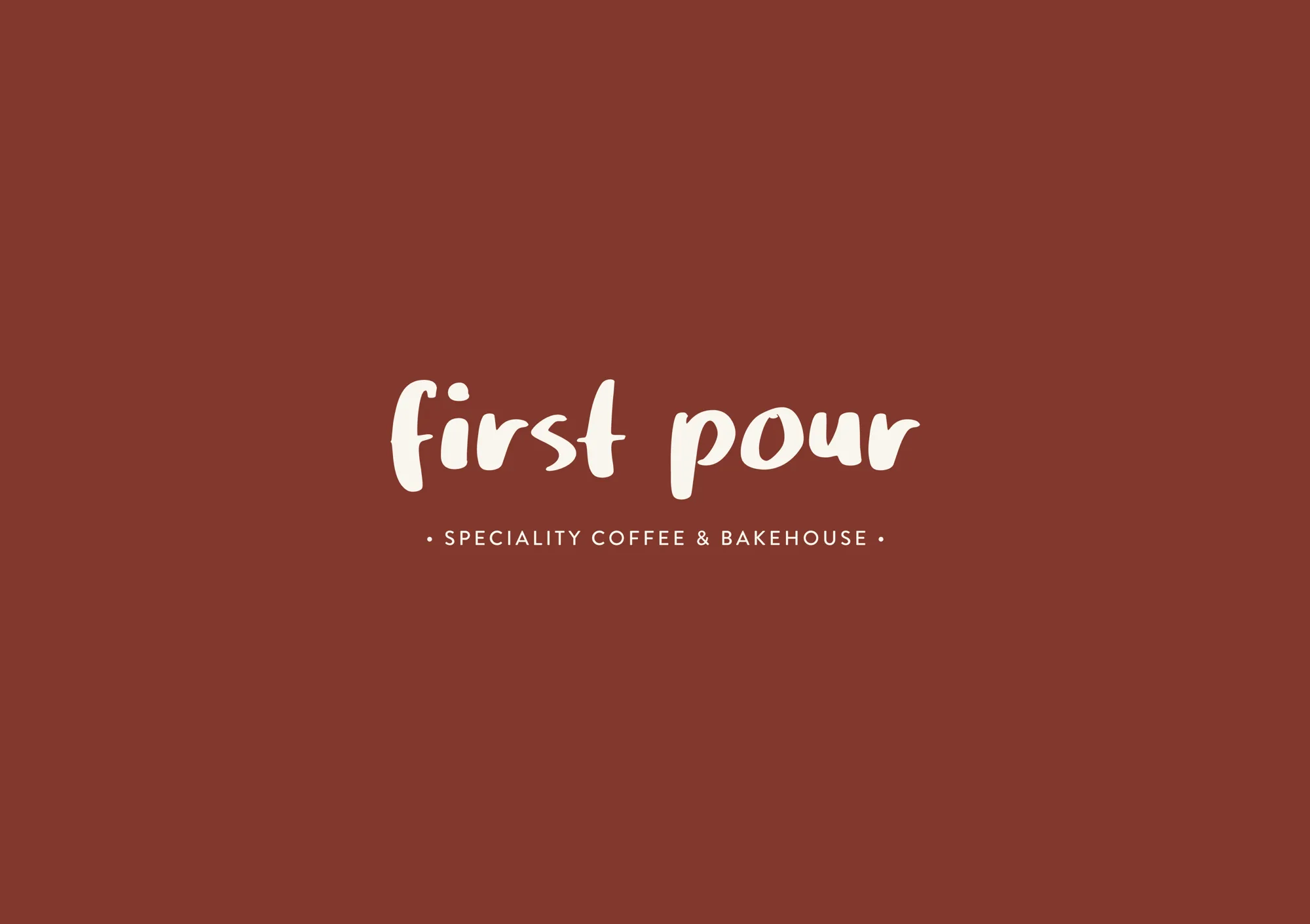
The wordmark is hand-lettered, warm and quick, like the morning's first cup. Underneath, the promise in plain words: speciality coffee and bakehouse. Reversed in cream on the brand red, it works on cups, signage and anywhere the café needs to be seen first.
Two colours, nothing more
The palette is deliberately small: a roasted red, #9F3321, and a warm cream, #F6F3ED. That discipline is what makes a small café recognisable. Customers see the red cup across a street, in a photo or on a desk, and know where it came from.
Discipline is what makes a small café look like a big brand.
Fourteen objects, one line
We drew a library of fourteen café objects, from croissant to moka pot, with the same line as the wordmark. Menus and walls can now talk without repeating the logo, and every new item can be drawn in the same hand.
On the counter
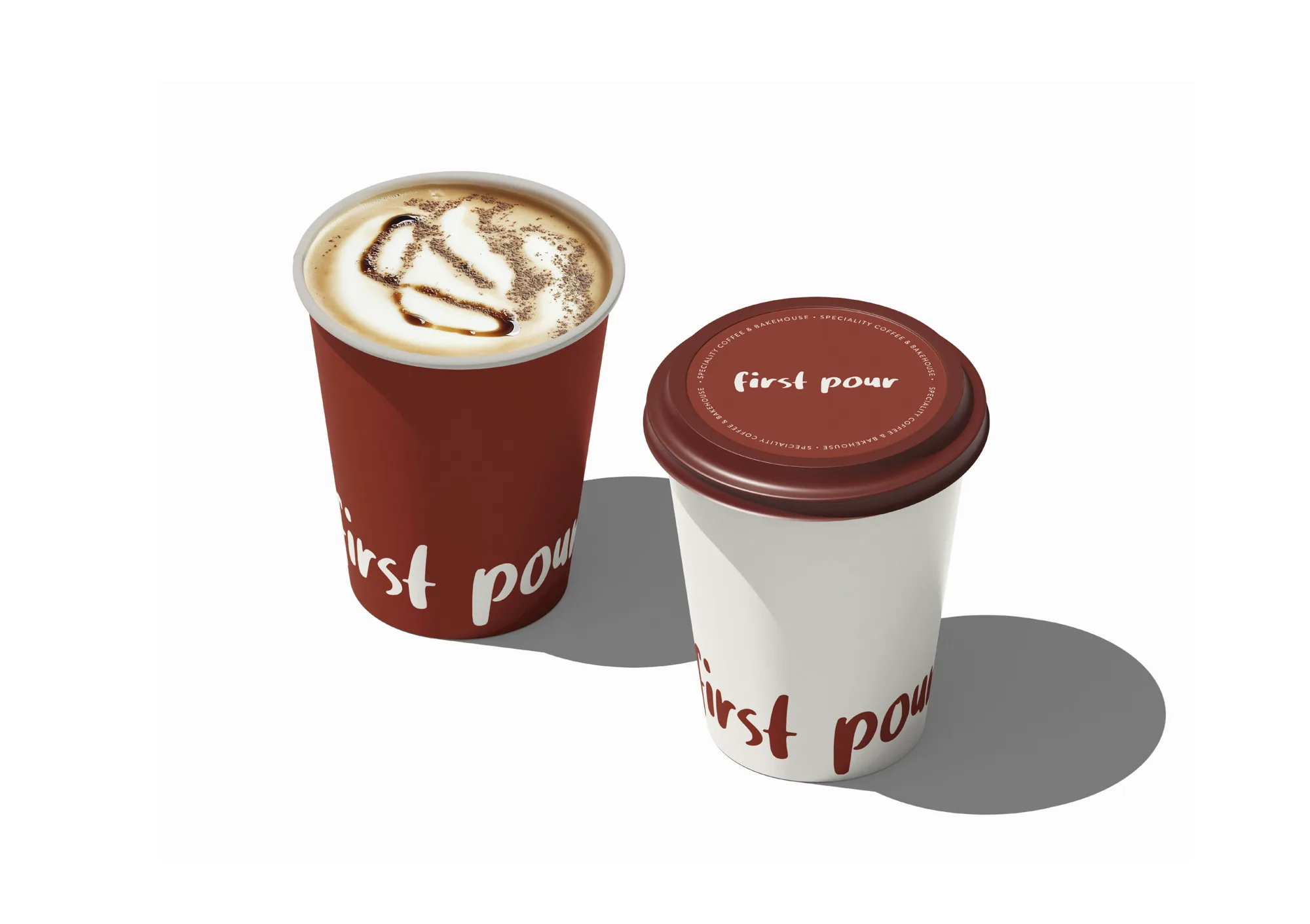
The takeaway cup is the most-travelled surface a café owns. A red cup and a cream cup, the wordmark wrapping both, and the promise circling the lid. For the bakehouse half of the name, a poster uses strokes from the wordmark to guide the eye down a stack of croissants.
Why a small system beats a big one
New cafés often ask for more: more colours, more fonts, more decoration. We did the opposite. A café is seen in quick moments: a cup on a desk, a sign from across the road, a story on a phone. In those moments, a brand with two colours and one hand-drawn line is recognised instantly, while a busier brand is just noise.
The system is also easy for a small team to use. Baristas can make a chalkboard, a sticker or a post without a designer in the room, because every element already speaks the same language. That makes the brand cheaper to run and harder to get wrong.
What café founders can take from this
Borrow the language of your setting. A name like First Pour makes sense inside a brewery and still says coffee first.
Choose two colours and keep them. Every extra colour weakens recognition.
Build a drawing system, not just a logo. Icons in the same hand let your brand speak on every surface.
Treat the cup as your billboard. It travels further than your signage ever will.
See the full identity on the First Pour project page, and read our café branding checklist before your own launch.