






Insights / Edtech branding
Edtech branding: how Greater Than turned its name into a symbol
Most edtech logos describe the category. This one borrowed a symbol every student already knows.

Most edtech brands look alike. A book, a graduation cap, a lightbulb, a gradient. They describe the category and say nothing about the company inside it.
Greater Than Educational Technologies, GTET for short, builds digital learning products from Koramangala, Bangalore. Its work leans on AI, data analytics and digital learning to make education more personal. The name already carried a strong idea. Our job was to make that idea visible.
The name was the brief
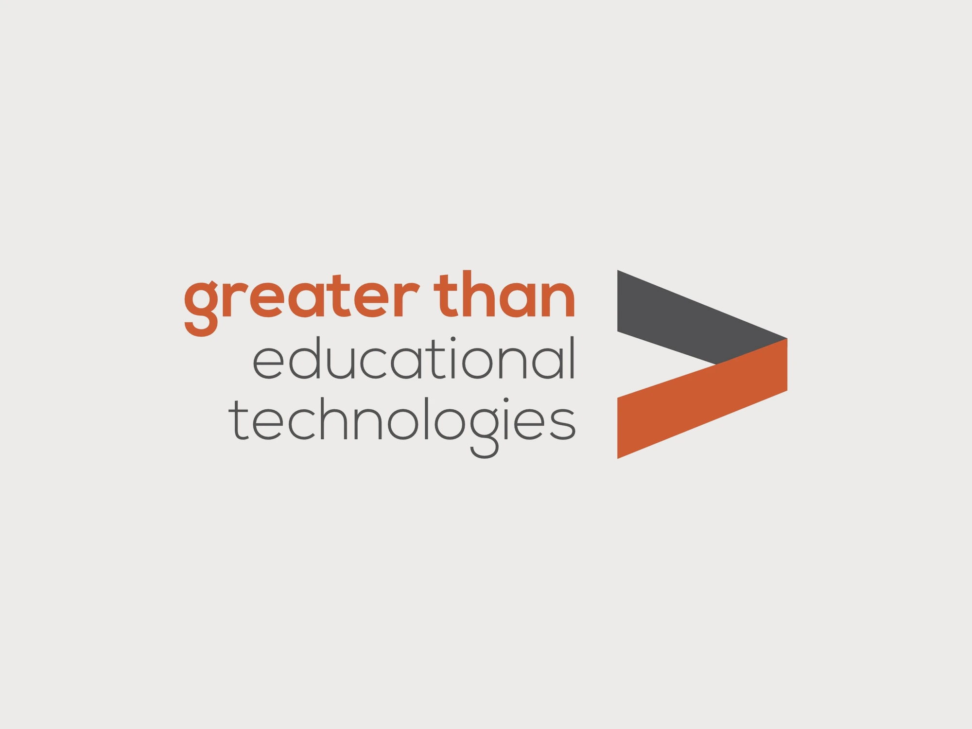
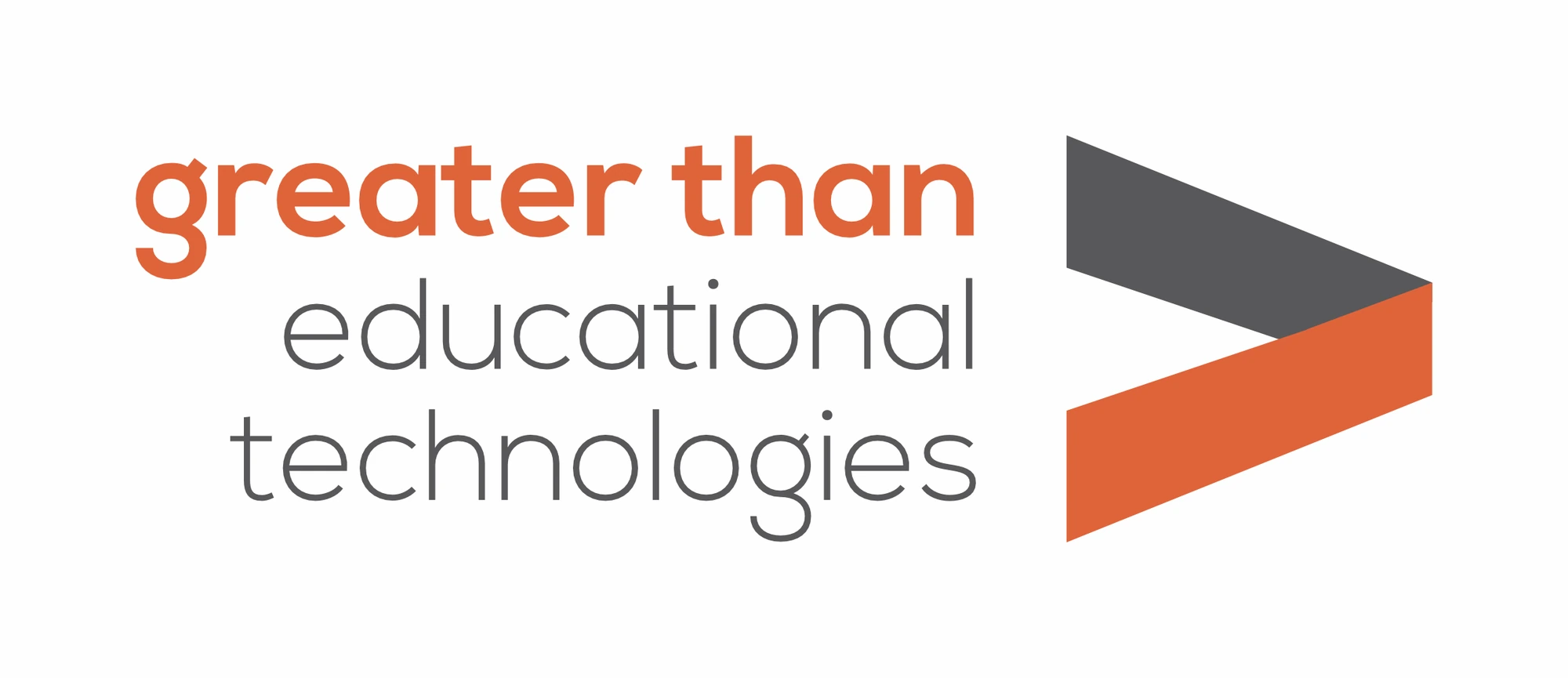
"Greater than" is a phrase, but it is also a symbol everyone learned in school: >. Very few companies get to own a piece of grammar that every student already knows. So we did not look for a separate icon. We let the name and the symbol sit side by side and say the same thing twice.
When a name already has a shape, the logo's job is to find it, not invent a new one.
A symbol that moves
A flat > would have read like a keyboard key. We built it instead from two bands, grey on top and orange below, folded where they meet like a ribbon turning a corner. The fold adds depth and a sense of motion, a quiet nod to learning as something that keeps moving forward.
The words do the same work in type. "greater than" is set bold in orange, so it reads first. "educational technologies" follows in a light grey, so the full name is clear without competing with the promise.
Built to grow with the products
GTET is a company that plans to ship many products, not one. A brand like that needs a mark that can sit above every product without fighting it. The > does exactly that: it can head a platform, a report or a pitch deck and still leave room for each product's own name. The parent brand stays constant while the products change around it.
Two colours, used with purpose
The palette is just orange and charcoal grey on white. Orange carries energy and points the way; grey keeps it grounded and credible. For a company that has to win the trust of institutions as well as the attention of students, that balance matters.
Stationery that carries the symbol
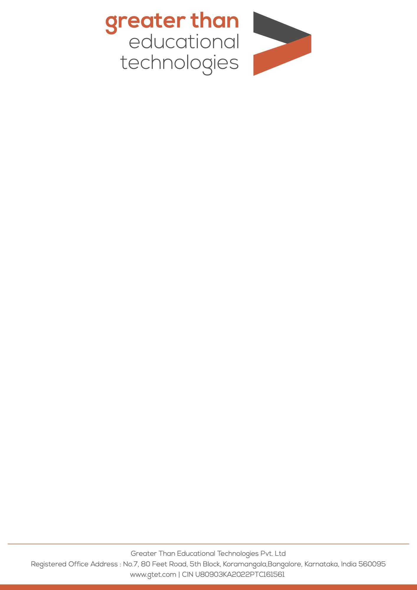
The letterhead keeps the mark at the head, the registered office at the foot and a single orange bar along the bottom edge. Nothing else competes with the letter itself.
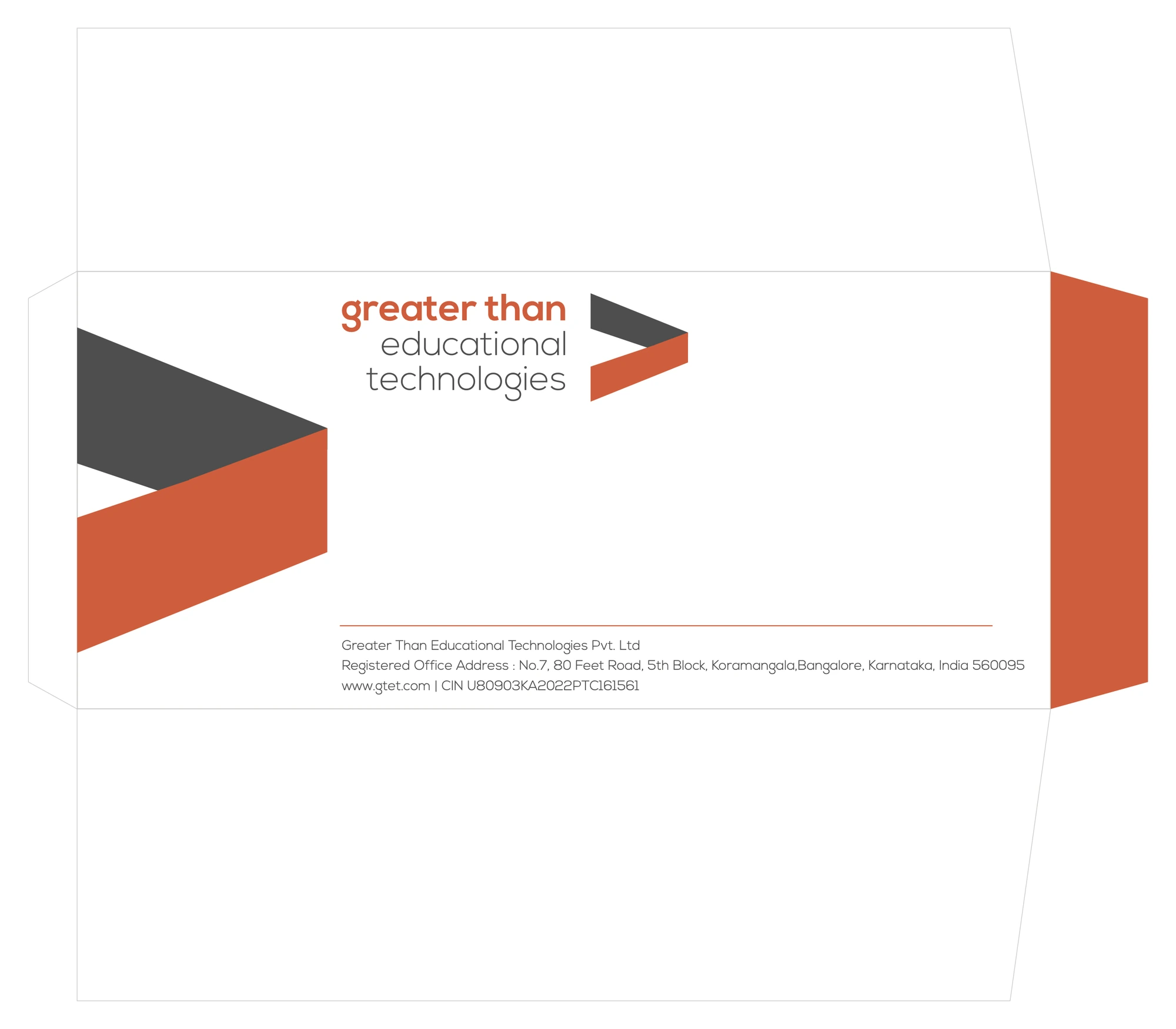
The envelope is where the ribbon gets to be bold. Laid flat, the > grows large enough to run off the front panel, and the side flap folds over in solid orange. Even before it is opened, the envelope says who sent it.
What edtech founders can take from this
Check your name for a hidden shape. A letter, a symbol or an everyday object inside your name can become a mark nobody else can claim.
Avoid the category clichés. If your logo could belong to any of fifty education companies, it will be remembered as none of them.
Keep the palette small. Two colours, applied the same way everywhere, build recognition faster than a rainbow.
Make the brand work at both scales. A mark that reads at the size of a favicon and still holds up across an envelope is a mark that will last.
If you are building an education company and your brand still looks like everyone else's, start with your name. It may already be telling you what to draw.