










Insights / Restaurant branding in Hyderabad
Restaurant branding in Hyderabad: how Telugu Medium made its language the logo
A South Indian kitchen didn’t need a translation. It needed one Telugu letter, given pride of place, and a name every generation feels is theirs.

Most restaurant branding in Hyderabad follows a familiar script: a warm colour, a chilli or a leaf somewhere in the logo, and a name set in whatever typeface feels vaguely traditional. The food may be regional, but the brand usually speaks a borrowed, neutral English. Telugu Medium, a kitchen and bar celebrating the ghee-laced, chilli-forward cooking of the two Telugu states, needed a brand as proud of where it comes from as its food is.
A name every generation calls its own
We named it Telugu Medium for two reasons, and both matter.
The first is literal. The restaurant is a medium to Telugu food: a way in to the cooking of Telangana and Andhra Pradesh, served the way it is made at home.
The second is personal. Telugu medium is how a whole region describes its schooling. Anyone who studied in a Telugu-medium classroom, from the 1960s to the late 2000s, hears their own story in the phrase: the teachers, the textbooks, the pride and the slight defiance of being from somewhere specific. Grandparents, parents and their children all feel the name belongs to them.
A good name doesn't explain the restaurant. It reminds every guest of themselves.
The letter that became the logo
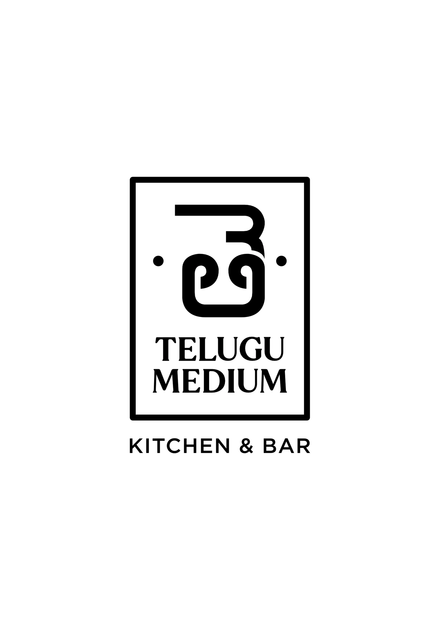
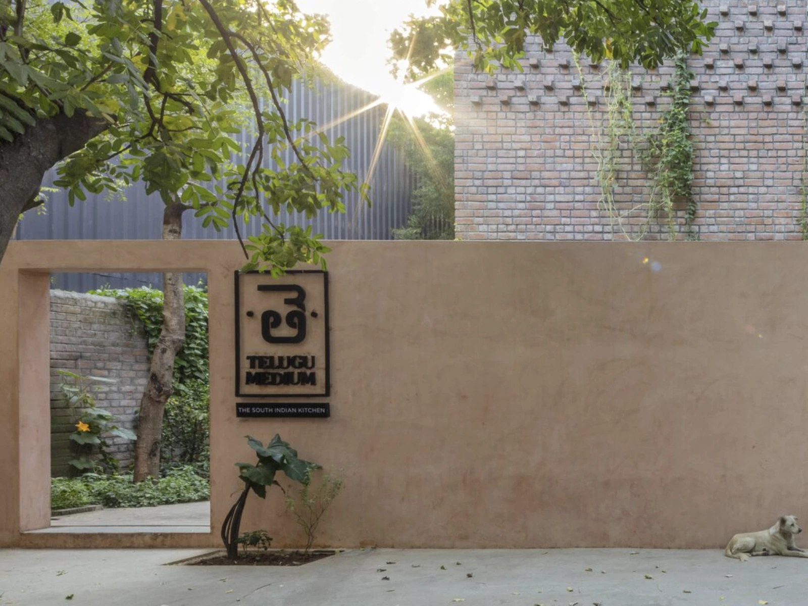
At the centre of the identity is one Telugu letter, తె, the first letter of the word Telugu itself. We gave it pride of place: set inside a bordered frame, equal parts hand-painted signboard and heritage stamp.
It reads as a mark even to people who cannot read the script. That was the balance we wanted: instantly familiar to Telugu speakers, and still a strong, simple shape to everyone else. The palette and patterns support the letter rather than compete with it: terracotta, banana-leaf green, and border patterns inspired by old Telangana textiles.
A monogram only works if it survives being small, stamped and slightly smudged.
The positioning was finished before the logo began.
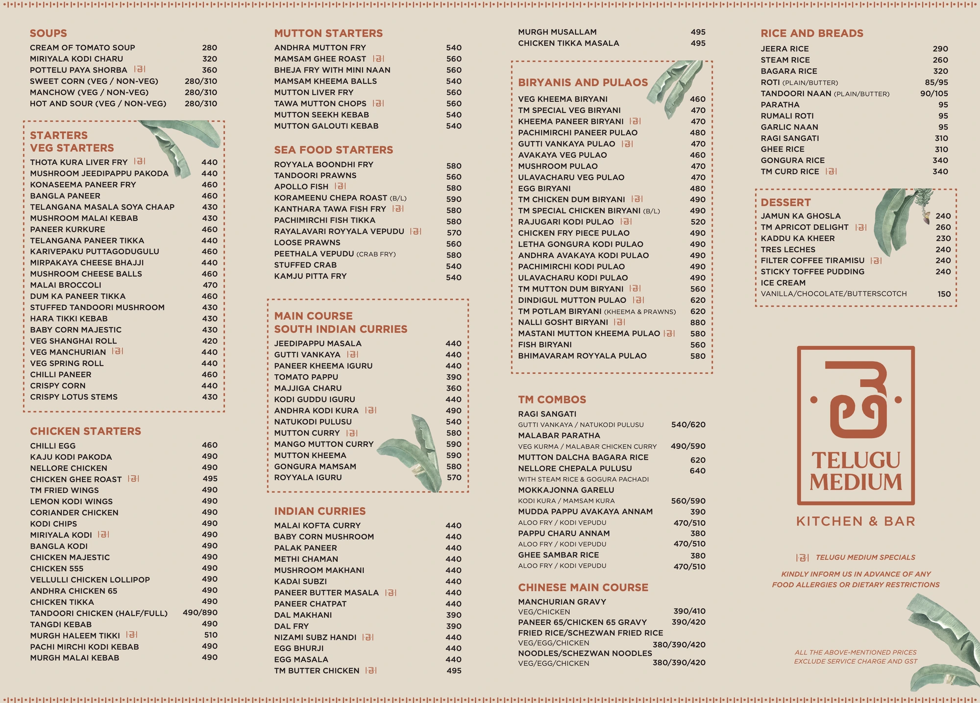
Menus that sound like home
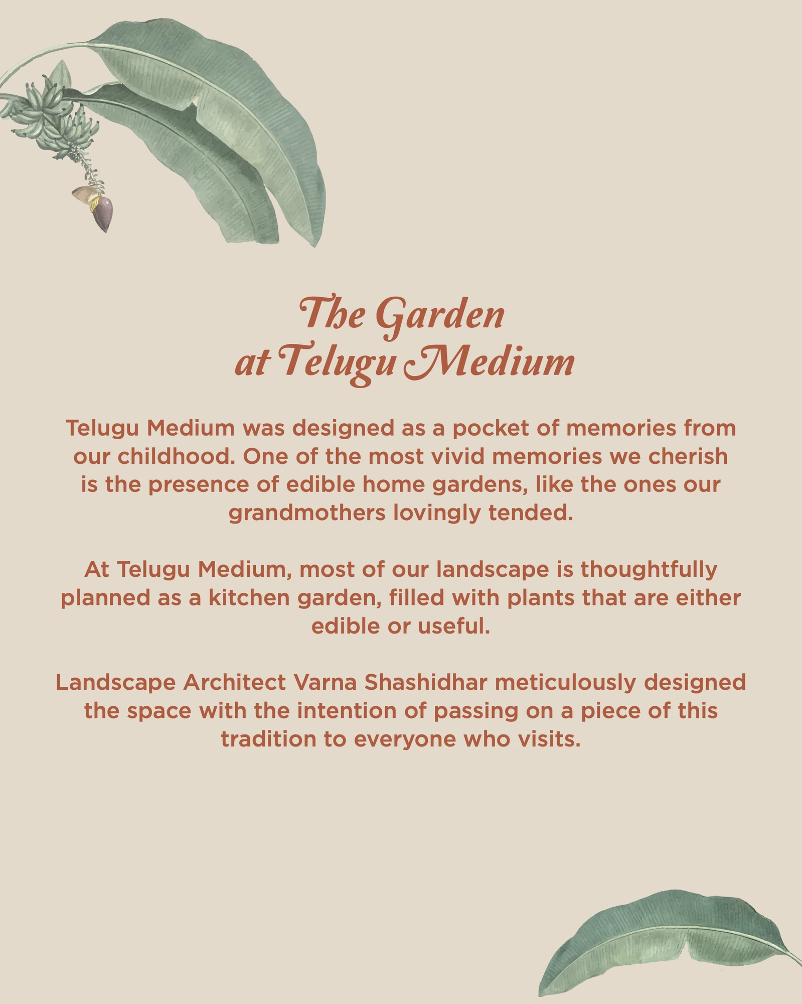
The food menu names every dish the way it is said at home: Gutti Vankaya, Natukodi Pulusu, Royyala Iguru. The bar menu keeps the same voice, with cocktails like Tamarind Twist, Masala Burn and Andhra after Dark. The restaurant also grows its own kitchen garden, and the garden pages let guests take seeds home: tulsi, butterfly pea, parijatha.
What leaves the table
Takeaway is often seen by more people than the dining room. The carry bag carries the banana leaf, the mark and the address, and an 81 mm seal closes every box, so the letter travels to desks, autos and homes across the city.
One frame, every post
We also run the restaurant's Instagram. Every post sits in the same frame, a cream border, banana leaf and a line of serif italic, so drinks, dishes and festivals all read as one place, even at thumbnail size. Reels walk you up the stairs, into the garden after rain, and into the tang that gives Telugu food its character.
The founders have since been featured by GQ India among its Most Influential Young Indians.
What restaurant founders can take from this
Name it for the guest's memory, not just the menu. A name that carries a shared experience does the marketing for you.
Give one symbol pride of place. A single letter, used with confidence, is more ownable than any illustration.
Treat takeaway and social as the flagship. They are where most people meet the brand first.
You can see the full identity on the Telugu Medium project page. For another food-and-beverage story, read how Autumn Leaf built a café brand one post at a time.