

















Insights / Retail and bookstore branding in Hyderabad
Bookstore branding in Hyderabad: how Off The Shelf tilted one letter into an identity
An independent bookstore competes with an app that delivers tomorrow. The brand has to make people want to walk in today.

Independent bookstores have a curious problem. Their product is available everywhere, often cheaper and delivered by tomorrow. What they sell, really, is the experience of finding a book: browsing, picking something up you weren't looking for, leaving with a notebook as well as a novel. For a bookstore, the brand isn't decoration. It's the reason to come in.
Off The Shelf is an independent bookstore in Hitec City, Hyderabad. A combination of its founders' love for books and stationery, it houses everything from bestsellers to thoughtful stationery.
Striking, but fuss-free
The brief for the identity was clear: it had to be striking yet fuss-free. A bookstore's walls are already full of colour and type, thousands of spines competing for attention. The brand had to stand out against that without adding noise.
When your shelves are full of other people's covers, your own brand has to be calm enough to be the frame.
One tilted letter
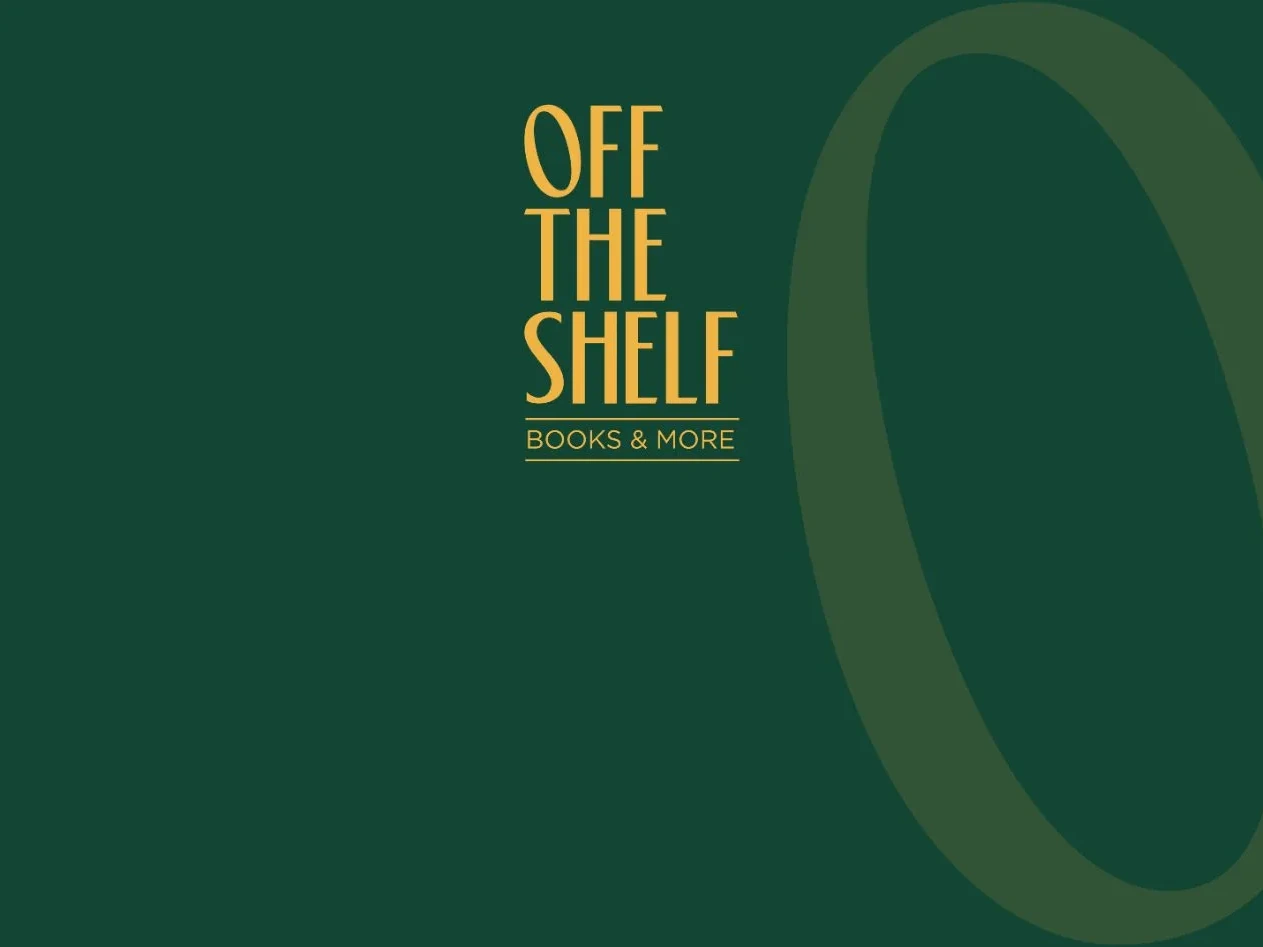
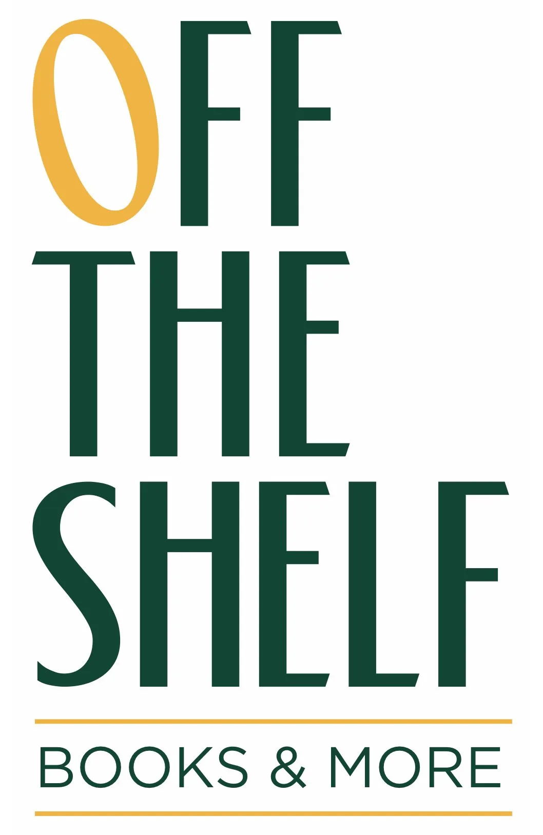
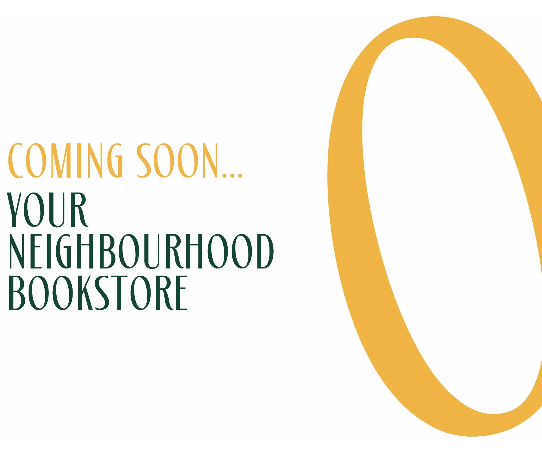
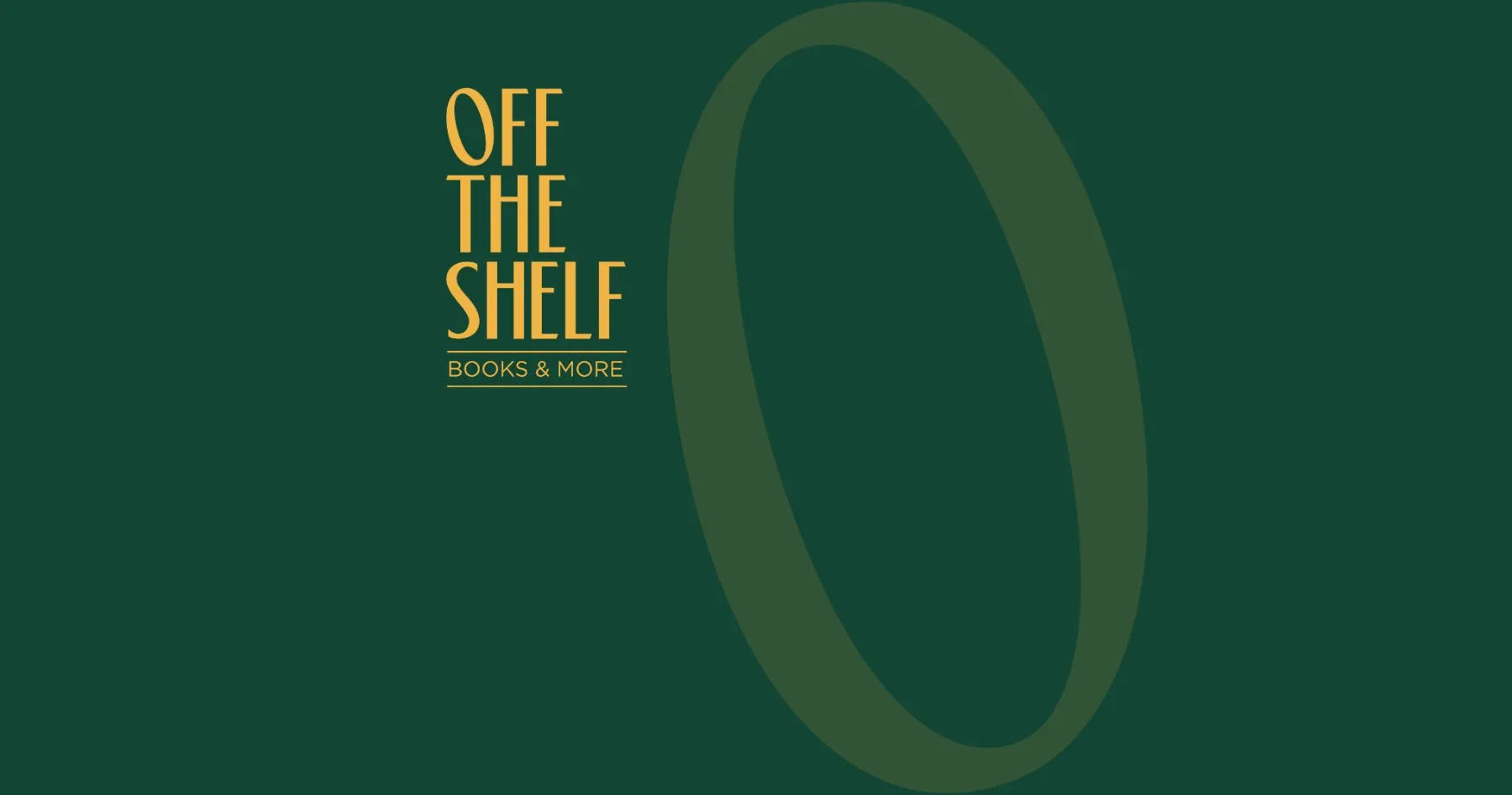
We built the identity around a single letter: the O. Tilted slightly off its axis, it captures the essence of the name, something pulled off the shelf, caught mid-movement. The rest of the wordmark is tall and narrow, stacked like spines, with a simple underline carrying the descriptor Books & More.
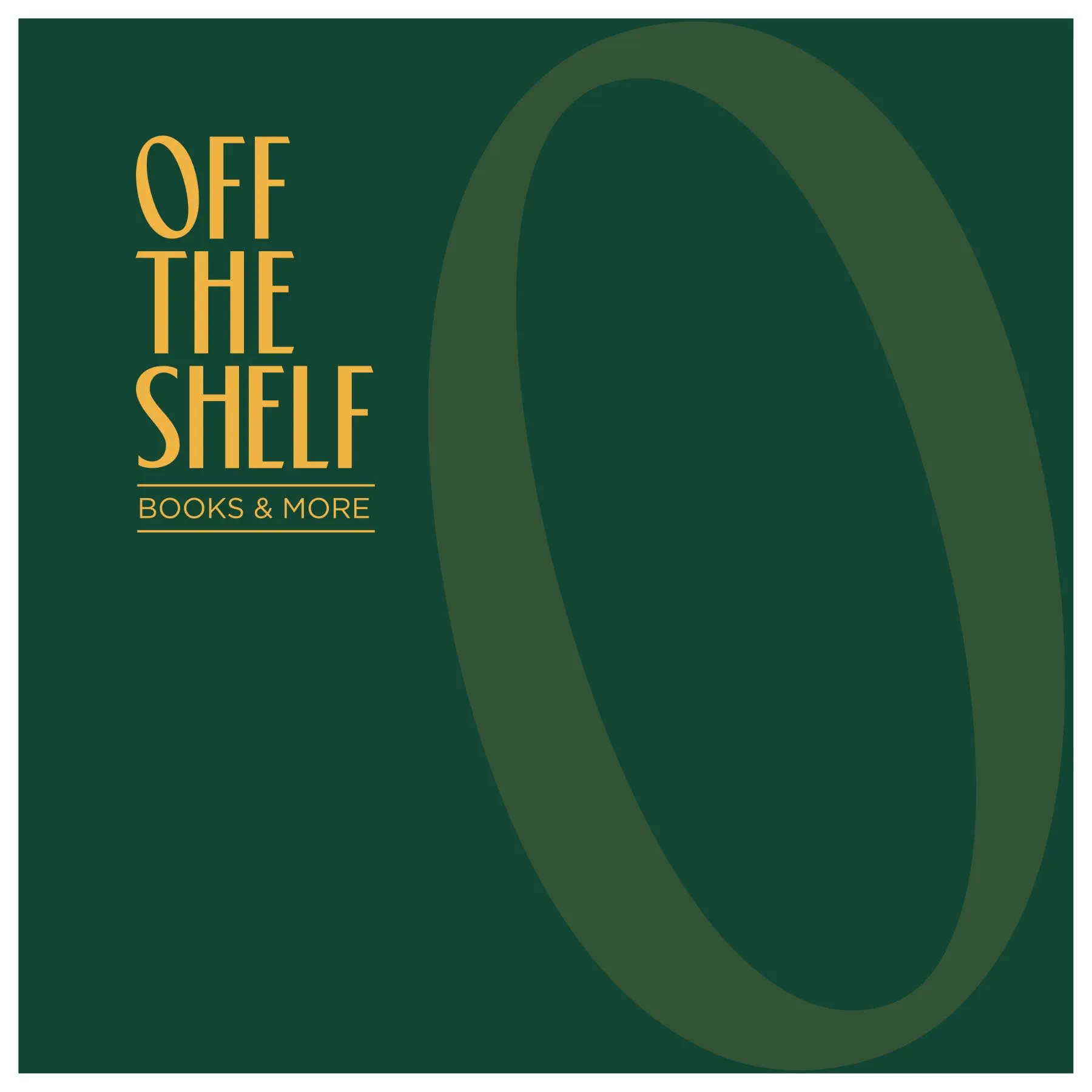
The tilted O became the overall branding element. It works on its own as a symbol, on a tote, a bookmark or a stamp, and it makes the full name instantly recognisable.
One shape, doing a dozen jobs.
Colours borrowed from old Oxford bookstores
The palette was inspired by old Oxford bookstores: deep bottle green with a warm, golden accent on the O. It brings in a sense of old-school charm that feels right for a space devoted to books, without tipping into nostalgia.
A brand you can walk into
An identity like this lives or dies in the physical space. We carried it onto the store's wall signage, its window, staff uniforms and stationery. The green polo with the stacked wordmark and the golden O is a small detail, but it makes the team part of the brand, and it photographs beautifully for social media.
Why independent retail needs strong branding
Hyderabad has a growing culture of independent stores: bookshops, cafés and concept stores that compete on experience rather than price. For these businesses, a strong, consistent identity is what turns a first visit into a habit. It makes the store easy to recommend, easy to find again and easy to share, which is how independent retail grows.
Lessons for retail founders
Design for the walk-in. Signage, window and uniforms are often the first and most lasting brand moments.
Own one element. A single distinctive detail, like a tilted O, can carry the whole identity.
Borrow from a feeling, not a trend. Old Oxford bookstores gave this palette its warmth and longevity.
Make it photographable. In retail, every customer with a phone is a potential ambassador.
Keep reading
See the identity on the Off The Shelf project page. For another neighbourhood favourite built on consistency, read how Autumn Leaf stayed consistent for a whole year.